FabCon is coming to Atlanta
Join us at FabCon Atlanta from March 16 - 20, 2026, for the ultimate Fabric, Power BI, AI and SQL community-led event. Save $200 with code FABCOMM.
Register now!- Power BI forums
- Get Help with Power BI
- Desktop
- Service
- Report Server
- Power Query
- Mobile Apps
- Developer
- DAX Commands and Tips
- Custom Visuals Development Discussion
- Health and Life Sciences
- Power BI Spanish forums
- Translated Spanish Desktop
- Training and Consulting
- Instructor Led Training
- Dashboard in a Day for Women, by Women
- Galleries
- Data Stories Gallery
- Themes Gallery
- Contests Gallery
- QuickViz Gallery
- Quick Measures Gallery
- Visual Calculations Gallery
- Notebook Gallery
- Translytical Task Flow Gallery
- TMDL Gallery
- R Script Showcase
- Webinars and Video Gallery
- Ideas
- Custom Visuals Ideas (read-only)
- Issues
- Issues
- Events
- Upcoming Events
The Power BI Data Visualization World Championships is back! Get ahead of the game and start preparing now! Learn more
- Power BI forums
- Forums
- Get Help with Power BI
- Desktop
- Re: Need help with Measure for Matrix Table and To...
- Subscribe to RSS Feed
- Mark Topic as New
- Mark Topic as Read
- Float this Topic for Current User
- Bookmark
- Subscribe
- Printer Friendly Page
- Mark as New
- Bookmark
- Subscribe
- Mute
- Subscribe to RSS Feed
- Permalink
- Report Inappropriate Content
Need help with Measure for Matrix Table and Top 5
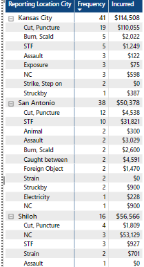
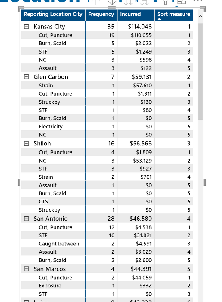
I really need help in writing a measure. I have attched sample PBI Table and screen shot of current table. I use a Filter for the Reporting Location City and a Measure that shows the Top 5 Reporting Location Cities by a Count and then Sum. That part works great. I have been trying to get help but not getting results on my own. Is this really not as simple as it seems.
Now I need someone to write a measure that I could add to the filter that would keep the Cause Grouping under each City to the Top 5 by Frequency. If a tie, then first look at top Frequency and then use the Incurred to break the tie to keep only 5.
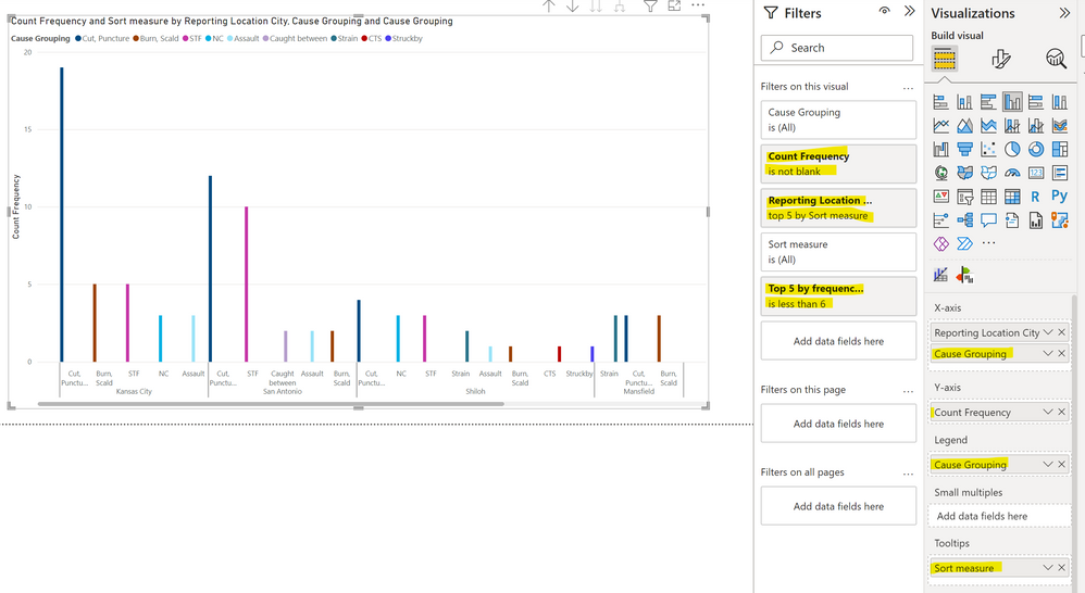
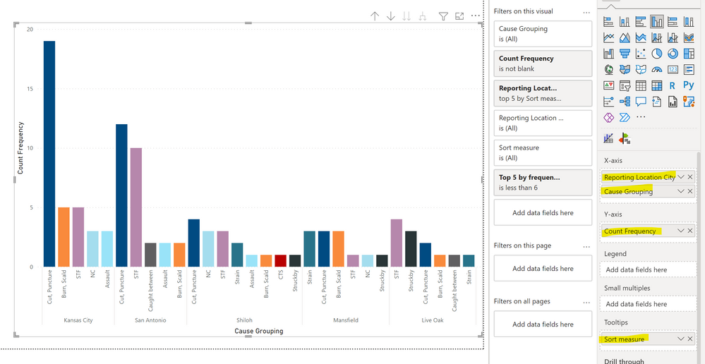
From image below , for example, under Kansas City there are three 3's which leaves 6 total causes The tied 3's are Assault, Exposure and NC.
The measure if working, would keep
Cut, Puncture 19
Burn, Scald 5
STF 5
NC 3
Assault 3
San Antonio would keep
Cut, Puncture 12
STF 10
Caught Between 2
Assault 2
Burn, Scald 2
Solved! Go to Solution.
- Mark as New
- Bookmark
- Subscribe
- Mute
- Subscribe to RSS Feed
- Permalink
- Report Inappropriate Content
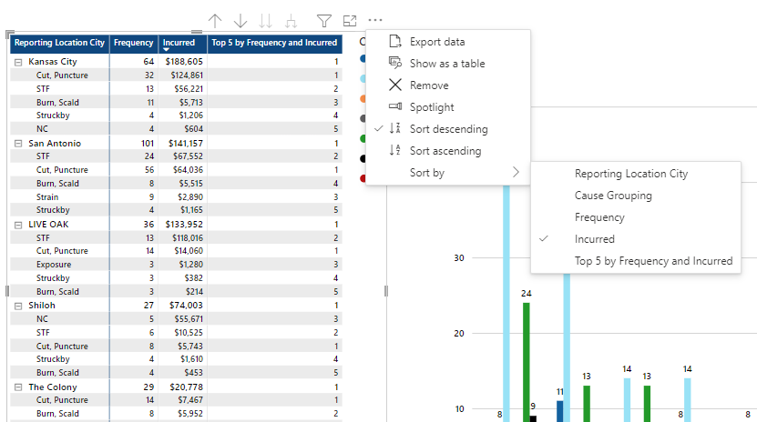
Have you tried sorting by the sum measure in descending order?
Did I answer your question? Mark my post as a solution!
In doing so, you are also helping me. Thank you!
Proud to be a Super User!
Paul on Linkedin.
- Mark as New
- Bookmark
- Subscribe
- Mute
- Subscribe to RSS Feed
- Permalink
- Report Inappropriate Content
I would go for:
Ref =
[Sum of Total Gross Incurred] * 1000000000000 + COUNT(LossRunToExcel[Reporting Location City])
Did I answer your question? Mark my post as a solution!
In doing so, you are also helping me. Thank you!
Proud to be a Super User!
Paul on Linkedin.
- Mark as New
- Bookmark
- Subscribe
- Mute
- Subscribe to RSS Feed
- Permalink
- Report Inappropriate Content
I got the first example to work in main file. Thank you for all the help. I will need more time this weekend to try the more creative and visual 2nd option.
- Mark as New
- Bookmark
- Subscribe
- Mute
- Subscribe to RSS Feed
- Permalink
- Report Inappropriate Content
Yes, it's definitely an issue in the service. You need to sort by the city field to get the axis to respect the structure:
It actually emulates the problem we used to have in Desktop when you turned off concatenate fields: for the setting to take effect, you needed to sort the axis by the fields:
It might be worth reporting the issue on the issues forum:
https://community.powerbi.com/t5/Issues/idb-p/Issues
Did I answer your question? Mark my post as a solution!
In doing so, you are also helping me. Thank you!
Proud to be a Super User!
Paul on Linkedin.
- Mark as New
- Bookmark
- Subscribe
- Mute
- Subscribe to RSS Feed
- Permalink
- Report Inappropriate Content
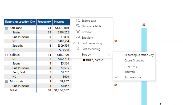
Paul, I found one account so far where sort is not working. Look under San Jose and 9 for NC is under the two 8's.? I can try more later.
- Mark as New
- Bookmark
- Subscribe
- Mute
- Subscribe to RSS Feed
- Permalink
- Report Inappropriate Content
Paul,
I changed
- Mark as New
- Bookmark
- Subscribe
- Mute
- Subscribe to RSS Feed
- Permalink
- Report Inappropriate Content
Paul, it does the City just fine but is it possible to rank the Cause Grouping the same as ther table? Down from highest to lowest?
- Mark as New
- Bookmark
- Subscribe
- Mute
- Subscribe to RSS Feed
- Permalink
- Report Inappropriate Content
I can sort descening incurred no problem, but then Reporting Location City Freqency Counts are not decending?
- Mark as New
- Bookmark
- Subscribe
- Mute
- Subscribe to RSS Feed
- Permalink
- Report Inappropriate Content
Can you post a depiction?
Did I answer your question? Mark my post as a solution!
In doing so, you are also helping me. Thank you!
Proud to be a Super User!
Paul on Linkedin.
- Mark as New
- Bookmark
- Subscribe
- Mute
- Subscribe to RSS Feed
- Permalink
- Report Inappropriate Content
- Mark as New
- Bookmark
- Subscribe
- Mute
- Subscribe to RSS Feed
- Permalink
- Report Inappropriate Content
Yes, I see what you mean!
First of all, change the [Ref] measure to:
Ref =
VAR _MX =
    MAXX (
        ALL ( InjuryCause[Cause Grouping] ),
        CALCULATE ( SUM ( LossRunToExcel[Total Gross Incurred] ) )
    )
VAR _LNGTh =
    LEN ( _MX ) + 1
RETURN
    COUNT ( LossRunToExcel[Total Gross Incurred] ) * POWER ( 10, _LNGTh )
        + SUM ( LossRunToExcel[Total Gross Incurred] )
Create a new measure to sort the matrix by:
Sort measure =
IF (
    ISINSCOPE ( InjuryCause[Cause Grouping] ),
    IF (
        ISBLANK ( [Sum of Total Gross Incurred] ),
        BLANK (),
        RANKX ( ALLSELECTED ( InjuryCause[Cause Grouping] ), [Ref],, ASC, SKIP )
    ),
    [Sum of Total Gross Incurred]
)
Then add and sort the matrix by the [Sort measure]
Did I answer your question? Mark my post as a solution!
In doing so, you are also helping me. Thank you!
Proud to be a Super User!
Paul on Linkedin.
- Mark as New
- Bookmark
- Subscribe
- Mute
- Subscribe to RSS Feed
- Permalink
- Report Inappropriate Content
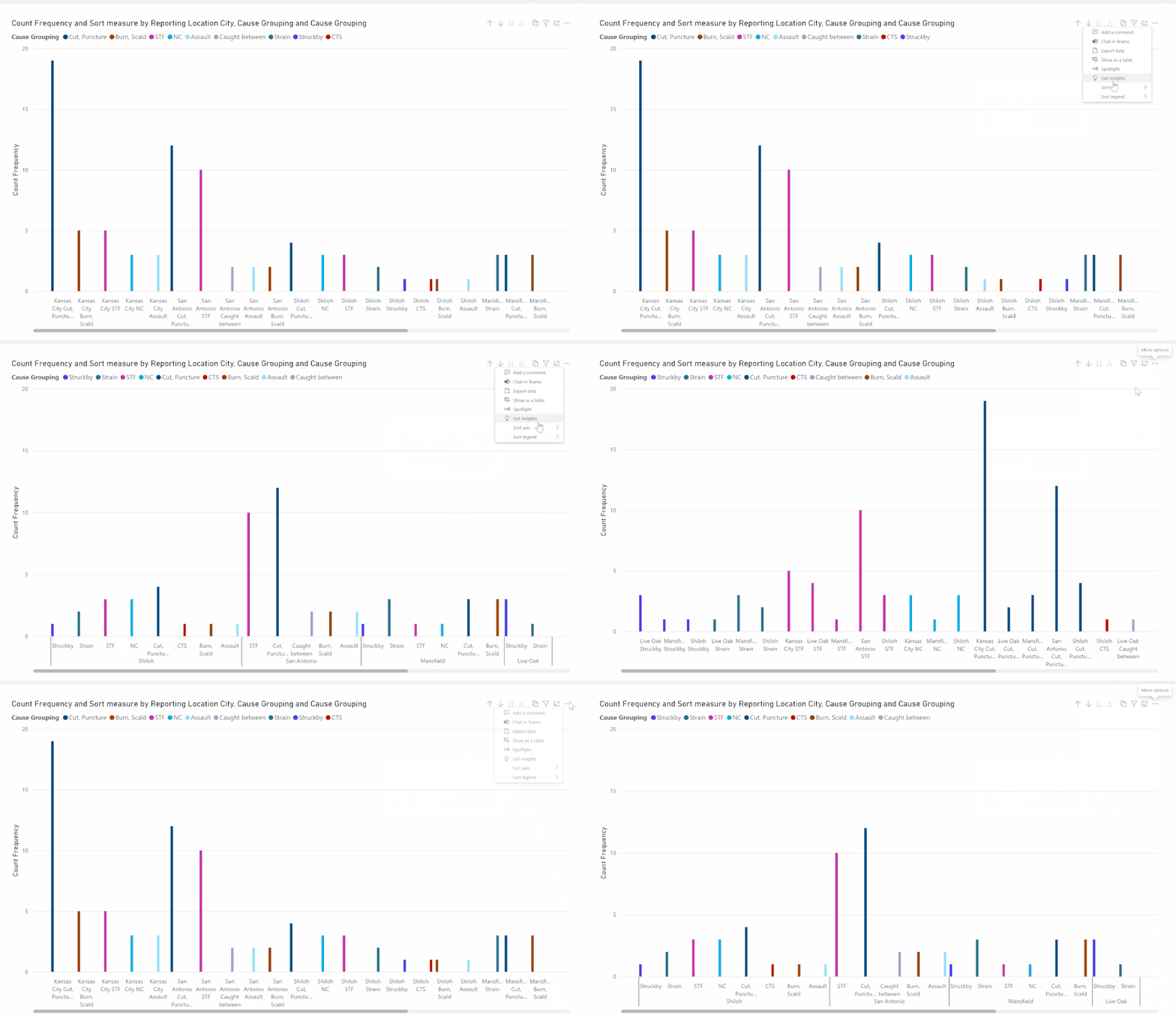
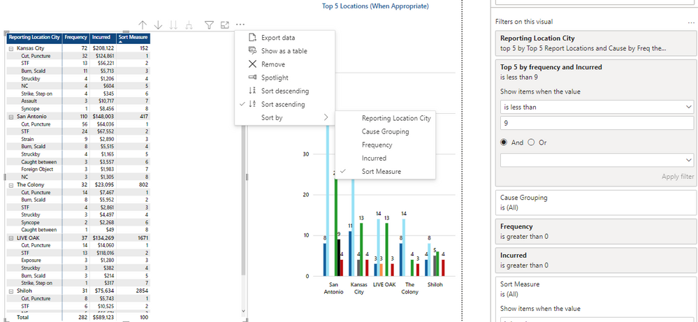
Maybe I did somehting wring. Here are screen shot of Acesnd and Descend Sort Measure. I Included my filter
Ascend
Decend
- Mark as New
- Bookmark
- Subscribe
- Mute
- Subscribe to RSS Feed
- Permalink
- Report Inappropriate Content
You did nothing wrong...I did!
Try with this measure to sort the matrix by:
Sort Measure =
IF (
    ISINSCOPE ( InjuryCause[Cause Grouping] ),
    IF (
        ISBLANK ( [Sum of Total Gross Incurred] ),
        BLANK (),
        RANKX ( ALL ( InjuryCause[Cause Grouping] ), [Ref],, DESC, SKIP )
    ),
    RANKX (
        ALL ( LossRunToExcel[Reporting Location City] ),
        CALCULATE (
            [Sum of Total Gross Incurred],
            ALLEXCEPT ( LossRunToExcel, LossRunToExcel[Reporting Location City] )
        ),
        ,
        DESC
    )
)
Did I answer your question? Mark my post as a solution!
In doing so, you are also helping me. Thank you!
Proud to be a Super User!
Paul on Linkedin.
- Mark as New
- Bookmark
- Subscribe
- Mute
- Subscribe to RSS Feed
- Permalink
- Report Inappropriate Content
Paul,
I got the sample file to be like yours and it looks fine.
When I applied Measure to my main file I still got a city out of order. I can provide more data later to sample file. San Antionio is below Kansas City. Not sure why?
- Mark as New
- Bookmark
- Subscribe
- Mute
- Subscribe to RSS Feed
- Permalink
- Report Inappropriate Content
Paul, I noticed the sample file screen shot from sample file is the same issue. Glen Carbon and Shiloh are ahead of San Antonio. So Cities are not sorting right?
Can we address that sort in there as well?
- Mark as New
- Bookmark
- Subscribe
- Mute
- Subscribe to RSS Feed
- Permalink
- Report Inappropriate Content
Ok...Let's try again!
These are the measures I've modified:
Ref =
VAR _MX =
    MAXX (
        ALL ( InjuryCause[Cause Grouping] ),
        CALCULATE ( SUM ( LossRunToExcel[Total Gross Incurred] ) )
    )
VAR _LNGTh =
    LEN ( FORMAT ( INT ( _MX ), "Text" ) ) + 1
RETURN
    COUNT ( LossRunToExcel[Total Gross Incurred] ) * POWER ( 10, _LNGTh )
        + SUM ( LossRunToExcel[Total Gross Incurred] )
New measure
Ref city =
VAR _MX =
    CALCULATE (
        DISTINCTCOUNT ( LossRunToExcel[Reporting Location City] ),
        ALLSELECTED ( LossRunToExcel )
    )
VAR _LNGTh =
    LEN ( FORMAT ( INT ( _MX ), "text" ) )
VAR _Res =
    CALCULATE ( [Count Frequency], ALLSELECTED ( InjuryCause[Cause Grouping] ) )
        * POWER ( 10, _lNGTH )
        + RANKX (
            ALL ( LossRunToExcel[Reporting Location City] ),
            CALCULATE (
                [Sum of Total Gross Incurred],
                ALLEXCEPT ( LossRunToExcel, LossRunToExcel[Reporting Location City] )
            ),
            ,
            ASC,
            DENSE
        )
RETURN
    _Res
Sort measure
Sort measure =
IF (
    ISINSCOPE ( InjuryCause[Cause Grouping] ),
    IF (
        ISBLANK ( [Sum of Total Gross Incurred] ),
        BLANK (),
        RANKX ( ALLSELECTED ( InjuryCause[Cause Grouping] ), [Ref],, ASC, SKIP )
    ),
    IF ( ISINSCOPE ( LossRunToExcel[Reporting Location City] ), [Ref city] )
)
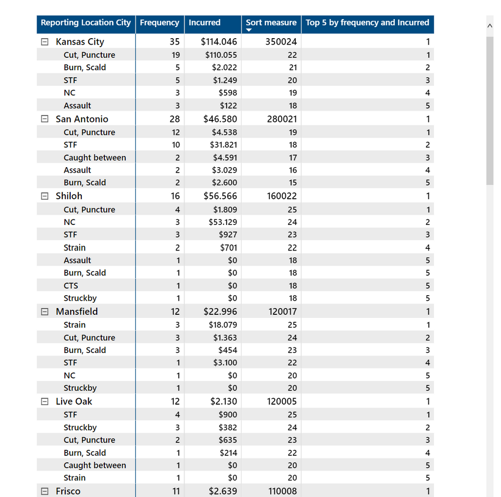
Did I answer your question? Mark my post as a solution!
In doing so, you are also helping me. Thank you!
Proud to be a Super User!
Paul on Linkedin.
- Mark as New
- Bookmark
- Subscribe
- Mute
- Subscribe to RSS Feed
- Permalink
- Report Inappropriate Content
I have checked 4 accounts so far but need to look a lttile deeper just to make sure data is right.
- Mark as New
- Bookmark
- Subscribe
- Mute
- Subscribe to RSS Feed
- Permalink
- Report Inappropriate Content
Paul, so far so good. How could I apply the Sort Measure to the Clustered Column Chart to mirror the Matrix Table? Possible?
- Mark as New
- Bookmark
- Subscribe
- Mute
- Subscribe to RSS Feed
- Permalink
- Report Inappropriate Content
Ok, I've been playing around with the clustered column chart and this is what I have so far:
Change the [Sort measure] to:
Sort measure =
VAR _FreqByCity =
    CALCULATE (
        [Count Frequency],
        FILTER (
            ALL ( InjuryCause[Cause Grouping] ),
            [Top 5 by frequency and Incurred] < 6
        )
    )
VAR _LN =
    LEN (
        FORMAT (
            CALCULATE (
                [Count Frequency],
                ALL ( 'LossRunToExcel'[Reporting Location City] )
            ),
            "text"
        )
    )
VAR _Pre =
    _FreqByCity
        * POWER ( 10, _LN * 2 )
VAR _Inc =
    CALCULATE (
        RANKX (
            ALLSELECTED ( LossRunToExcel[Reporting Location City] ),
            [Sum of Total Gross Incurred],
            ,
            ASC,
            DENSE
        ),
        ALLSELECTED ( InjuryCause[Cause Grouping] )
    )
VAR _Mid =
    _Inc * POWER ( 10, _LN )
RETURN
    IF (
        ISBLANK ( [Count Frequency] ),
        BLANK (),
        _Pre + _Mid
            + RANKX ( ALLSELECTED ( InjuryCause[Cause Grouping] ), [Ref],, ASC, SKIP )
    )
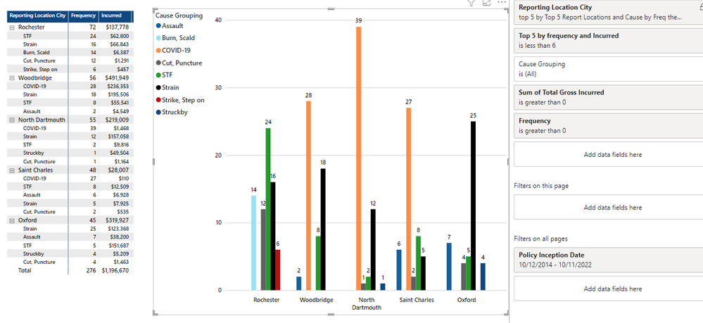
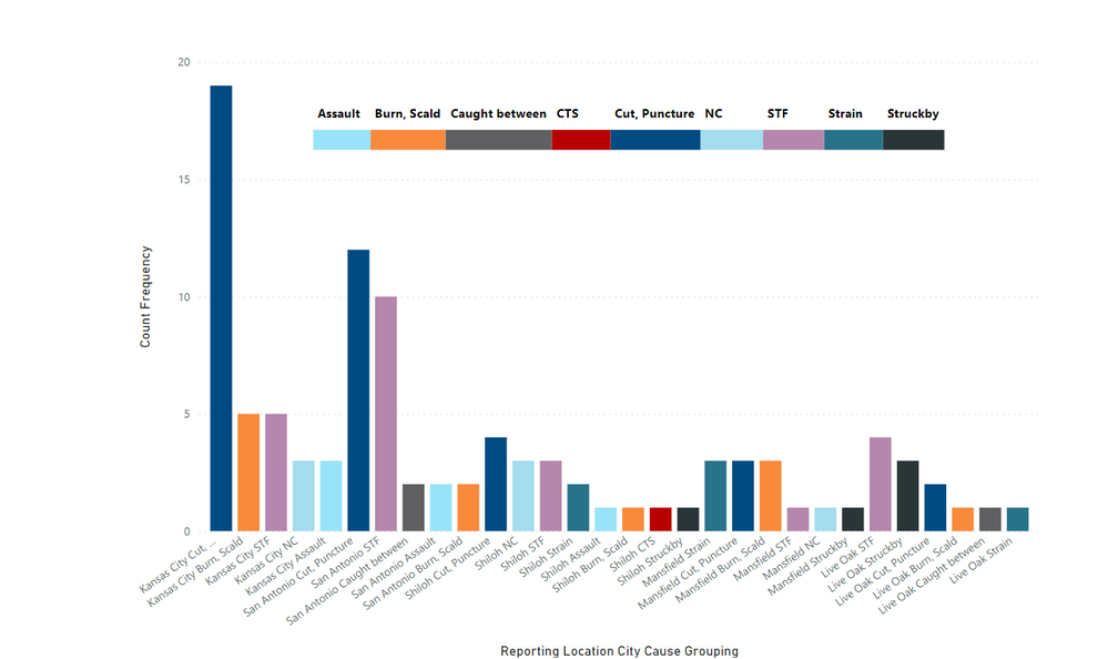
If you now create the clustered column chart with the default options, adding filters to the filter pane to limit the cities, you can get what you are looking for, albeit it isn't particularly pretty:
If you prefer, you can create a more appealing visual as follows (albeit it might require maintenance, because we need to create a separate table for the legend colours which means if the dataset grows in cause groupings, you will need to update the legend table accordingly)
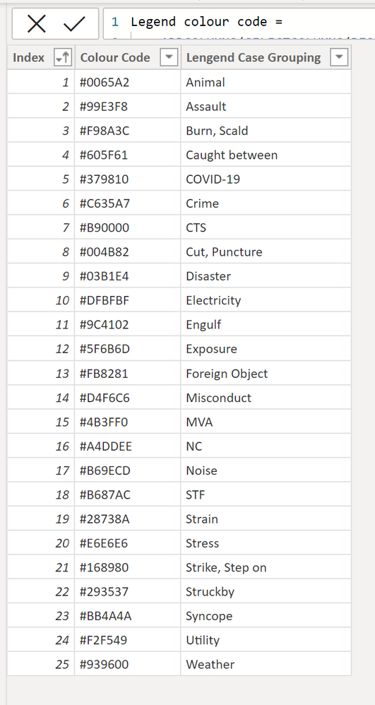
I've created the legend colour code using DAX as follows:
Legend colour code =
ADDCOLUMNS (
    SELECTCOLUMNS (
        DISTINCT ( InjuryCause[Cause Grouping] ),
        "Lengend Case Grouping", InjuryCause[Cause Grouping],
        "Index",
            RANKX (
                VALUES ( InjuryCause[Cause Grouping] ),
                InjuryCause[Cause Grouping],
                ,
                ASC
            )
    ),
    "Colour Code",
        SWITCH (
            [Index],
            1, "#0065A2",
            2, "#99E3F8",
            3, "#F98A3C",
            4, "#605F61",
            5, "#379810",
            6, "#C635A7",
            7, "#B90000",
            8, "#004B82",
            9, "#03B1E4",
            10, "#DFBFBF",
            11, "#9C4102",
            12, "#5F6B6D",
            13, "#FB8281",
            14, "#D4F6C6",
            15, "#4B3FF0",
            16, "#A4DDEE",
            17, "#B69ECD",
            18, "#B687AC",
            19, "#28738A",
            20, "#E6E6E6",
            21, "#168980",
            22, "#293537",
            23, "#BB4A4A",
            24, "#F2F549",
            25, "#939600"
        )
)
So the problem with this method is that if new "Case groupings" appear, you need to update and add new colour codes in the switch function.
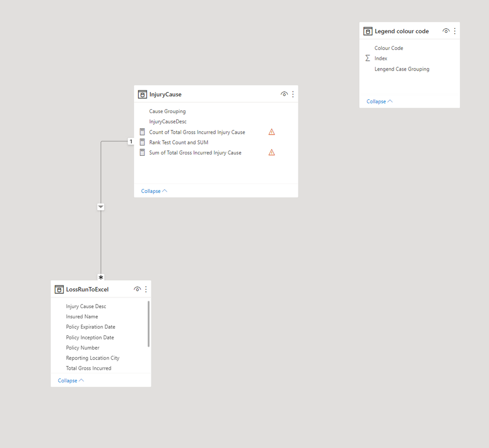
The model is now as follows:
You can now create the same column chart as the default, but leave out the legend. You can use the following measure for the conditional formatting of the columns:
Colour legend =
LOOKUPVALUE (
    'Legend colour code'[Colour Code],
    'Legend colour code'[Lengend Case Grouping], MAX ( InjuryCause[Cause Grouping] )
)
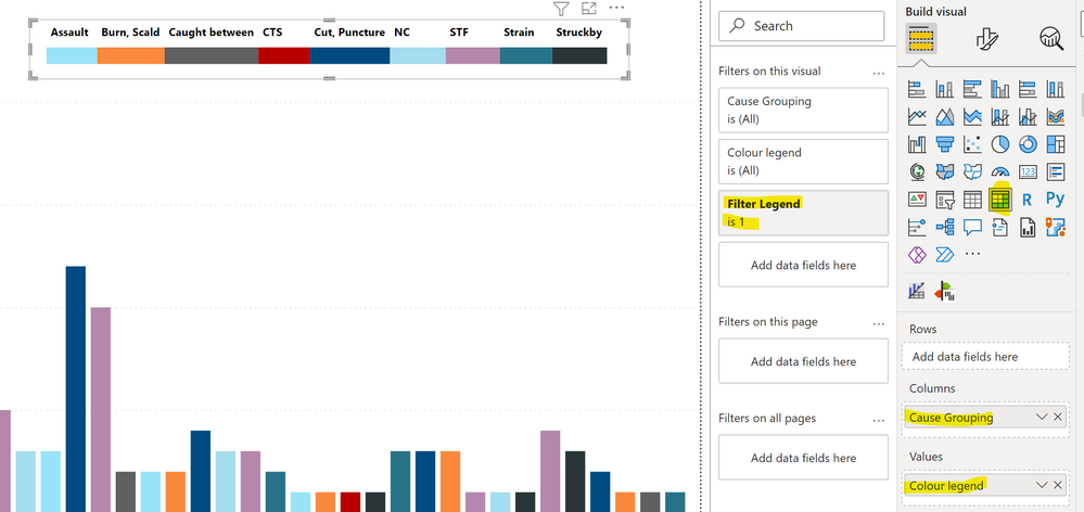
Create a separate legend using a matrix visual as follows (you will need this measure to filter the values in the legend):
Filter Legend =
VAR _Table =
    ADDCOLUMNS (
        SUMMARIZE (
            LossRunToExcel,
            LossRunToExcel[Reporting Location City],
            'InjuryCause'[Cause Grouping]
        ),
        "@Rows",
            IF (
                CALCULATE (
                    RANKX (
                        ALL ( LossRunToExcel[Reporting Location City] ),
                        CALCULATE ( [Count Frequency], ALL ( InjuryCause[Cause Grouping] ) ),
                        ,
                        DESC,
                        SKIP
                    ),
                    ALL ( 'Legend colour code'[Lengend Case Grouping] )
                ) < 6
                    && [Top 5 by frequency and Incurred] < 6
                    && NOT ISBLANK ( [Count Frequency] ),
                1
            )
    )
RETURN
    COUNTROWS (
        CALCULATETABLE (
            VALUES ( 'InjuryCause'[Cause Grouping] ),
            FILTER ( _table, NOT ISBLANK ( [@Rows] ) )
        )
    )
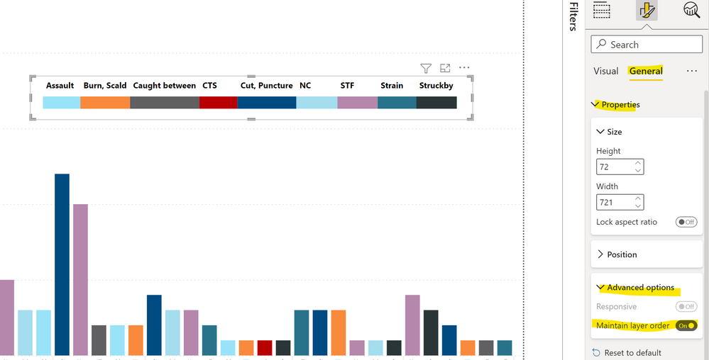
Make sure "Maintain layer order is "on" under properties in the formatting pane - it will keep the legend visible once published even if you click on the chart.
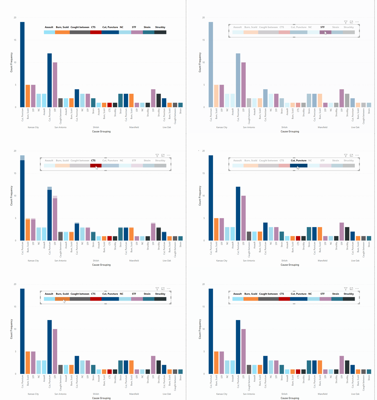
And the visual will be interactive based on a selection in the legend:
New file attached
Did I answer your question? Mark my post as a solution!
In doing so, you are also helping me. Thank you!
Proud to be a Super User!
Paul on Linkedin.
- Mark as New
- Bookmark
- Subscribe
- Mute
- Subscribe to RSS Feed
- Permalink
- Report Inappropriate Content
Both samples are still there. I can not figure out why publishing the file changes the saved file example I sent where the city name is in line with all causes at angle. Not looking good like your first example and my file. I thought removing city name might help..
- Mark as New
- Bookmark
- Subscribe
- Mute
- Subscribe to RSS Feed
- Permalink
- Report Inappropriate Content
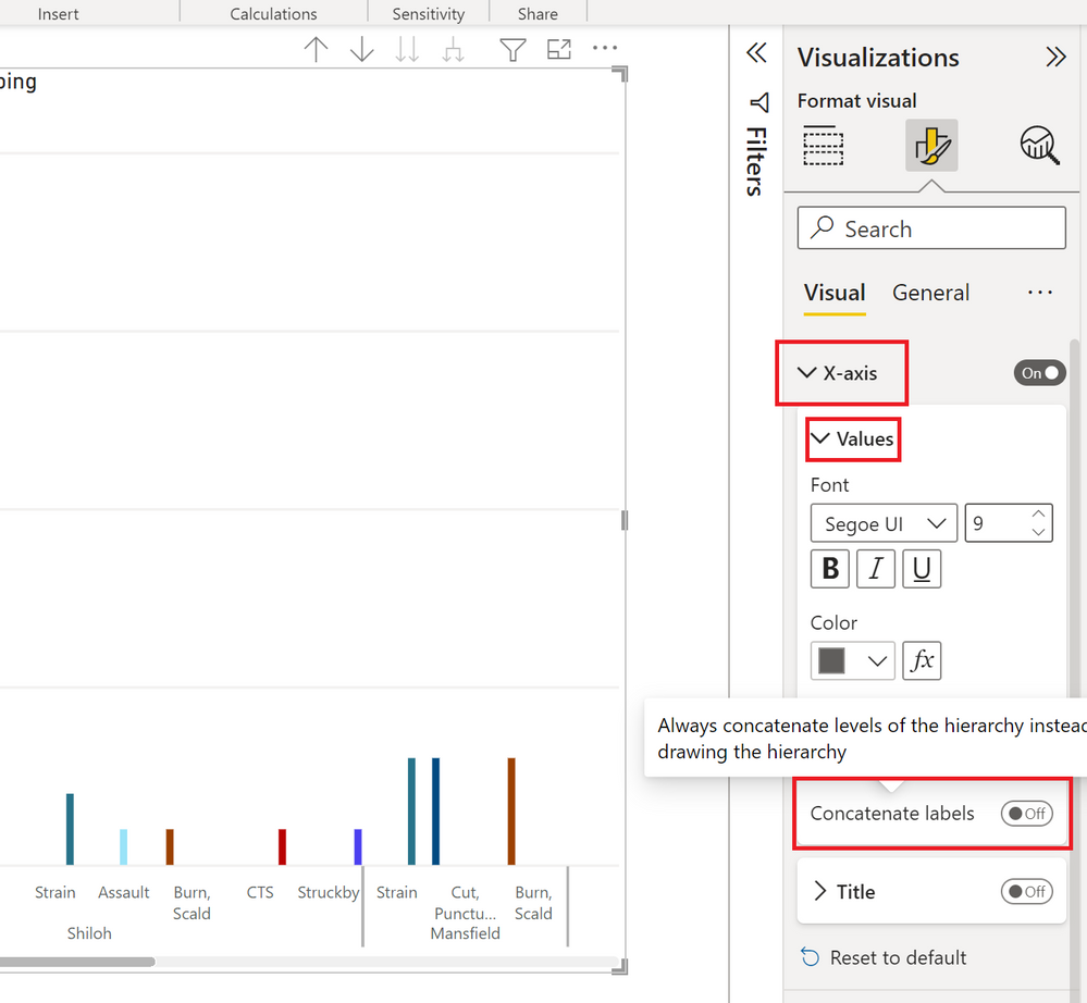
Have you made sure that "concatenate labels" is turned off under the x-axis options for values in the formatting pane?
Did I answer your question? Mark my post as a solution!
In doing so, you are also helping me. Thank you!
Proud to be a Super User!
Paul on Linkedin.
- Mark as New
- Bookmark
- Subscribe
- Mute
- Subscribe to RSS Feed
- Permalink
- Report Inappropriate Content
Yes I did. It's even worse if turned off. Publishing is the issue.
- Mark as New
- Bookmark
- Subscribe
- Mute
- Subscribe to RSS Feed
- Permalink
- Report Inappropriate Content
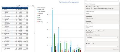
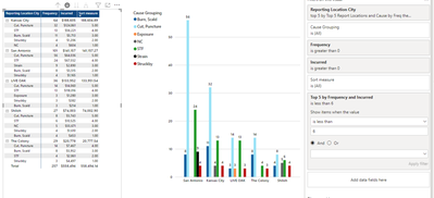
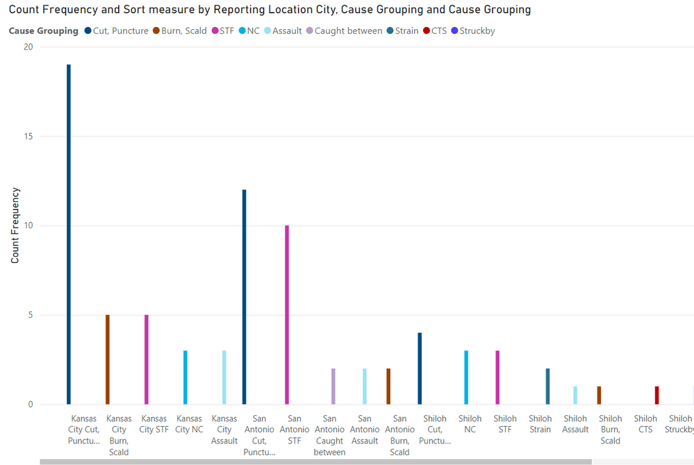
Here is what both look like from your Sample file when published. See how City hops in front of the Cause. How do we adjust the measure to maybe change this or can we?
- Mark as New
- Bookmark
- Subscribe
- Mute
- Subscribe to RSS Feed
- Permalink
- Report Inappropriate Content
Yes, it's definitely an issue in the service. You need to sort by the city field to get the axis to respect the structure:
It actually emulates the problem we used to have in Desktop when you turned off concatenate fields: for the setting to take effect, you needed to sort the axis by the fields:
It might be worth reporting the issue on the issues forum:
https://community.powerbi.com/t5/Issues/idb-p/Issues
Did I answer your question? Mark my post as a solution!
In doing so, you are also helping me. Thank you!
Proud to be a Super User!
Paul on Linkedin.
Helpful resources

Power BI Dataviz World Championships
The Power BI Data Visualization World Championships is back! Get ahead of the game and start preparing now!

| User | Count |
|---|---|
| 39 | |
| 38 | |
| 38 | |
| 28 | |
| 27 |
| User | Count |
|---|---|
| 124 | |
| 89 | |
| 73 | |
| 66 | |
| 65 |
