Get Fabric certified for FREE!
Don't miss your chance to take the Fabric Data Engineer (DP-600) exam for FREE! Find out how by watching the DP-600 session on-demand now through April 28th.
Learn more- Power BI forums
- Get Help with Power BI
- Desktop
- Service
- Report Server
- Power Query
- Mobile Apps
- Developer
- DAX Commands and Tips
- Custom Visuals Development Discussion
- Health and Life Sciences
- Power BI Spanish forums
- Translated Spanish Desktop
- Training and Consulting
- Instructor Led Training
- Dashboard in a Day for Women, by Women
- Galleries
- Data Stories Gallery
- Themes Gallery
- Contests Gallery
- QuickViz Gallery
- Quick Measures Gallery
- Visual Calculations Gallery
- Notebook Gallery
- Translytical Task Flow Gallery
- TMDL Gallery
- R Script Showcase
- Webinars and Video Gallery
- Ideas
- Custom Visuals Ideas (read-only)
- Issues
- Issues
- Events
- Upcoming Events
Join the FabCon + SQLCon recap series. Up next: Power BI, Real-Time Intelligence, IQ and AI, and Data Factory take center stage. All sessions are available on-demand after the live show. Register now
- Power BI forums
- Forums
- Get Help with Power BI
- Desktop
- Re: Need help in R Visual
- Subscribe to RSS Feed
- Mark Topic as New
- Mark Topic as Read
- Float this Topic for Current User
- Bookmark
- Subscribe
- Printer Friendly Page
- Mark as New
- Bookmark
- Subscribe
- Mute
- Subscribe to RSS Feed
- Permalink
- Report Inappropriate Content
Need help in R Visual
Hi Everyone,
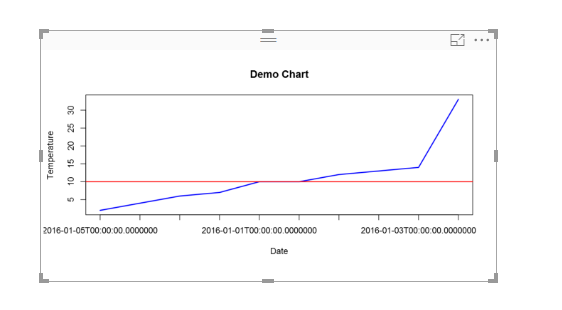
I am in process of creatiing a R Visual in which i need to change color of line above threshold.
So far, i have written below script to genrate the visual uploaded below. Can someone help me to get my desired result i.e If my threshold is breahed/surpassed, color of line should change.
If this can be achived using traditional Power BI visuals then that suggestion is also welcome.
Here is my code and visual created so far.
plot(dataset$Temperature,type="l",lwd=2,
xaxt="n",col="blue",
xlab="Date",ylab="Temperature",
main="Demo Chart")
axis(1,at=1:length(dataset$Date),labels=dataset$Date)
abline(h=dataset$TargetTemperature,col="red")
Edit 1: Sorry for tagging you guys. Kindly help if anybody knows.
@v-haibl-msft
@v-huizhn-msft
@Anonymous
Solved! Go to Solution.
- Mark as New
- Bookmark
- Subscribe
- Mute
- Subscribe to RSS Feed
- Permalink
- Report Inappropriate Content
Try below R code. Multiple colours works for points i.e. col = ifelse(temperature >15,"blue","red") etc but does not work for line charts in base R plot.
plot(dataset$Temperature,type = "l",col = "blue")
abline(h=10,col = "red")
clip(0,100,0,10)
lines(dataset$Temperature, col='green', type='l')
- Mark as New
- Bookmark
- Subscribe
- Mute
- Subscribe to RSS Feed
- Permalink
- Report Inappropriate Content
Hi @prateekraina,
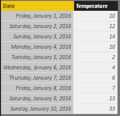
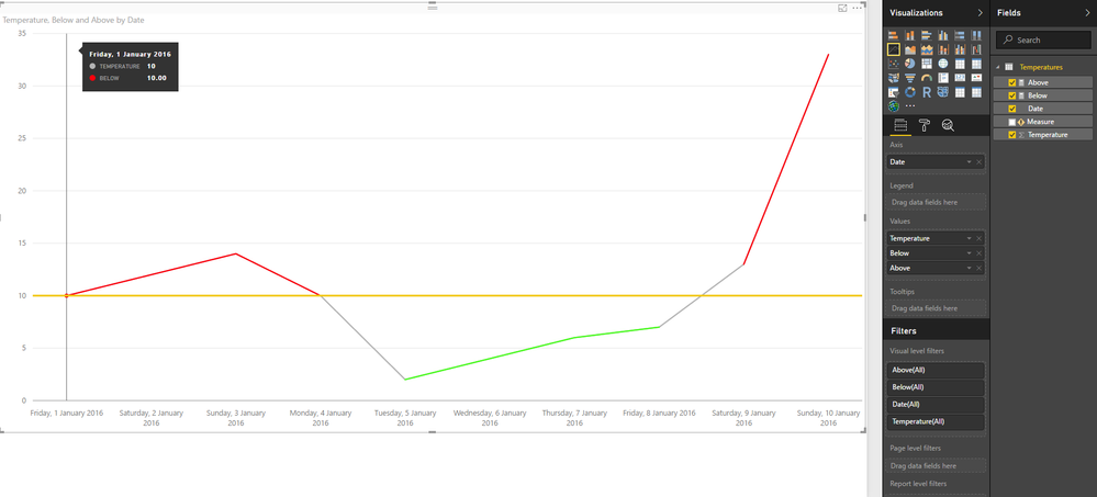
I was looking at your data and I believe this is possible doing to measures and adding the visuals on a line chart at a specific order.
Above = SWITCH(TRUE(),MAX(Temperatures[Temperature])>10,MAX(Temperatures[Temperature]),"")

Below = SWITCH(TRUE(),MAX(Temperatures[Temperature])<=10,MAX(Temperatures[Temperature]),"")
I supposed the threshold was 10 but you can make this a specific value as I did or a variable according to a slicer.
Then select the Line chart and add Temperature, Below, Above, making in this order will make you achieve the lines on top of each others and when you have changes in the temperature that go more than the threshold you have a line, also be aware the you need to have the X-axis to categorical in order to have the null values vanish from your lines grey lines.
Sorry for refering this again but be aware fo the way you add the measures in your graph since if you had the temperature in the end it will be over the other two line and you only see that line, this line is just to join the points were the graph transfers from the below to above threshold and vice-versa.
Regards,
MFelix
Regards
Miguel Félix
Did I answer your question? Mark my post as a solution!
Proud to be a Super User!
Check out my blog: Power BI em Português- Mark as New
- Bookmark
- Subscribe
- Mute
- Subscribe to RSS Feed
- Permalink
- Report Inappropriate Content
Hi @MFelix,
I understood. Your data set will be little diff so only difference is there.
But my problem is that these grey lines which are connecting Red with Green and Vice versa, can we somehow keep them as same color till they reach threshold line and then they change?
I know not possible in Power BI but still taking chance by asking.
- Mark as New
- Bookmark
- Subscribe
- Mute
- Subscribe to RSS Feed
- Permalink
- Report Inappropriate Content
Try below R code. Multiple colours works for points i.e. col = ifelse(temperature >15,"blue","red") etc but does not work for line charts in base R plot.
plot(dataset$Temperature,type = "l",col = "blue")
abline(h=10,col = "red")
clip(0,100,0,10)
lines(dataset$Temperature, col='green', type='l')
- Mark as New
- Bookmark
- Subscribe
- Mute
- Subscribe to RSS Feed
- Permalink
- Report Inappropriate Content
Hi @lalthan,
Thank you for the snippet.
I am almost there, just one question. Can you please let me know how do i plot it against Date as shown in my problem set snapshot.
Currently temperature is getting plotted against Index (1 - 10). Refer below screenshot:
Regards,
Prateek Raina
- Mark as New
- Bookmark
- Subscribe
- Mute
- Subscribe to RSS Feed
- Permalink
- Report Inappropriate Content
The X-axis was already defined in the later part of your R code. However, try this
plot(x = dataset$Date, y = dataset$Temperature,type = "l",col = "blue")
abline(h=10,col = "red")
clip(0,100,0,10)
lines(dataset$Temperature, col='green', type='l')
- Mark as New
- Bookmark
- Subscribe
- Mute
- Subscribe to RSS Feed
- Permalink
- Report Inappropriate Content
Hi @lalthan,
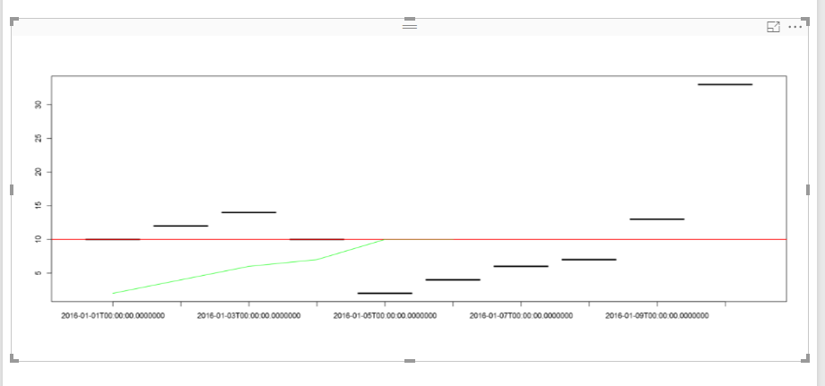
I tried this one but am getting odd results. Refer below screenshot:
After adding below line, it happens
plot(x = dataset$Date, y = dataset$Temperature,type = "l",col = "blue")
Any workaround?
- Mark as New
- Bookmark
- Subscribe
- Mute
- Subscribe to RSS Feed
- Permalink
- Report Inappropriate Content
- Mark as New
- Bookmark
- Subscribe
- Mute
- Subscribe to RSS Feed
- Permalink
- Report Inappropriate Content
Hi @MFelix,
Thank you for the prompt response.
I followed the steps which you mentioned. I appreciate your approach but i am not getting the same result as shown in your screenshot.
Can you pls share your pbix where you tried.
Thanks !!!
- Mark as New
- Bookmark
- Subscribe
- Mute
- Subscribe to RSS Feed
- Permalink
- Report Inappropriate Content
Hi @prateekraina,
In attach PBIX file.
Regards,
MFelix
Regards
Miguel Félix
Did I answer your question? Mark my post as a solution!
Proud to be a Super User!
Check out my blog: Power BI em Português- Mark as New
- Bookmark
- Subscribe
- Mute
- Subscribe to RSS Feed
- Permalink
- Report Inappropriate Content
Helpful resources

Power BI Monthly Update - April 2026
Check out the April 2026 Power BI update to learn about new features.

New to Fabric Survey
If you have recently started exploring Fabric, we'd love to hear how it's going. Your feedback can help with product improvements.

Power BI DataViz World Championships - June 2026
A new Power BI DataViz World Championship is coming this June! Don't miss out on submitting your entry.

| User | Count |
|---|---|
| 45 | |
| 38 | |
| 34 | |
| 21 | |
| 17 |
| User | Count |
|---|---|
| 65 | |
| 63 | |
| 31 | |
| 26 | |
| 25 |


