This time we’re going bigger than ever. Fabric, Power BI, SQL, AI and more. We're covering it all. You won't want to miss it.
Learn moreLevel up your Power BI skills this month - build one visual each week and tell better stories with data! Get started
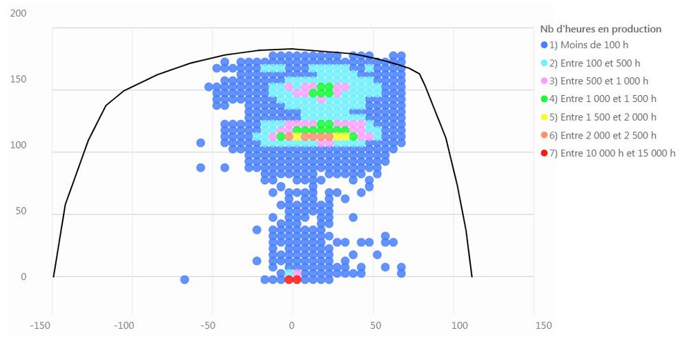
Hey, is there any way to create a chart with a serie with a line and other serie with dots like this one ?
Thanks
Hey guys, hope you're doing fine !
I need to create a chart in BI Desktop with a serie with a line and another one with dots. For example, the line is the theory and the dots are the experimental measures.
Do you know how ?
Thanks
PL
Hi @PLDoyon,
You could have a try with the custom visual Line Dot Chart, please refer to this blog.
If that cannot meet your requirement, I'm afraid that you should use R script to create the R visual in Power BI Desktop.
Best Regards,
Cherry
Hello v-piga-msft, thanks for your reply. No, the Line Dot chart doesn't do what I'm looking for because you can't have one serie of data for the line and another one for the dots.
It's really sad that Power BI can't create like in Excel a chart where you can custom and add different series of data. I guess it will be in future version of Power Bi because it's an important type of chart.
So, I understand that I have to create a new chart using R. Do you have a suggestion for easily creating this chart ? I have never used R. Maybe in using the code for existing chart like the combo chart, or mixing the line and the scatter charts.
Thanks
Check out the April 2026 Power BI update to learn about new features.
Sign up to receive a private message when registration opens and key events begin.
If you have recently started exploring Fabric, we'd love to hear how it's going. Your feedback can help with product improvements.
| User | Count |
|---|---|
| 35 | |
| 33 | |
| 26 | |
| 22 | |
| 18 |
| User | Count |
|---|---|
| 67 | |
| 36 | |
| 32 | |
| 26 | |
| 23 |