FabCon is coming to Atlanta
Join us at FabCon Atlanta from March 16 - 20, 2026, for the ultimate Fabric, Power BI, AI and SQL community-led event. Save $200 with code FABCOMM.
Register now!- Power BI forums
- Get Help with Power BI
- Desktop
- Service
- Report Server
- Power Query
- Mobile Apps
- Developer
- DAX Commands and Tips
- Custom Visuals Development Discussion
- Health and Life Sciences
- Power BI Spanish forums
- Translated Spanish Desktop
- Training and Consulting
- Instructor Led Training
- Dashboard in a Day for Women, by Women
- Galleries
- Data Stories Gallery
- Themes Gallery
- Contests Gallery
- QuickViz Gallery
- Quick Measures Gallery
- Visual Calculations Gallery
- Notebook Gallery
- Translytical Task Flow Gallery
- TMDL Gallery
- R Script Showcase
- Webinars and Video Gallery
- Ideas
- Custom Visuals Ideas (read-only)
- Issues
- Issues
- Events
- Upcoming Events
The Power BI Data Visualization World Championships is back! Get ahead of the game and start preparing now! Learn more
- Power BI forums
- Forums
- Get Help with Power BI
- Desktop
- Re: Need help creating a PowerBI graph please.
- Subscribe to RSS Feed
- Mark Topic as New
- Mark Topic as Read
- Float this Topic for Current User
- Bookmark
- Subscribe
- Printer Friendly Page
- Mark as New
- Bookmark
- Subscribe
- Mute
- Subscribe to RSS Feed
- Permalink
- Report Inappropriate Content
Need help creating a PowerBI graph please.
Hi,
I am looking to create the follow graph (right of screenshot) from the data in table (left of the screenshot) in Power BI.
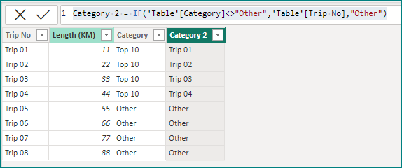
So far I have the below table in my power query editor exactly as you see it.
I have ranked the top 10 trips and want them to be shown in parts in the first column of my proposed graph, but each of the top 10 to be dived into 10 parts in the graph and the size depending on the Length (KM) value. I then want the remain (none top 10) just to be shown as one whole value within the bar named "Other".
Any ideas how I can get this to represent this data, so far I am not having much luck. Note, it is important that the length figures are displayed in each part of the the first bar. The "Other" bar I need all the total values of Length KM where "Other" is in the Category column.
Screenshot is a rough drawing from excel.
Solved! Go to Solution.
- Mark as New
- Bookmark
- Subscribe
- Mute
- Subscribe to RSS Feed
- Permalink
- Report Inappropriate Content
Hi @alexw94 ,
Please try to create a calculated column.
Category 2 = IF('Table'[Category]<>"Other",'Table'[Trip No],"Other")Result.
Best Regards,
Gao
Community Support Team
If there is any post helps, then please consider Accept it as the solution to help the other members find it more quickly. If I misunderstand your needs or you still have problems on it, please feel free to let us know. Thanks a lot!
How to get your questions answered quickly -- How to provide sample data in the Power BI Forum
- Mark as New
- Bookmark
- Subscribe
- Mute
- Subscribe to RSS Feed
- Permalink
- Report Inappropriate Content
Is anyone able to help me with this please? I am a little stuck.
- Mark as New
- Bookmark
- Subscribe
- Mute
- Subscribe to RSS Feed
- Permalink
- Report Inappropriate Content
Hey Alex, did you run into any problems with my suggestion of a stacked column chart with km on Y-axis and TripNo in Legend, Category on Y axis?
- Mark as New
- Bookmark
- Subscribe
- Mute
- Subscribe to RSS Feed
- Permalink
- Report Inappropriate Content
Hi @alexw94 ,
Please try to create a calculated column.
Category 2 = IF('Table'[Category]<>"Other",'Table'[Trip No],"Other")Result.
Best Regards,
Gao
Community Support Team
If there is any post helps, then please consider Accept it as the solution to help the other members find it more quickly. If I misunderstand your needs or you still have problems on it, please feel free to let us know. Thanks a lot!
How to get your questions answered quickly -- How to provide sample data in the Power BI Forum
- Mark as New
- Bookmark
- Subscribe
- Mute
- Subscribe to RSS Feed
- Permalink
- Report Inappropriate Content
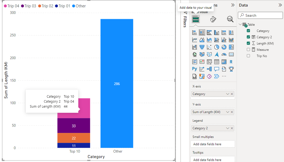
It looks exaclty like a stacked column chart with km on Y-axis and TripNo in Legend, Category on Y axis.
Unfortunately the stacked column chart doesn't allow you to use the data label (i.e trip name) on the bars, but only the values.
- Mark as New
- Bookmark
- Subscribe
- Mute
- Subscribe to RSS Feed
- Permalink
- Report Inappropriate Content
Thanks for your reply, I am not wanting to put the names of the columns on the bars. I know they can apear appear as you hover over them with the mouse.
- Mark as New
- Bookmark
- Subscribe
- Mute
- Subscribe to RSS Feed
- Permalink
- Report Inappropriate Content
Can you please share the Excel file you are using ?
Proud to be a Power BI Super User !
Microsoft Community : https://docs.microsoft.com/en-us/users/AmiraBedhiafi
Linkedin : https://www.linkedin.com/in/amira-bedhiafi/
StackOverflow : https://stackoverflow.com/users/9517769/amira-bedhiafi
C-Sharp Corner : https://www.c-sharpcorner.com/members/amira-bedhiafi
Power BI Community :https://community.powerbi.com/t5/user/viewprofilepage/user-id/332696
- Mark as New
- Bookmark
- Subscribe
- Mute
- Subscribe to RSS Feed
- Permalink
- Report Inappropriate Content
I am not able to do that unfortunatley.
Helpful resources

Power BI Monthly Update - November 2025
Check out the November 2025 Power BI update to learn about new features.

Fabric Data Days
Advance your Data & AI career with 50 days of live learning, contests, hands-on challenges, study groups & certifications and more!


