Join us at FabCon Vienna from September 15-18, 2025
The ultimate Fabric, Power BI, SQL, and AI community-led learning event. Save €200 with code FABCOMM.
Get registered- Power BI forums
- Get Help with Power BI
- Desktop
- Service
- Report Server
- Power Query
- Mobile Apps
- Developer
- DAX Commands and Tips
- Custom Visuals Development Discussion
- Health and Life Sciences
- Power BI Spanish forums
- Translated Spanish Desktop
- Training and Consulting
- Instructor Led Training
- Dashboard in a Day for Women, by Women
- Galleries
- Data Stories Gallery
- Themes Gallery
- Contests Gallery
- Quick Measures Gallery
- Notebook Gallery
- Translytical Task Flow Gallery
- TMDL Gallery
- R Script Showcase
- Webinars and Video Gallery
- Ideas
- Custom Visuals Ideas (read-only)
- Issues
- Issues
- Events
- Upcoming Events
Enhance your career with this limited time 50% discount on Fabric and Power BI exams. Ends September 15. Request your voucher.
- Power BI forums
- Forums
- Get Help with Power BI
- Desktop
- Re: Multiple Filters on multiple tables
- Subscribe to RSS Feed
- Mark Topic as New
- Mark Topic as Read
- Float this Topic for Current User
- Bookmark
- Subscribe
- Printer Friendly Page
- Mark as New
- Bookmark
- Subscribe
- Mute
- Subscribe to RSS Feed
- Permalink
- Report Inappropriate Content
Multiple Filters on multiple tables
Hi,
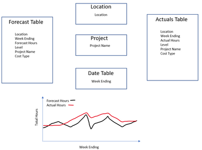
I have the below scenario where I have a forecast table and an actuals table. I would like to present "forecsat hours" and "actual hours" on a chart visual with the week ending on the X axis. I would like the data to be filtered by location, project name and week ending using slicers. Any help would be much appreicated. Thanks
- Mark as New
- Bookmark
- Subscribe
- Mute
- Subscribe to RSS Feed
- Permalink
- Report Inappropriate Content
Hello, what is your expected solution here? In which area you need help?
- Mark as New
- Bookmark
- Subscribe
- Mute
- Subscribe to RSS Feed
- Permalink
- Report Inappropriate Content
Sorry, I can't seem to get the visual to look how i want it to. If i set the relationships for each of the three filters (location, project, date) to the forecast & actual tables I get errors. I can get one set of data on the visual, but then when i add the other its not filtered by location or project. Does that make sense?
Helpful resources
| User | Count |
|---|---|
| 60 | |
| 55 | |
| 53 | |
| 49 | |
| 30 |
| User | Count |
|---|---|
| 179 | |
| 87 | |
| 70 | |
| 48 | |
| 45 |


