Huge last-minute discounts for FabCon Vienna from September 15-18, 2025
Supplies are limited. Contact info@espc.tech right away to save your spot before the conference sells out.
Get your discount- Power BI forums
- Get Help with Power BI
- Desktop
- Service
- Report Server
- Power Query
- Mobile Apps
- Developer
- DAX Commands and Tips
- Custom Visuals Development Discussion
- Health and Life Sciences
- Power BI Spanish forums
- Translated Spanish Desktop
- Training and Consulting
- Instructor Led Training
- Dashboard in a Day for Women, by Women
- Galleries
- Data Stories Gallery
- Themes Gallery
- Contests Gallery
- Quick Measures Gallery
- Notebook Gallery
- Translytical Task Flow Gallery
- TMDL Gallery
- R Script Showcase
- Webinars and Video Gallery
- Ideas
- Custom Visuals Ideas (read-only)
- Issues
- Issues
- Events
- Upcoming Events
Score big with last-minute savings on the final tickets to FabCon Vienna. Secure your discount
- Power BI forums
- Forums
- Get Help with Power BI
- Desktop
- Re: Multi Line and Column chart
- Subscribe to RSS Feed
- Mark Topic as New
- Mark Topic as Read
- Float this Topic for Current User
- Bookmark
- Subscribe
- Printer Friendly Page
- Mark as New
- Bookmark
- Subscribe
- Mute
- Subscribe to RSS Feed
- Permalink
- Report Inappropriate Content
Multi Line and Column chart
It’s been 2 years since I worked on creating any Power BI reports and it seems I've forgotten nearly everything, which is driving me nuts.
I thought I'd pick on one of our easy excel reports to convert to Power BI to demo to the new business unit I am in, and now I've found myself in a pickle.
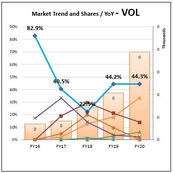
All I am trying to do is recreate a chart with 6 lines to show our and the top 6 competitors market share over 5 years and a column to show the total volume sales each year.
Simple in Excel and when I agreed to take this on, I thought it would be even simpler in Power BI.
I've got the Top 6 and their percentage share working correctly and as line chart it’s all good, but when I attempt to change this, to a multi chart it appends all the line together into a single line and breaks the Volume sales by competitor, I literally need the complete opposite.
Any ideas?
- Mark as New
- Bookmark
- Subscribe
- Mute
- Subscribe to RSS Feed
- Permalink
- Report Inappropriate Content
@LUCASM ,The information you have provided is not making the problem clear to me. Can you please explain with an example.
Appreciate your Kudos.
- Mark as New
- Bookmark
- Subscribe
- Mute
- Subscribe to RSS Feed
- Permalink
- Report Inappropriate Content
Hi @amitchandak
It's easy to forget that the question may be easy for the user to understand...
I need to create a combo chart in Power BI
The combo Chart consists of
- Fiscal year volume in Columns
- Volume share of the top 6 in the Market as Lines in the same chart
- as shown in my initial question above
I have the DAX code all created to produce the Volume Share numbers
I am just struggeling to work out how can produce this combo chart.
We use this style of chart a lot.
My next project is to produce another Power Bi report which currectly has around 70 of these
But I cannot work out how to do this.
If it helps I'll create a pbix file.
Let me know
Helpful resources
| User | Count |
|---|---|
| 64 | |
| 59 | |
| 47 | |
| 33 | |
| 32 |
| User | Count |
|---|---|
| 84 | |
| 75 | |
| 56 | |
| 50 | |
| 44 |


