Get certified for free when you join Fabric Data Days 2026 and dive into Fabric, Power BI, SQL, AI, and other essential data skills.
Join nowJuly 28 - August 9 | Final Round of the Power BI Dataviz World Championships. This is your chance. Learn more
Hi,
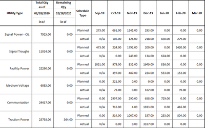
I need to show the following visualization as it is on my report.
Please advise on how I can achieve this visual.
Thanks in advance
Hi @SwaroopShankar ,
Can you show us your .pbix file if it's not confidential,you can upload it to onedrive and share the link with us.
Hi Kelly,
My apologies for the late reply.
What I am trying to achieve is similar to what is on the second page of the following dashboard.
Please take a look at it and let me know how we can achieve this kind of a table?
Thanks in advance
Might be worth looking at what I did with Impossible to see if it might work in this case. I'll take a look later if I have time but PBIX is attached. It is sort of a spin on the disconnected table trick essentially.
I do not think the current Matrix can do this.
I suggested a similar one
https://ideas.powerbi.com/forums/265200-power-bi-ideas/suggestions/39773011-hybrid-table
If you love stickers, then you will definitely want to check out our community sticker challenge, Barcelona edition!
Check out the July 2026 Power BI update to learn about new features.
| User | Count |
|---|---|
| 28 | |
| 28 | |
| 20 | |
| 19 | |
| 19 |
| User | Count |
|---|---|
| 43 | |
| 31 | |
| 18 | |
| 18 | |
| 16 |