FabCon is coming to Atlanta
Join us at FabCon Atlanta from March 16 - 20, 2026, for the ultimate Fabric, Power BI, AI and SQL community-led event. Save $200 with code FABCOMM.
Register now!- Power BI forums
- Get Help with Power BI
- Desktop
- Service
- Report Server
- Power Query
- Mobile Apps
- Developer
- DAX Commands and Tips
- Custom Visuals Development Discussion
- Health and Life Sciences
- Power BI Spanish forums
- Translated Spanish Desktop
- Training and Consulting
- Instructor Led Training
- Dashboard in a Day for Women, by Women
- Galleries
- Data Stories Gallery
- Themes Gallery
- Contests Gallery
- Quick Measures Gallery
- Notebook Gallery
- Translytical Task Flow Gallery
- TMDL Gallery
- R Script Showcase
- Webinars and Video Gallery
- Ideas
- Custom Visuals Ideas (read-only)
- Issues
- Issues
- Events
- Upcoming Events
To celebrate FabCon Vienna, we are offering 50% off select exams. Ends October 3rd. Request your discount now.
- Power BI forums
- Forums
- Get Help with Power BI
- Desktop
- Re: Measure to sum monthly capacity and usage
- Subscribe to RSS Feed
- Mark Topic as New
- Mark Topic as Read
- Float this Topic for Current User
- Bookmark
- Subscribe
- Printer Friendly Page
- Mark as New
- Bookmark
- Subscribe
- Mute
- Subscribe to RSS Feed
- Permalink
- Report Inappropriate Content
Measure to sum monthly capacity and usage
Hi There
I urgently need help with this
I am trying to figure out how to show how much each person is being utilized every month out of their total capacity in a stacked graph.
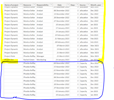
I have appended query showing
Yellow - how many days each week a person is booked on a project (allocated)
Blue - How many days they are available that week (capacity)
I think I need to add a measure, but not sure what calculation will work.
No 1 is my primary visual showing all allocated, but when I filter this by date my 2nd visual aligns to allocated and removes the capacity. Ideally, i would like this 2nd visual as a stacked graph but haven't been able to make that work
https://drive.google.com/file/d/1WCf6YP8mE2BlSndGF92hrnZGQquKg6-1/view?usp=share_link
any help on this would be brilliant
Thank you
- Mark as New
- Bookmark
- Subscribe
- Mute
- Subscribe to RSS Feed
- Permalink
- Report Inappropriate Content
Thank you for your reply!!
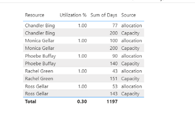
Not sure what's going wrong., but it's not working correctly...
Updated file:
https://drive.google.com/file/d/1WCf6YP8mE2BlSndGF92hrnZGQquKg6-1/view?usp=share_link
- Mark as New
- Bookmark
- Subscribe
- Mute
- Subscribe to RSS Feed
- Permalink
- Report Inappropriate Content
@Fiona83 Seems like it should be something along the lines of:
Utilization % =
  VAR __allocated = SUMX(FILTER('Table',[Source] = "allocation"),[Days])
  VAR __capacity = SUMX(FILTER('Table',[Source] = "Capacity"),[Days])
  VAR __Result = DIVIDE(__allocated, __allocated + __capacity,0)
RETURN
  __Result
Follow on LinkedIn
@ me in replies or I'll lose your thread!!!
Instead of a Kudo, please vote for this idea
Become an expert!: Enterprise DNA
External Tools: MSHGQM
YouTube Channel!: Microsoft Hates Greg
Latest book!: DAX For Humans
DAX is easy, CALCULATE makes DAX hard...


