FabCon is coming to Atlanta
Join us at FabCon Atlanta from March 16 - 20, 2026, for the ultimate Fabric, Power BI, AI and SQL community-led event. Save $200 with code FABCOMM.
Register now!- Power BI forums
- Get Help with Power BI
- Desktop
- Service
- Report Server
- Power Query
- Mobile Apps
- Developer
- DAX Commands and Tips
- Custom Visuals Development Discussion
- Health and Life Sciences
- Power BI Spanish forums
- Translated Spanish Desktop
- Training and Consulting
- Instructor Led Training
- Dashboard in a Day for Women, by Women
- Galleries
- Data Stories Gallery
- Themes Gallery
- Contests Gallery
- QuickViz Gallery
- Quick Measures Gallery
- Visual Calculations Gallery
- Notebook Gallery
- Translytical Task Flow Gallery
- TMDL Gallery
- R Script Showcase
- Webinars and Video Gallery
- Ideas
- Custom Visuals Ideas (read-only)
- Issues
- Issues
- Events
- Upcoming Events
The Power BI Data Visualization World Championships is back! Get ahead of the game and start preparing now! Learn more
- Power BI forums
- Forums
- Get Help with Power BI
- Desktop
- Measure to sum monthly capacity and usage
- Subscribe to RSS Feed
- Mark Topic as New
- Mark Topic as Read
- Float this Topic for Current User
- Bookmark
- Subscribe
- Printer Friendly Page
- Mark as New
- Bookmark
- Subscribe
- Mute
- Subscribe to RSS Feed
- Permalink
- Report Inappropriate Content
Measure to sum monthly capacity and usage
Hi There
I urgently need help with this
I am trying to figure out how to show how much each person is being utilized every month out of their total capacity in a stacked graph.
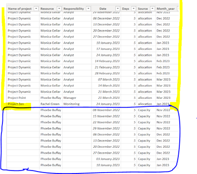
I have appended query showing
Yellow - how many days each week a person is booked on a project (allocated)
Blue - How many days they are available that week (capacity)
I think I need to add a measure, but not sure what calculation will work.
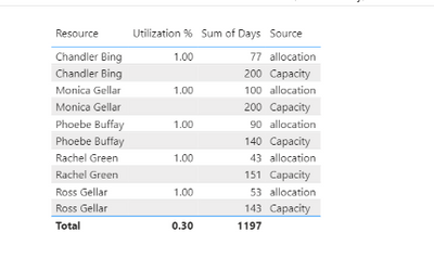
No 1 is my primary visual showing all allocated, but when I filter this by date my 2nd visual aligns to allocated and removes the capacity. Ideally, i would like this 2nd visual as a stacked graph but haven't been able to make that work
https://drive.google.com/file/d/1WCf6YP8mE2BlSndGF92hrnZGQquKg6-1/view?usp=share_link
any help on this would be brilliant
Thank you
- Mark as New
- Bookmark
- Subscribe
- Mute
- Subscribe to RSS Feed
- Permalink
- Report Inappropriate Content
Thank you for your reply!!
Not sure what's going wrong., but it's not working correctly...
Updated file:
https://drive.google.com/file/d/1WCf6YP8mE2BlSndGF92hrnZGQquKg6-1/view?usp=share_link
- Mark as New
- Bookmark
- Subscribe
- Mute
- Subscribe to RSS Feed
- Permalink
- Report Inappropriate Content
@Fiona83 Seems like it should be something along the lines of:
Utilization % =
  VAR __allocated = SUMX(FILTER('Table',[Source] = "allocation"),[Days])
  VAR __capacity = SUMX(FILTER('Table',[Source] = "Capacity"),[Days])
  VAR __Result = DIVIDE(__allocated, __allocated + __capacity,0)
RETURN
  __Result
Follow on LinkedIn
@ me in replies or I'll lose your thread!!!
Instead of a Kudo, please vote for this idea
Become an expert!: Enterprise DNA
External Tools: MSHGQM
YouTube Channel!: Microsoft Hates Greg
Latest book!: DAX For Humans
DAX is easy, CALCULATE makes DAX hard...
Helpful resources

Power BI Dataviz World Championships
The Power BI Data Visualization World Championships is back! Get ahead of the game and start preparing now!

Power BI Monthly Update - November 2025
Check out the November 2025 Power BI update to learn about new features.

| User | Count |
|---|---|
| 59 | |
| 46 | |
| 42 | |
| 23 | |
| 18 |
| User | Count |
|---|---|
| 192 | |
| 125 | |
| 99 | |
| 67 | |
| 48 |


