FabCon is coming to Atlanta
Join us at FabCon Atlanta from March 16 - 20, 2026, for the ultimate Fabric, Power BI, AI and SQL community-led event. Save $200 with code FABCOMM.
Register now!- Power BI forums
- Get Help with Power BI
- Desktop
- Service
- Report Server
- Power Query
- Mobile Apps
- Developer
- DAX Commands and Tips
- Custom Visuals Development Discussion
- Health and Life Sciences
- Power BI Spanish forums
- Translated Spanish Desktop
- Training and Consulting
- Instructor Led Training
- Dashboard in a Day for Women, by Women
- Galleries
- Data Stories Gallery
- Themes Gallery
- Contests Gallery
- QuickViz Gallery
- Quick Measures Gallery
- Visual Calculations Gallery
- Notebook Gallery
- Translytical Task Flow Gallery
- TMDL Gallery
- R Script Showcase
- Webinars and Video Gallery
- Ideas
- Custom Visuals Ideas (read-only)
- Issues
- Issues
- Events
- Upcoming Events
The Power BI Data Visualization World Championships is back! Get ahead of the game and start preparing now! Learn more
- Power BI forums
- Forums
- Get Help with Power BI
- Desktop
- Matrix displays repeated values in every column
- Subscribe to RSS Feed
- Mark Topic as New
- Mark Topic as Read
- Float this Topic for Current User
- Bookmark
- Subscribe
- Printer Friendly Page
- Mark as New
- Bookmark
- Subscribe
- Mute
- Subscribe to RSS Feed
- Permalink
- Report Inappropriate Content
Matrix displays repeated values in every column
Hi everyone, need your help on this again!!!
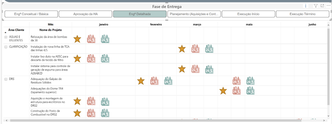
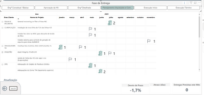
I have a matrix that only displays values if the filter "Fase de Entrega" is selected.
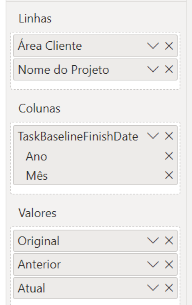
Values columns:
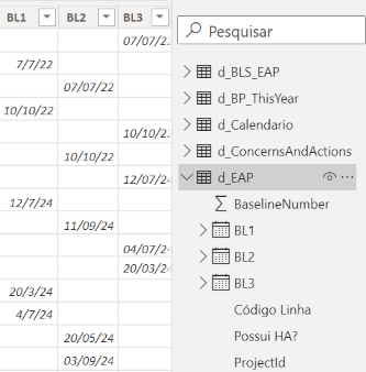
"Anterior" = Previous values; font = d_EAP(BL3);
"Atual" = Actual values; font = d_EAP(BL2);
"Original" = Original value, won't be changed ever = d_EAP(BL1).
Note that they're all from the same table, but different columns.
Furthermore, I've got two measures for the icons that I Want to appear on the matrix columns, one for the Actual ["Atual" on green] value and another for the Previous ["Anterior" on red] value. Booth return an image based on the "Fase de Entrega" filter, and have the following code structure (where the letters (a, b, c) are changed by the image url on the real code):
Icon_Imp_Atual =
var filtro = SELECTEDVALUE('d_EAP_Códigos_Fases'[Fase])
return
IF(ISFILTERED('d_EAP_Códigos_Fases'[Fase]),
    SWITCH(
        TRUE(),
        filtro =  "Engª Conceitual / Básica","a",
        filtro = "Aprovação da HA","b",
        filtro = "Engª Detalhada","c",
        filtro = "Planejamento (Aquisições e Contratações)","d",
        filtro = "Execução Início","e",
        filtro = "Execução Término","f"),"")
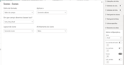
Then I use this DAX as the code that will change the icon of my cell elements' values.
The thing is that everytime that I have a value for the "Actual" or "Previous" columns, the icon with both coulors is displayed at both column. But I want that's only the Previous or Actual column contains the proper icon.
I hope you could understand my issue and help me with it!
Best Regards!
Solved! Go to Solution.
- Mark as New
- Bookmark
- Subscribe
- Mute
- Subscribe to RSS Feed
- Permalink
- Report Inappropriate Content
Hi everyone,
So, I end up finding the solution by myself (and a little help from Chat GPT lol).
I've decided to use only one data-set column on Value field, this column gathers all dates for every case (Original, Previous, and Actual).
Then I've decided that the "Previous" info wasn't necessery for our report. With that decision made, i've writen the following dax:
- Mark as New
- Bookmark
- Subscribe
- Mute
- Subscribe to RSS Feed
- Permalink
- Report Inappropriate Content
Hi @Anonymous ,
Struggling in getting how your setup is puicking up the actual vs previous.
Can you please share a mockup data or sample of your PBIX file. You can use a onedrive, google drive, we transfer or similar link to upload your files.
If the information is sensitive please share it trough private message.
Regards
Miguel Félix
Did I answer your question? Mark my post as a solution!
Proud to be a Super User!
Check out my blog: Power BI em Português- Mark as New
- Bookmark
- Subscribe
- Mute
- Subscribe to RSS Feed
- Permalink
- Report Inappropriate Content
Hi Miguel,
Thanks for trying to understand my issue.
I'm sending you the file via private message
Summing all up, this matrix has 3 columns (Original date, Previous date, and Actual date), and rather than returning these dates on the matrix, I want to display icons that are calculated by an switch dax code, triggered by the "Fase de Entrega" Filter. These icons have different colours, the original is a system default Star, the Previous should display red icons, as the Actual are green.
The main trouble is, for exemple,if I have these dates:
Original (01/01/23);
Previous (01/02/23);
Actual (01/03/23)
the matrix is displaying the icons like that:
| 01/01/23 | 01/01/23 | 01/01/23 | 01/02/23 | 01/02/23 | 01/02/23 | 01/03/23 | 01/03/23 | 01/03/23 |
| Original | Previous | Actual | Original | Previous | Actual | Original | Previous | Actual |
| ⭐ | 🔴 | 💚 | ⭐ | 🔴 | 💚 | ⭐ | 🔴 | 💚 |
but the way it supposed to:
| 01/01/23 | 01/01/23 | 01/01/23 | 01/02/23 | 01/02/23 | 01/02/23 | 01/03/23 | 01/03/23 | 01/03/23 |
| Original | Previous | Actual | Original | Previous | Actual | Original | Previous | Actual |
| ⭐ | 🔴 | 💚 |
- Mark as New
- Bookmark
- Subscribe
- Mute
- Subscribe to RSS Feed
- Permalink
- Report Inappropriate Content
Hi everyone,
So, I end up finding the solution by myself (and a little help from Chat GPT lol).
I've decided to use only one data-set column on Value field, this column gathers all dates for every case (Original, Previous, and Actual).
Then I've decided that the "Previous" info wasn't necessery for our report. With that decision made, i've writen the following dax:

Helpful resources

Power BI Dataviz World Championships
The Power BI Data Visualization World Championships is back! Get ahead of the game and start preparing now!

| User | Count |
|---|---|
| 38 | |
| 36 | |
| 33 | |
| 31 | |
| 28 |
| User | Count |
|---|---|
| 129 | |
| 88 | |
| 79 | |
| 68 | |
| 63 |
