A new Data Days event is coming soon!
This time we’re going bigger than ever. Fabric, Power BI, SQL, AI and more. We're covering it all. You won't want to miss it.
Learn more- Power BI forums
- Get Help with Power BI
- Desktop
- Service
- Report Server
- Power Query
- Mobile Apps
- Developer
- DAX Commands and Tips
- Custom Visuals Development Discussion
- Health and Life Sciences
- Power BI Spanish forums
- Translated Spanish Desktop
- Training and Consulting
- Instructor Led Training
- Dashboard in a Day for Women, by Women
- Galleries
- Data Stories Gallery
- Themes Gallery
- Contests Gallery
- QuickViz Gallery
- Quick Measures Gallery
- Visual Calculations Gallery
- Notebook Gallery
- Translytical Task Flow Gallery
- TMDL Gallery
- R Script Showcase
- Webinars and Video Gallery
- Ideas
- Custom Visuals Ideas (read-only)
- Issues
- Issues
- Events
- Upcoming Events
Level up your Power BI skills this month - build one visual each week and tell better stories with data! Get started
- Power BI forums
- Forums
- Get Help with Power BI
- Desktop
- Matrix Visual
- Subscribe to RSS Feed
- Mark Topic as New
- Mark Topic as Read
- Float this Topic for Current User
- Bookmark
- Subscribe
- Printer Friendly Page
- Mark as New
- Bookmark
- Subscribe
- Mute
- Subscribe to RSS Feed
- Permalink
- Report Inappropriate Content
Matrix Visual
Hey,
my problem is the matrix visual and i read many articles but i got no solution.
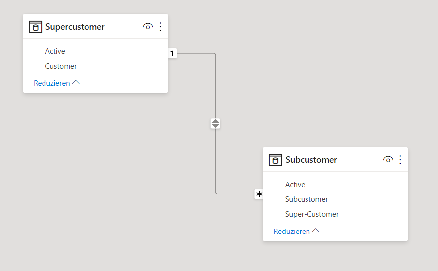
My situation is the dependency as shown in the picture with supercustomer and subcustomer.
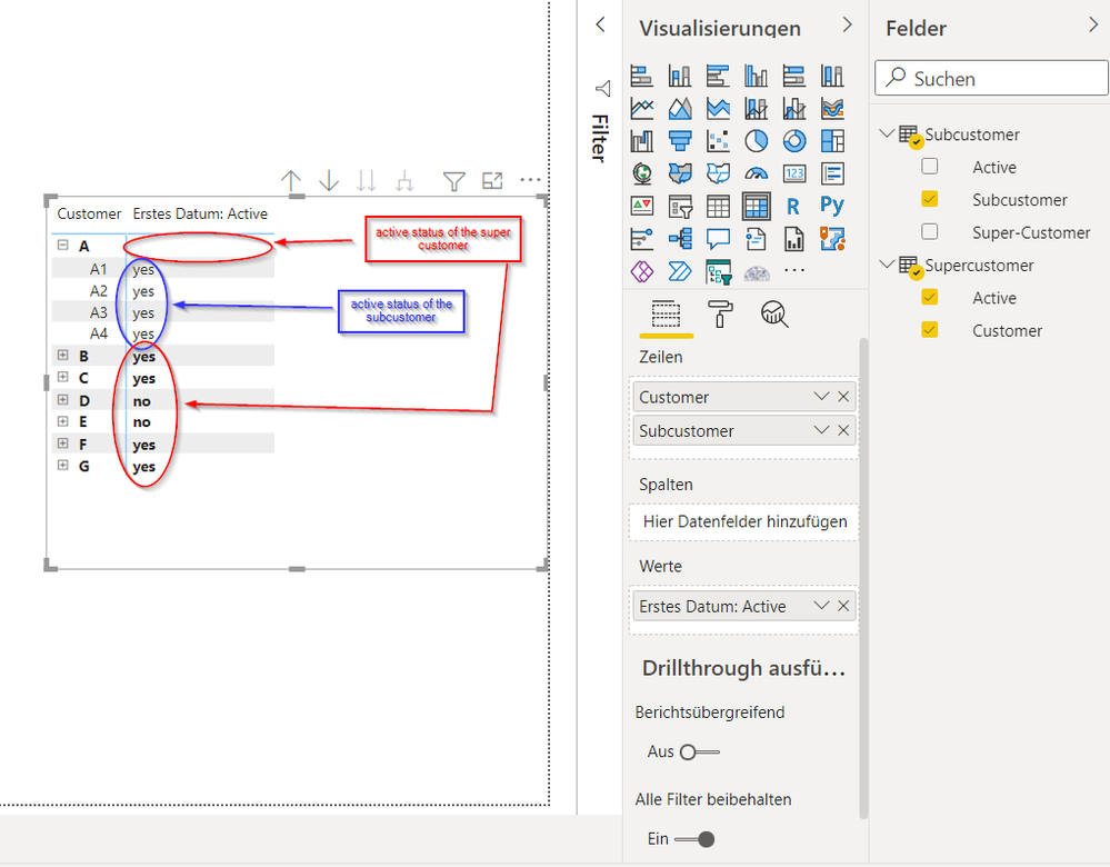
I want to show this data as shown in the picture "visualizuation" but i don't have a clue how to put the data in the format so that:
- in the red circles (red annotation) the "active status" of the super-customer is shown and
- in the blue circle (blue annotation) the "active status" of the subcustomer is shown.
Is this even possible with the matrix visual or do i nee anything else?
Thanks!


- Mark as New
- Bookmark
- Subscribe
- Mute
- Subscribe to RSS Feed
- Permalink
- Report Inappropriate Content
Hey @amitchandak,
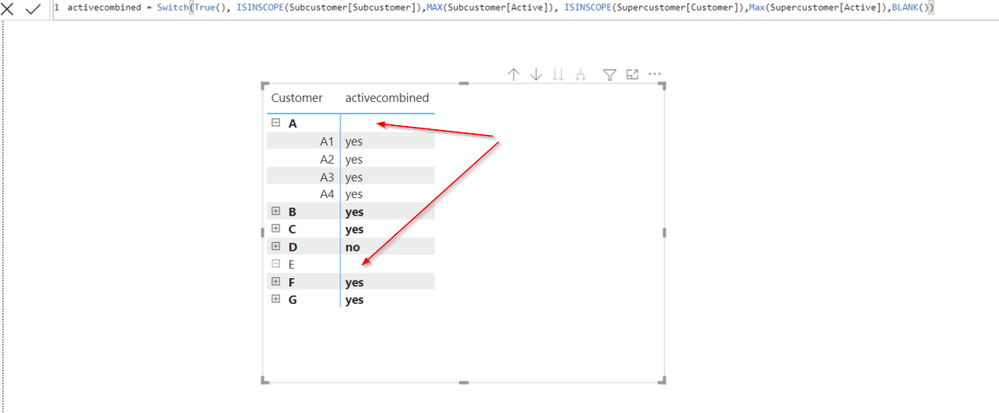
this measure worked quite good, but i don't understand why the "active status" of the Supercustomer isn't shown when i expand the Matrix like below.
Do you know a solution for that or is something wrong with my measure?
Thanks!
- Mark as New
- Bookmark
- Subscribe
- Mute
- Subscribe to RSS Feed
- Permalink
- Report Inappropriate Content
Hi @Steven_ ,
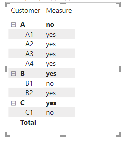
I could get correct value using amitchandak 's code. Could you please share your pbix file?
Best Regards,
Winniz
- Mark as New
- Bookmark
- Subscribe
- Mute
- Subscribe to RSS Feed
- Permalink
- Report Inappropriate Content
@Steven_ , Create a measure like
Switch( True() ,
isinscope(SubCustomer[SubCustomer]) , Max(SubCustomer[Active]) ,
isinscope(SuperCustomer[Customer]) , Max(SuperCustomer[Active]) ,
blank()
)
IsInScope - Switch measure at different levels: https://youtu.be/kh0gezKICEM
Helpful resources

Power BI Monthly Update - April 2026
Check out the April 2026 Power BI update to learn about new features.

Data Days 2026 coming soon!
Sign up to receive a private message when registration opens and key events begin.

New to Fabric Survey
If you have recently started exploring Fabric, we'd love to hear how it's going. Your feedback can help with product improvements.

| User | Count |
|---|---|
| 35 | |
| 27 | |
| 26 | |
| 22 | |
| 18 |
| User | Count |
|---|---|
| 67 | |
| 36 | |
| 32 | |
| 26 | |
| 23 |


