Get certified for free when you join Fabric Data Days 2026 and dive into Fabric, Power BI, SQL, AI, and other essential data skills.
Join nowJuly 7 - July 17 | Round 2 of the Power BI Dataviz World Championships. Don't miss your chance! Learn more
Hi All,
Need some help. I'm have a list of part numbers and the unit price I bought it at. I'm looking to do a matrix so I can see the unit price across the months of 2023.
Problem I'm encountering is that my raw data is in entry format so the value is being summed. I know by clicking the down arrow I can change it to something else, but there's no option to just display all the different unit prices?
Below please find the example I created:
Raw Data:
| Part Number | Unit Price | Date |
| 123 | 1.00 | 01/01/23 |
| 123 | 1.05 | 01/01/23 |
| 123 | 1.00 | 02/01/23 |
Matrix output:
| Part Number | January | February |
| 123 | 2.05 | 1.00 |
Solved! Go to Solution.
Hi , @JP_G
Thanks for your sample data first!
According to your description, you want to " create a way so that the user can look across months rather than entries, like how the raw data is."
Here are the steps you can refer to :
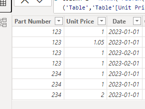
(1)This is my test data:
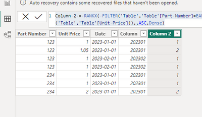
(2)First we need to create two calculated columns like this:
Column = YEAR([Date]) * 100 + MONTH([Date])Column 2 = RANKX( FILTER('Table','Table'[Part Number]=EARLIER('Table'[Part Number]) && 'Table'[Column]=EARLIER('Table'[Column])), CALCULATE(MAX('Table'[Unit Price]), ALLEXCEPT('Table','Table'[Unit Price])),,ASC,Dense)
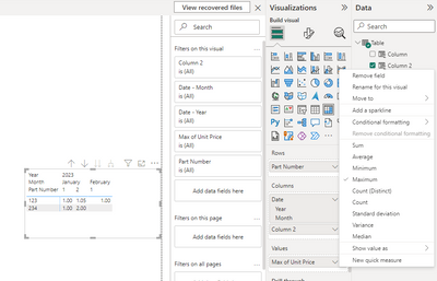
(3)Then we can put this field on the visual and then we can get this result :
Thank you for your time and sharing, and thank you for your support and understanding of PowerBI!
Best Regards,
Aniya Zhang
If this post helps, then please consider Accept it as the solution to help the other members find it more quickly
Hi,
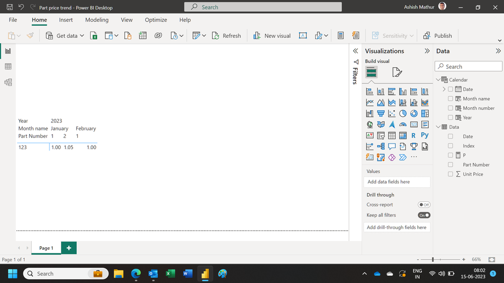
Show the exact result that you are expecting.
Hi Ashish,
Trying to present the data in some type of format like this(maybe Matrix isn't the correct tool to be using:
| Part Number | January | February |
| 123 | $1.00, $1.05 | $1.00 |
Trying to create a way so that the user can look across months rather than entries, like how the raw data is.
Hi , @JP_G
Thanks for your sample data first!
According to your description, you want to " create a way so that the user can look across months rather than entries, like how the raw data is."
Here are the steps you can refer to :
(1)This is my test data:
(2)First we need to create two calculated columns like this:
Column = YEAR([Date]) * 100 + MONTH([Date])Column 2 = RANKX( FILTER('Table','Table'[Part Number]=EARLIER('Table'[Part Number]) && 'Table'[Column]=EARLIER('Table'[Column])), CALCULATE(MAX('Table'[Unit Price]), ALLEXCEPT('Table','Table'[Unit Price])),,ASC,Dense)
(3)Then we can put this field on the visual and then we can get this result :
Thank you for your time and sharing, and thank you for your support and understanding of PowerBI!
Best Regards,
Aniya Zhang
If this post helps, then please consider Accept it as the solution to help the other members find it more quickly
Join us in Barcelona for FabCon and SQLCon, the Fabric, Power BI, SQL, and AI community event. Save €200 with code FABCMTY200.
Join Data Days 2026: 60 days of free live/on-demand sessions, challenges, study groups, and certification opportunities.
| User | Count |
|---|---|
| 29 | |
| 27 | |
| 26 | |
| 24 | |
| 16 |
| User | Count |
|---|---|
| 53 | |
| 47 | |
| 39 | |
| 31 | |
| 21 |