Join us at the 2025 Microsoft Fabric Community Conference
March 31 - April 2, 2025, in Las Vegas, Nevada. Use code MSCUST for a $150 discount! Early bird discount ends December 31.
Register Now- Power BI forums
- Get Help with Power BI
- Desktop
- Service
- Report Server
- Power Query
- Mobile Apps
- Developer
- DAX Commands and Tips
- Custom Visuals Development Discussion
- Health and Life Sciences
- Power BI Spanish forums
- Translated Spanish Desktop
- Training and Consulting
- Instructor Led Training
- Dashboard in a Day for Women, by Women
- Galleries
- Community Connections & How-To Videos
- COVID-19 Data Stories Gallery
- Themes Gallery
- Data Stories Gallery
- R Script Showcase
- Webinars and Video Gallery
- Quick Measures Gallery
- 2021 MSBizAppsSummit Gallery
- 2020 MSBizAppsSummit Gallery
- 2019 MSBizAppsSummit Gallery
- Events
- Ideas
- Custom Visuals Ideas
- Issues
- Issues
- Events
- Upcoming Events
Be one of the first to start using Fabric Databases. View on-demand sessions with database experts and the Microsoft product team to learn just how easy it is to get started. Watch now
- Power BI forums
- Forums
- Get Help with Power BI
- Desktop
- Re: Matrix Values without Sum
- Subscribe to RSS Feed
- Mark Topic as New
- Mark Topic as Read
- Float this Topic for Current User
- Bookmark
- Subscribe
- Printer Friendly Page
- Mark as New
- Bookmark
- Subscribe
- Mute
- Subscribe to RSS Feed
- Permalink
- Report Inappropriate Content
Matrix Values without Sum
Hi All,
Need some help. I'm have a list of part numbers and the unit price I bought it at. I'm looking to do a matrix so I can see the unit price across the months of 2023.
Problem I'm encountering is that my raw data is in entry format so the value is being summed. I know by clicking the down arrow I can change it to something else, but there's no option to just display all the different unit prices?
Below please find the example I created:
Raw Data:
| Part Number | Unit Price | Date |
| 123 | 1.00 | 01/01/23 |
| 123 | 1.05 | 01/01/23 |
| 123 | 1.00 | 02/01/23 |
Matrix output:
| Part Number | January | February |
| 123 | 2.05 | 1.00 |
Solved! Go to Solution.
- Mark as New
- Bookmark
- Subscribe
- Mute
- Subscribe to RSS Feed
- Permalink
- Report Inappropriate Content
Hi , @JP_G
Thanks for your sample data first!
According to your description, you want to " create a way so that the user can look across months rather than entries, like how the raw data is."
Here are the steps you can refer to :
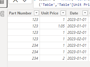
(1)This is my test data:
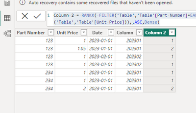
(2)First we need to create two calculated columns like this:
Column = YEAR([Date]) * 100 + MONTH([Date])Column 2 = RANKX( FILTER('Table','Table'[Part Number]=EARLIER('Table'[Part Number]) && 'Table'[Column]=EARLIER('Table'[Column])), CALCULATE(MAX('Table'[Unit Price]), ALLEXCEPT('Table','Table'[Unit Price])),,ASC,Dense)
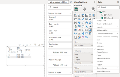
(3)Then we can put this field on the visual and then we can get this result :
Thank you for your time and sharing, and thank you for your support and understanding of PowerBI!
Best Regards,
Aniya Zhang
If this post helps, then please consider Accept it as the solution to help the other members find it more quickly
- Mark as New
- Bookmark
- Subscribe
- Mute
- Subscribe to RSS Feed
- Permalink
- Report Inappropriate Content
Hi,
Show the exact result that you are expecting.
Regards,
Ashish Mathur
http://www.ashishmathur.com
https://www.linkedin.com/in/excelenthusiasts/
- Mark as New
- Bookmark
- Subscribe
- Mute
- Subscribe to RSS Feed
- Permalink
- Report Inappropriate Content
Hi Ashish,
Trying to present the data in some type of format like this(maybe Matrix isn't the correct tool to be using:
| Part Number | January | February |
| 123 | $1.00, $1.05 | $1.00 |
Trying to create a way so that the user can look across months rather than entries, like how the raw data is.
- Mark as New
- Bookmark
- Subscribe
- Mute
- Subscribe to RSS Feed
- Permalink
- Report Inappropriate Content
- Mark as New
- Bookmark
- Subscribe
- Mute
- Subscribe to RSS Feed
- Permalink
- Report Inappropriate Content
Hi , @JP_G
Thanks for your sample data first!
According to your description, you want to " create a way so that the user can look across months rather than entries, like how the raw data is."
Here are the steps you can refer to :
(1)This is my test data:
(2)First we need to create two calculated columns like this:
Column = YEAR([Date]) * 100 + MONTH([Date])Column 2 = RANKX( FILTER('Table','Table'[Part Number]=EARLIER('Table'[Part Number]) && 'Table'[Column]=EARLIER('Table'[Column])), CALCULATE(MAX('Table'[Unit Price]), ALLEXCEPT('Table','Table'[Unit Price])),,ASC,Dense)
(3)Then we can put this field on the visual and then we can get this result :
Thank you for your time and sharing, and thank you for your support and understanding of PowerBI!
Best Regards,
Aniya Zhang
If this post helps, then please consider Accept it as the solution to help the other members find it more quickly
Helpful resources

Join us at the Microsoft Fabric Community Conference
March 31 - April 2, 2025, in Las Vegas, Nevada. Use code MSCUST for a $150 discount!

We want your feedback!
Your insights matter. That’s why we created a quick survey to learn about your experience finding answers to technical questions.

Microsoft Fabric Community Conference 2025
Arun Ulag shares exciting details about the Microsoft Fabric Conference 2025, which will be held in Las Vegas, NV.

| User | Count |
|---|---|
| 134 | |
| 91 | |
| 89 | |
| 64 | |
| 58 |
| User | Count |
|---|---|
| 201 | |
| 137 | |
| 107 | |
| 72 | |
| 68 |


