FabCon is coming to Atlanta
Join us at FabCon Atlanta from March 16 - 20, 2026, for the ultimate Fabric, Power BI, AI and SQL community-led event. Save $200 with code FABCOMM.
Register now!- Power BI forums
- Get Help with Power BI
- Desktop
- Service
- Report Server
- Power Query
- Mobile Apps
- Developer
- DAX Commands and Tips
- Custom Visuals Development Discussion
- Health and Life Sciences
- Power BI Spanish forums
- Translated Spanish Desktop
- Training and Consulting
- Instructor Led Training
- Dashboard in a Day for Women, by Women
- Galleries
- Data Stories Gallery
- Themes Gallery
- Contests Gallery
- QuickViz Gallery
- Quick Measures Gallery
- Visual Calculations Gallery
- Notebook Gallery
- Translytical Task Flow Gallery
- TMDL Gallery
- R Script Showcase
- Webinars and Video Gallery
- Ideas
- Custom Visuals Ideas (read-only)
- Issues
- Issues
- Events
- Upcoming Events
The Power BI Data Visualization World Championships is back! Get ahead of the game and start preparing now! Learn more
- Power BI forums
- Forums
- Get Help with Power BI
- Desktop
- Matrix Graph equivalent
- Subscribe to RSS Feed
- Mark Topic as New
- Mark Topic as Read
- Float this Topic for Current User
- Bookmark
- Subscribe
- Printer Friendly Page
- Mark as New
- Bookmark
- Subscribe
- Mute
- Subscribe to RSS Feed
- Permalink
- Report Inappropriate Content
Matrix Graph equivalent
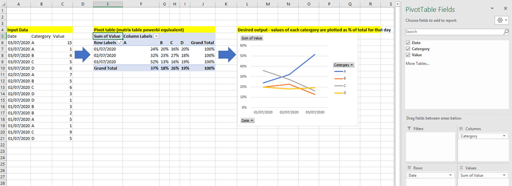
I have a table on input data formatted as per below (left of image).
I'm trying to plot the trend in value for each catergory overtime as a percentage of each days total (graph, right of image).
In excel i would first create a pivot table (middle image), with date's as rows, and the catergory pivoted to create 4 columns, and then values summed and displayed as % of row total. That would then automatically produce the desired graph as a pivot chart.
I can create a desired table in powerbi via the matrix table - but i'm then unable to then create the corresponding graph. Can anyone advise how i can create a graph in that format in powerbi?
Solved! Go to Solution.
- Mark as New
- Bookmark
- Subscribe
- Mute
- Subscribe to RSS Feed
- Permalink
- Report Inappropriate Content
Hi @Anonymous
Create the follwing measure:
% of total by date = SUM('Table'[Value]) / CALCULATE(SUM('Table'[Value]), ALLSELECTED('Table'[Category]))
Now create the line chart with the following setup:
- Axis: Date (Categorical)
- Legend: Category
- Values [%of total by date]
Check PBIX file attach.
Regards
Miguel Félix
Did I answer your question? Mark my post as a solution!
Proud to be a Super User!
Check out my blog: Power BI em Português- Mark as New
- Bookmark
- Subscribe
- Mute
- Subscribe to RSS Feed
- Permalink
- Report Inappropriate Content
Hi Felix - that answer worked perfectly, thank you so much! Also, much appreciate the quick response
Helpful resources

Power BI Dataviz World Championships
The Power BI Data Visualization World Championships is back! Get ahead of the game and start preparing now!

| User | Count |
|---|---|
| 165 | |
| 132 | |
| 118 | |
| 79 | |
| 53 |


