FabCon is coming to Atlanta
Join us at FabCon Atlanta from March 16 - 20, 2026, for the ultimate Fabric, Power BI, AI and SQL community-led event. Save $200 with code FABCOMM.
Register now!- Power BI forums
- Get Help with Power BI
- Desktop
- Service
- Report Server
- Power Query
- Mobile Apps
- Developer
- DAX Commands and Tips
- Custom Visuals Development Discussion
- Health and Life Sciences
- Power BI Spanish forums
- Translated Spanish Desktop
- Training and Consulting
- Instructor Led Training
- Dashboard in a Day for Women, by Women
- Galleries
- Data Stories Gallery
- Themes Gallery
- Contests Gallery
- QuickViz Gallery
- Quick Measures Gallery
- Visual Calculations Gallery
- Notebook Gallery
- Translytical Task Flow Gallery
- TMDL Gallery
- R Script Showcase
- Webinars and Video Gallery
- Ideas
- Custom Visuals Ideas (read-only)
- Issues
- Issues
- Events
- Upcoming Events
The Power BI Data Visualization World Championships is back! Get ahead of the game and start preparing now! Learn more
- Power BI forums
- Forums
- Get Help with Power BI
- Desktop
- Re: Matrix: Conditional format on KPIs
- Subscribe to RSS Feed
- Mark Topic as New
- Mark Topic as Read
- Float this Topic for Current User
- Bookmark
- Subscribe
- Printer Friendly Page
- Mark as New
- Bookmark
- Subscribe
- Mute
- Subscribe to RSS Feed
- Permalink
- Report Inappropriate Content
Matrix: Conditional format on KPIs
Hi,
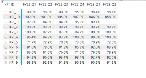
Is it possible to create a conditional format on KPIs by row?
Or is there a workaround? I.e. could I create a new measure? The below KPI matrix table has different targets for different KPIs and I would like to shade to colours if out performing or underperforming.
Thanks
Alan
Solved! Go to Solution.
- Mark as New
- Bookmark
- Subscribe
- Mute
- Subscribe to RSS Feed
- Permalink
- Report Inappropriate Content
Hi @Alan_Gould ,
Is this what you are looking for?
You can try something like this measure. You will have to change the columns/tables/fields to match yours as well as add the extra KPIs. You will also need to change the performance range of what constitutes underperforming and overperforming. I added a "Red" and "Green" but you can change them to a hex code.
SWITCH (
    TRUE (),
    MAX ( 'Table'[Performance] ) < 80
        && MAX ( 'Table'[KPI ID] ) = "KPI1", "Red",
    MAX ( 'Table'[Performance] ) < 90
        && MAX ( 'Table'[KPI ID] ) = "KPI2", "Red",
    MAX ( 'Table'[Performance] ) < 90
        && MAX ( 'Table'[KPI ID] ) = "KPI3", "Red",
    MAX ( 'Table'[Performance] ) < 70
        && MAX ( 'Table'[KPI ID] ) = "KPI4", "Red",
    "Green"
)
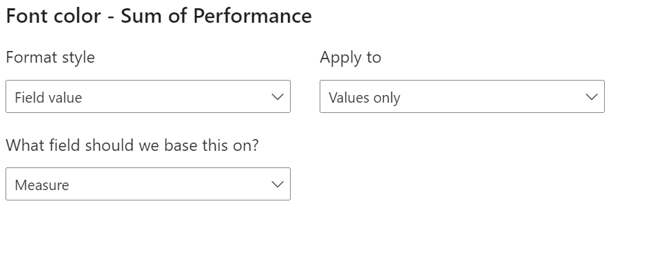
Once you create the measure, add a conditional formatting on your Value Field; Format style should be "Field Value" and field based on should be your measure name e.g.:
- Mark as New
- Bookmark
- Subscribe
- Mute
- Subscribe to RSS Feed
- Permalink
- Report Inappropriate Content
Yes it would still work. You just add an extra condition e.g.
"Green"
that would color numbers below 60 but above 20 as yellow
anything below 20 would be red
anything above 60 green
- Mark as New
- Bookmark
- Subscribe
- Mute
- Subscribe to RSS Feed
- Permalink
- Report Inappropriate Content
Hi @Alan_Gould ,
Is this what you are looking for?
You can try something like this measure. You will have to change the columns/tables/fields to match yours as well as add the extra KPIs. You will also need to change the performance range of what constitutes underperforming and overperforming. I added a "Red" and "Green" but you can change them to a hex code.
SWITCH (
    TRUE (),
    MAX ( 'Table'[Performance] ) < 80
        && MAX ( 'Table'[KPI ID] ) = "KPI1", "Red",
    MAX ( 'Table'[Performance] ) < 90
        && MAX ( 'Table'[KPI ID] ) = "KPI2", "Red",
    MAX ( 'Table'[Performance] ) < 90
        && MAX ( 'Table'[KPI ID] ) = "KPI3", "Red",
    MAX ( 'Table'[Performance] ) < 70
        && MAX ( 'Table'[KPI ID] ) = "KPI4", "Red",
    "Green"
)
Once you create the measure, add a conditional formatting on your Value Field; Format style should be "Field Value" and field based on should be your measure name e.g.:
- Mark as New
- Bookmark
- Subscribe
- Mute
- Subscribe to RSS Feed
- Permalink
- Report Inappropriate Content
Hi @m_alireza,
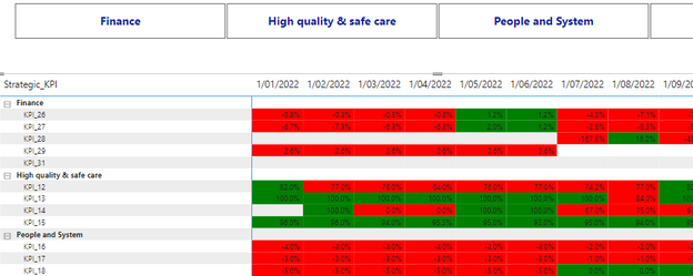
Quick question, how should I think about writing this if I wanted to have Red if below a certain value, but yellow if between Red and Green thresholds? Would the Switch function still be okay?
The results so far look great!
Thanks,
Alan
- Mark as New
- Bookmark
- Subscribe
- Mute
- Subscribe to RSS Feed
- Permalink
- Report Inappropriate Content
Yes it would still work. You just add an extra condition e.g.
"Green"
that would color numbers below 60 but above 20 as yellow
anything below 20 would be red
anything above 60 green
- Mark as New
- Bookmark
- Subscribe
- Mute
- Subscribe to RSS Feed
- Permalink
- Report Inappropriate Content
Fantastic!
Works perfectly! Thank you very much 🙂
Helpful resources

Power BI Dataviz World Championships
The Power BI Data Visualization World Championships is back! Get ahead of the game and start preparing now!

| User | Count |
|---|---|
| 40 | |
| 35 | |
| 34 | |
| 31 | |
| 28 |
| User | Count |
|---|---|
| 136 | |
| 102 | |
| 68 | |
| 66 | |
| 58 |


