Join us at FabCon Vienna from September 15-18, 2025
The ultimate Fabric, Power BI, SQL, and AI community-led learning event. Save €200 with code FABCOMM.
Get registered- Power BI forums
- Get Help with Power BI
- Desktop
- Service
- Report Server
- Power Query
- Mobile Apps
- Developer
- DAX Commands and Tips
- Custom Visuals Development Discussion
- Health and Life Sciences
- Power BI Spanish forums
- Translated Spanish Desktop
- Training and Consulting
- Instructor Led Training
- Dashboard in a Day for Women, by Women
- Galleries
- Data Stories Gallery
- Themes Gallery
- Contests Gallery
- Quick Measures Gallery
- Notebook Gallery
- Translytical Task Flow Gallery
- TMDL Gallery
- R Script Showcase
- Webinars and Video Gallery
- Ideas
- Custom Visuals Ideas (read-only)
- Issues
- Issues
- Events
- Upcoming Events
Enhance your career with this limited time 50% discount on Fabric and Power BI exams. Ends August 31st. Request your voucher.
- Power BI forums
- Forums
- Get Help with Power BI
- Desktop
- Re: Map point sizes almost all the same
- Subscribe to RSS Feed
- Mark Topic as New
- Mark Topic as Read
- Float this Topic for Current User
- Bookmark
- Subscribe
- Printer Friendly Page
- Mark as New
- Bookmark
- Subscribe
- Mute
- Subscribe to RSS Feed
- Permalink
- Report Inappropriate Content
Map point sizes almost all the same
Hi
I've got an issue with the standard map visualisation. Depending on the measure I use for size, I get points plotted with near equal sizes. For example points that have values of 1, 1000 and 10000 all show the same size.
I can't see anything obvious, so has anyone seen this before and does anyone have any ideas?
Duncan
Solved! Go to Solution.
- Mark as New
- Bookmark
- Subscribe
- Mute
- Subscribe to RSS Feed
- Permalink
- Report Inappropriate Content
Thanks for your detailed description. I’ve also reproduced this issue locally and reported it internally. I’ll update here if there is some feedback.
Best Regards,
Herbert
- Mark as New
- Bookmark
- Subscribe
- Mute
- Subscribe to RSS Feed
- Permalink
- Report Inappropriate Content
@v-haibl-msft, has there been any progress on this issue? I'm seeing the same sort of behaviour using build Version: 2.43.4647.541 32-bit (February 2017).
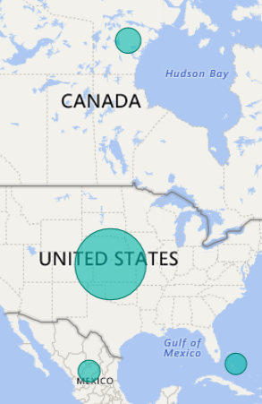
My data is from countries around the world, and the values I am plotting range from just of 3000 to 1. Taking a fairly casual glance at it, it seems that the bubble get subtly larger where the data is using 3 difgits and mush larger in the single case where the data uses 4 digits. The value being platted is a whole number, in the Size slot.
in the image, the values are: USA - 3116, Canada - 257, Mexico - 37, Bahamas - 2
- Mark as New
- Bookmark
- Subscribe
- Mute
- Subscribe to RSS Feed
- Permalink
- Report Inappropriate Content
I've added this to the ideas page so it can be voted on as I think this needs sorting asap..
Michael
- Mark as New
- Bookmark
- Subscribe
- Mute
- Subscribe to RSS Feed
- Permalink
- Report Inappropriate Content
It looks like they tried to fix this, per the March '19 release. However, I'm still seeing what I would call -- not enough of a differential between bubble sizes respective of their value.
https://powerbi.microsoft.com/en-us/blog/power-bi-desktop-march-2019-feature-summary/#bubbleSize

- Mark as New
- Bookmark
- Subscribe
- Mute
- Subscribe to RSS Feed
- Permalink
- Report Inappropriate Content
Completely agree with DandyDan, still not enough differential in size. There should be an option to adjust the level of differential among bubble sizes. In the case of a range with a max of 80,000 and a min of 1, this at maximum differential should essentially render the bubble for a 1 value nearly or entirely invisible on the map and a very large bubble for the 80,000 value. Allowing a user to shift the differential around to find an appropriate balance between size accuracy and visibility to suit their needs would be the ideal solution.
@Anonymous wrote:It looks like they tried to fix this, per the March '19 release. However, I'm still seeing what I would call -- not enough of a differential between bubble sizes respective of their value.
https://powerbi.microsoft.com/en-us/blog/power-bi-desktop-march-2019-feature-summary/#bubbleSize
Playing with the size control does not help the matter that there is not enough differential between the bubble sizes
- Mark as New
- Bookmark
- Subscribe
- Mute
- Subscribe to RSS Feed
- Permalink
- Report Inappropriate Content
You can vote on the Power BI ideas site for this feature:
- Mark as New
- Bookmark
- Subscribe
- Mute
- Subscribe to RSS Feed
- Permalink
- Report Inappropriate Content
- Mark as New
- Bookmark
- Subscribe
- Mute
- Subscribe to RSS Feed
- Permalink
- Report Inappropriate Content
Hi
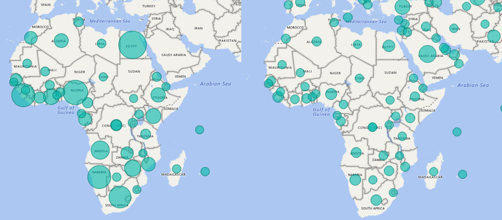
Thank you both for getting back. I am using the latest version of desktop, and I'm using country names for the map locations, and a normal decimal measure for the sizes. I've done a bit more work and discovered that the more points I have on the map, the less accurate the sizes are. So in the picture below I'm showing the same points for countries in Africa. On the left is the data filtered to just show Africa data, and on the right is the data for the whole world, but zoomed in to show the same region. As you can see, there is a huge difference in what the map shows in each case. I've noticed the same thing if I filter down on other dimensions.
I'm not sure that this is exactly what I was seeing on Friday, as it seemed like the whole map was showing points the same size, but it does throw up a limitation of the map visualization which is that points seem to have a minimum size. This means that when you have one point that is quite a bit larger than the others, in this case around 70k is the largest, then the rest just end up looking the same, even when one is 2k and another is 0.2.
Duncan
- Mark as New
- Bookmark
- Subscribe
- Mute
- Subscribe to RSS Feed
- Permalink
- Report Inappropriate Content
Thanks for your detailed description. I’ve also reproduced this issue locally and reported it internally. I’ll update here if there is some feedback.
Best Regards,
Herbert
- Mark as New
- Bookmark
- Subscribe
- Mute
- Subscribe to RSS Feed
- Permalink
- Report Inappropriate Content
6 years later... not fixed?
- Mark as New
- Bookmark
- Subscribe
- Mute
- Subscribe to RSS Feed
- Permalink
- Report Inappropriate Content
Fully agree. I share the exact same frustration.
I have values ranging between 1-100, but the relative size is very very small. Size of bubbles don't visualize at all as I want them. Such a dissappointment! What is the workaround?
- Mark as New
- Bookmark
- Subscribe
- Mute
- Subscribe to RSS Feed
- Permalink
- Report Inappropriate Content
I don't like asking the obvious but have you selected the correct sort of map and put the correct column in the size field?


