FabCon is coming to Atlanta
Join us at FabCon Atlanta from March 16 - 20, 2026, for the ultimate Fabric, Power BI, AI and SQL community-led event. Save $200 with code FABCOMM.
Register now!- Power BI forums
- Get Help with Power BI
- Desktop
- Service
- Report Server
- Power Query
- Mobile Apps
- Developer
- DAX Commands and Tips
- Custom Visuals Development Discussion
- Health and Life Sciences
- Power BI Spanish forums
- Translated Spanish Desktop
- Training and Consulting
- Instructor Led Training
- Dashboard in a Day for Women, by Women
- Galleries
- Data Stories Gallery
- Themes Gallery
- Contests Gallery
- Quick Measures Gallery
- Notebook Gallery
- Translytical Task Flow Gallery
- TMDL Gallery
- R Script Showcase
- Webinars and Video Gallery
- Ideas
- Custom Visuals Ideas (read-only)
- Issues
- Issues
- Events
- Upcoming Events
To celebrate FabCon Vienna, we are offering 50% off select exams. Ends October 3rd. Request your discount now.
- Power BI forums
- Forums
- Get Help with Power BI
- Desktop
- Re: Lumping spatial data on Bing Maps
- Subscribe to RSS Feed
- Mark Topic as New
- Mark Topic as Read
- Float this Topic for Current User
- Bookmark
- Subscribe
- Printer Friendly Page
- Mark as New
- Bookmark
- Subscribe
- Mute
- Subscribe to RSS Feed
- Permalink
- Report Inappropriate Content
Lumping spatial data on Bing Maps
Hello,
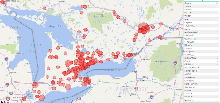
Please refer to the screenshot below.
I have mapped this data based on postal codes.
I am looking for suggestions of 'How I can best visualize this data on the Map view by lumping all these points based on specific regions'
I could
1) Create a region lookup up table and relate it to this data table. Give the region some pseudo longitide and latitude
and map it
2)Look up coordinates for each postal code. Create some complicated DAX expression which calculates distances between the coordinates and lumps the data itself
3) Use a Heat Map
Any other suggestions other than the above would be appreciated.
- Mark as New
- Bookmark
- Subscribe
- Mute
- Subscribe to RSS Feed
- Permalink
- Report Inappropriate Content
HI, @Anonymous
I think you could try the way as your plan 1.
Create a region lookup up table and relate it to this data table.
Then you could drag region column into Legend value.
Best Regards,
Lin
If this post helps, then please consider Accept it as the solution to help the other members find it more quickly.


