FabCon is coming to Atlanta
Join us at FabCon Atlanta from March 16 - 20, 2026, for the ultimate Fabric, Power BI, AI and SQL community-led event. Save $200 with code FABCOMM.
Register now!- Power BI forums
- Get Help with Power BI
- Desktop
- Service
- Report Server
- Power Query
- Mobile Apps
- Developer
- DAX Commands and Tips
- Custom Visuals Development Discussion
- Health and Life Sciences
- Power BI Spanish forums
- Translated Spanish Desktop
- Training and Consulting
- Instructor Led Training
- Dashboard in a Day for Women, by Women
- Galleries
- Data Stories Gallery
- Themes Gallery
- Contests Gallery
- QuickViz Gallery
- Quick Measures Gallery
- Visual Calculations Gallery
- Notebook Gallery
- Translytical Task Flow Gallery
- TMDL Gallery
- R Script Showcase
- Webinars and Video Gallery
- Ideas
- Custom Visuals Ideas (read-only)
- Issues
- Issues
- Events
- Upcoming Events
The Power BI Data Visualization World Championships is back! Get ahead of the game and start preparing now! Learn more
- Power BI forums
- Forums
- Get Help with Power BI
- Desktop
- Re: Linechart filtering
- Subscribe to RSS Feed
- Mark Topic as New
- Mark Topic as Read
- Float this Topic for Current User
- Bookmark
- Subscribe
- Printer Friendly Page
- Mark as New
- Bookmark
- Subscribe
- Mute
- Subscribe to RSS Feed
- Permalink
- Report Inappropriate Content
Linechart filtering
I currently am working on a linechart wich needs to show the total sales in € per month of a specific order type.
It is pretty much working except the line chart shows the total sales amount of all the order types, eventhough i did put a filter on it which should filter it on one specific order type.
i hope someone has any idea on how i could solve this and make the linechart sum up all the sales of a specific order type per month.
Solved! Go to Solution.
- Mark as New
- Bookmark
- Subscribe
- Mute
- Subscribe to RSS Feed
- Permalink
- Report Inappropriate Content
Hi @Anonymous,
I created some data:
Here are the steps you can follow:
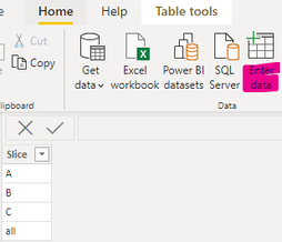
1.Use Enter data to create a table.
2. Create measure.
slice_amount =
var _select=SELECTEDVALUE('Slicetable'[Slice])
return
IF(
    _select in {"A","B","C"},CALCULATE(SUM('Table'[Amount]),FILTER(ALL('Table'),'Table'[Month]=MAX('Table'[Month])&&'Table'[OrderType]=_select)),
    CALCULATE(SUM('Table'[Amount]),FILTER(ALL('Table'),'Table'[Month]=MAX('Table'[Month]))))
3. Result:
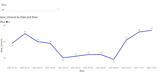
The slicer selects ALL to display the full monthly amount:
The slicer selects A and displays the monthly amount in A:
If I have misunderstood your meaning, please provide your desired output and your pbix without privacy information.
Best Regards,
Liu Yang
If this post helps, then please consider Accept it as the solution to help the other members find it more quickly
- Mark as New
- Bookmark
- Subscribe
- Mute
- Subscribe to RSS Feed
- Permalink
- Report Inappropriate Content
@Anonymous , Not very clear ,
1. you can use order type as legend
2. you can slicer or filter for order type
3. Create a measure with order type
example
calculate(sum(Table[Value]), filter(Table, Table[Order Type] = "ABC" ))
- Mark as New
- Bookmark
- Subscribe
- Mute
- Subscribe to RSS Feed
- Permalink
- Report Inappropriate Content
Sorry i'll put in some screenshots, that hopefully wil clarify the situation.
Please don't hate on my dashboard it is my first time using Power BI😂.
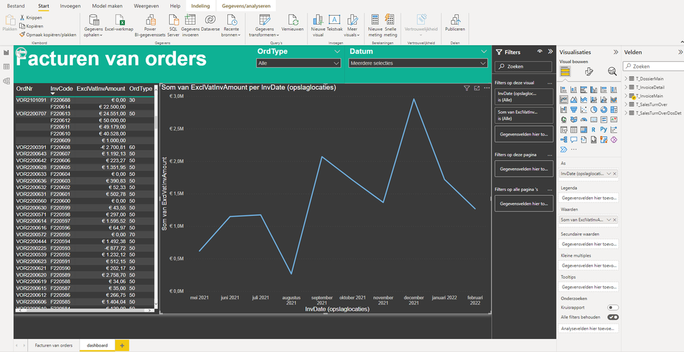
As you can see in the first printscreen, the table shows all the orders of the company, with the amount in € and the ordertype, in this situation the linechart is correct because it sums up all the orders that were sold per month.
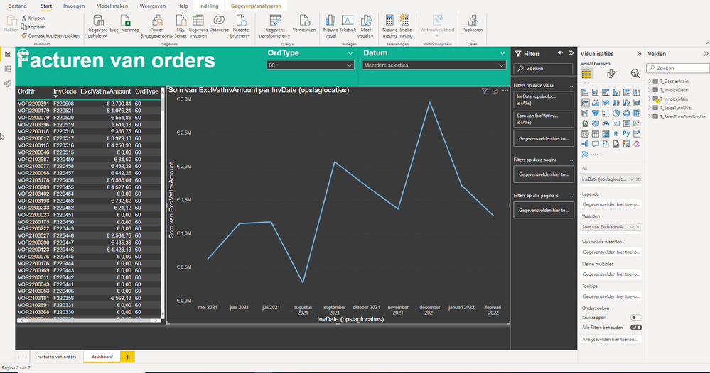
However, as you can see in the second printscreen, whenever i select ordertype 60 (which is the specific ordertype i want to show in the linechart) the table does filter out all the other order types. But the linechart stays exactly the same.
What i would like to see is that the line chart sums up all the orders with order type 60 per month.
i have already tried a lot but can't seem te figure out why it keeps showing all order types.
I hope this makes more sense😁
Helpful resources

Power BI Dataviz World Championships
The Power BI Data Visualization World Championships is back! Get ahead of the game and start preparing now!

| User | Count |
|---|---|
| 161 | |
| 132 | |
| 117 | |
| 79 | |
| 53 |


