FabCon is coming to Atlanta
Join us at FabCon Atlanta from March 16 - 20, 2026, for the ultimate Fabric, Power BI, AI and SQL community-led event. Save $200 with code FABCOMM.
Register now!- Power BI forums
- Get Help with Power BI
- Desktop
- Service
- Report Server
- Power Query
- Mobile Apps
- Developer
- DAX Commands and Tips
- Custom Visuals Development Discussion
- Health and Life Sciences
- Power BI Spanish forums
- Translated Spanish Desktop
- Training and Consulting
- Instructor Led Training
- Dashboard in a Day for Women, by Women
- Galleries
- Data Stories Gallery
- Themes Gallery
- Contests Gallery
- QuickViz Gallery
- Quick Measures Gallery
- Visual Calculations Gallery
- Notebook Gallery
- Translytical Task Flow Gallery
- TMDL Gallery
- R Script Showcase
- Webinars and Video Gallery
- Ideas
- Custom Visuals Ideas (read-only)
- Issues
- Issues
- Events
- Upcoming Events
Get Fabric Certified for FREE during Fabric Data Days. Don't miss your chance! Request now
- Power BI forums
- Forums
- Get Help with Power BI
- Desktop
- Re: Line graph - Line continues for months with no...
- Subscribe to RSS Feed
- Mark Topic as New
- Mark Topic as Read
- Float this Topic for Current User
- Bookmark
- Subscribe
- Printer Friendly Page
- Mark as New
- Bookmark
- Subscribe
- Mute
- Subscribe to RSS Feed
- Permalink
- Report Inappropriate Content
Line graph - Line continues for months with no data
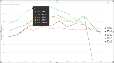
Have an issue with a line chart showing multiple lines each representing a year. 2016 line continues even though there is no data for november and december. How can i get rid of this?
- Mark as New
- Bookmark
- Subscribe
- Mute
- Subscribe to RSS Feed
- Permalink
- Report Inappropriate Content
Hey @madden318,
Easy fix, go to the paint roll "Format" tab and under the "X-Axis" dropdown, change the type to "Categorical" instead of "Continuous". This should stop the graph at the last point.
Hope this helps,
Alan
- Mark as New
- Bookmark
- Subscribe
- Mute
- Subscribe to RSS Feed
- Permalink
- Report Inappropriate Content
Thanks Alan but it is already on the categorical setting. Has this ever fixed it for you?
- Mark as New
- Bookmark
- Subscribe
- Mute
- Subscribe to RSS Feed
- Permalink
- Report Inappropriate Content
- Mark as New
- Bookmark
- Subscribe
- Mute
- Subscribe to RSS Feed
- Permalink
- Report Inappropriate Content
Yes it is definitley adding 0 values into may data where there is none. Tried switching it to a line and stacked volume chart and it did the same thing.
- Mark as New
- Bookmark
- Subscribe
- Mute
- Subscribe to RSS Feed
- Permalink
- Report Inappropriate Content
Hi @madden318,
You should be able to use BLANK Function (DAX) to skip the value 0 in this scenario. For example, if you are showing "Total Sales" on the Line Chart.
Total Sales = SUM ( Sales[Revenue] )
Then you should be able to show the following measure instead on the Line Chart to skip the value 0.
Measure = IF ( [Total Sales] = 0, BLANK (), [Total Sales] )
Regards
- Mark as New
- Bookmark
- Subscribe
- Mute
- Subscribe to RSS Feed
- Permalink
- Report Inappropriate Content
I am typing this on an iPad and have not tested this so this is just a guess...
However I suspect your Calendar table runs till the end of the current year if not beyond...
so try adding a FILTER statement in the Measure you are charting to only calculate till today
something like this...
Measure = CALCULATE ( SUM (...), FILTER ( ALLSELECTED ( 'Calendar' ), 'Calendar'[Date] <= TODAY () )
Again I have not tested this - just a suggestion.
Helpful resources

Power BI Monthly Update - November 2025
Check out the November 2025 Power BI update to learn about new features.

Fabric Data Days
Advance your Data & AI career with 50 days of live learning, contests, hands-on challenges, study groups & certifications and more!


