FabCon is coming to Atlanta
Join us at FabCon Atlanta from March 16 - 20, 2026, for the ultimate Fabric, Power BI, AI and SQL community-led event. Save $200 with code FABCOMM.
Register now!- Power BI forums
- Get Help with Power BI
- Desktop
- Service
- Report Server
- Power Query
- Mobile Apps
- Developer
- DAX Commands and Tips
- Custom Visuals Development Discussion
- Health and Life Sciences
- Power BI Spanish forums
- Translated Spanish Desktop
- Training and Consulting
- Instructor Led Training
- Dashboard in a Day for Women, by Women
- Galleries
- Data Stories Gallery
- Themes Gallery
- Contests Gallery
- QuickViz Gallery
- Quick Measures Gallery
- Visual Calculations Gallery
- Notebook Gallery
- Translytical Task Flow Gallery
- TMDL Gallery
- R Script Showcase
- Webinars and Video Gallery
- Ideas
- Custom Visuals Ideas (read-only)
- Issues
- Issues
- Events
- Upcoming Events
Vote for your favorite vizzies from the Power BI Dataviz World Championship submissions. Vote now!
- Power BI forums
- Forums
- Get Help with Power BI
- Desktop
- Re: Line chart without aggregate values
- Subscribe to RSS Feed
- Mark Topic as New
- Mark Topic as Read
- Float this Topic for Current User
- Bookmark
- Subscribe
- Printer Friendly Page
- Mark as New
- Bookmark
- Subscribe
- Mute
- Subscribe to RSS Feed
- Permalink
- Report Inappropriate Content
Line chart without aggregate values
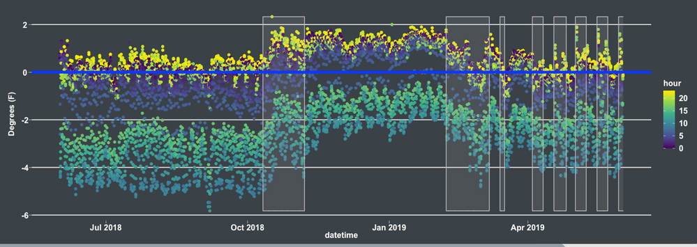
Is there not a way to disaggregate value data on a line chart? I want to plot hourly data on a daily line chart like the chart below. So each day will have 24 plots. But I cannot use a "Do not aggregrate" option for the values, only an aggegration like "average". That would be fine if I wanted the daily average for the value but I want all the values for a single day plotted for that day. I don't want to zoom either to the hour level on the x-axis either.
So far the only solution I think of is to create measure to calculate the average for each hour. e.g
AvgHourly_Hour4 =
CALCULATE(
AVERAGE('Data'[Value]),
'Date'[Hour] = 4
)
(so 24 measures in total) and plotting them as series on the line chart.
Solved! Go to Solution.
- Mark as New
- Bookmark
- Subscribe
- Mute
- Subscribe to RSS Feed
- Permalink
- Report Inappropriate Content
Hi @ashamsuzzoha ,
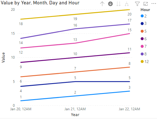
You could apply Hour to Legend pane.
Refer to these for further help.
https://community.powerbi.com/t5/Desktop/Do-not-sum-line-chart-Values/m-p/794565
https://community.powerbi.com/t5/Desktop/How-to-show-value-instead-of-aggregate/m-p/122327
Best Regards,
Eyelyn Qin
If this post helps, then please consider Accept it as the solution to help the other members find it more quickly.
- Mark as New
- Bookmark
- Subscribe
- Mute
- Subscribe to RSS Feed
- Permalink
- Report Inappropriate Content
Oh, that's exactly what I was looking for! Can't believe I overlooked that.
Thanks!
- Mark as New
- Bookmark
- Subscribe
- Mute
- Subscribe to RSS Feed
- Permalink
- Report Inappropriate Content
that, or use calculation groups. This really is a multi party conflict between your valid business reason, the rendering's engine enforced limits, and the screen resolution. You cannot technically see all your data points, so mindful aggregation will not make the user experience worse.
Helpful resources

Power BI Dataviz World Championships
Vote for your favorite vizzies from the Power BI World Championship submissions!

Join our Community Sticker Challenge 2026
If you love stickers, then you will definitely want to check out our Community Sticker Challenge!

Power BI Monthly Update - January 2026
Check out the January 2026 Power BI update to learn about new features.

| User | Count |
|---|---|
| 57 | |
| 53 | |
| 40 | |
| 17 | |
| 16 |
| User | Count |
|---|---|
| 116 | |
| 105 | |
| 41 | |
| 34 | |
| 25 |


