Get Fabric certified for FREE!
Don't miss your chance to take the Fabric Data Engineer (DP-600) exam for FREE! Find out how by attending the DP-600 session on April 23rd (pacific time), live or on-demand.
Learn more- Power BI forums
- Get Help with Power BI
- Desktop
- Service
- Report Server
- Power Query
- Mobile Apps
- Developer
- DAX Commands and Tips
- Custom Visuals Development Discussion
- Health and Life Sciences
- Power BI Spanish forums
- Translated Spanish Desktop
- Training and Consulting
- Instructor Led Training
- Dashboard in a Day for Women, by Women
- Galleries
- Data Stories Gallery
- Themes Gallery
- Contests Gallery
- QuickViz Gallery
- Quick Measures Gallery
- Visual Calculations Gallery
- Notebook Gallery
- Translytical Task Flow Gallery
- TMDL Gallery
- R Script Showcase
- Webinars and Video Gallery
- Ideas
- Custom Visuals Ideas (read-only)
- Issues
- Issues
- Events
- Upcoming Events
Next up in the FabCon + SQLCon recap series: The roadmap for Microsoft SQL and Maximizing Developer experiences in Fabric. All sessions are available on-demand after the live show. Register now
- Power BI forums
- Forums
- Get Help with Power BI
- Desktop
- Line chart truncation
- Subscribe to RSS Feed
- Mark Topic as New
- Mark Topic as Read
- Float this Topic for Current User
- Bookmark
- Subscribe
- Printer Friendly Page
- Mark as New
- Bookmark
- Subscribe
- Mute
- Subscribe to RSS Feed
- Permalink
- Report Inappropriate Content
Line chart truncation
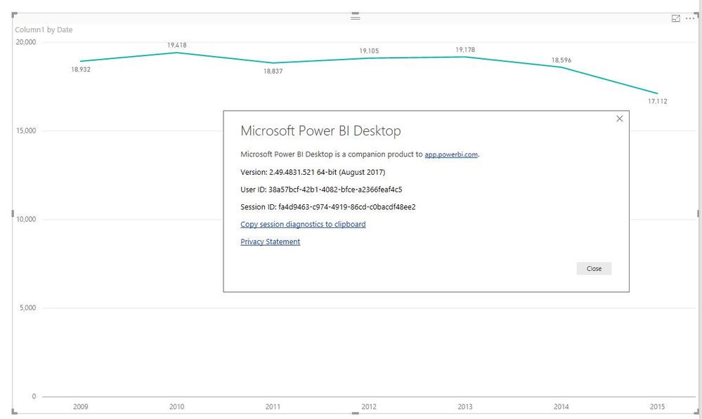
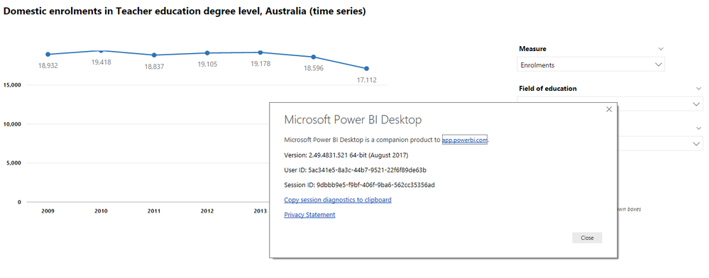
Line charts appear truncated at the top when a minimum value of zero is set for the y-axis as per the example below.
I suspect this is a Power BI bug given the number of posts about chart truncation. The x-axis is categorical (as required to produce a line chart with markers), and making it continuous makes no difference to the truncation of y-axis labels.
Any advice would be greatly appreciated.
Steve
- Mark as New
- Bookmark
- Subscribe
- Mute
- Subscribe to RSS Feed
- Permalink
- Report Inappropriate Content
- Mark as New
- Bookmark
- Subscribe
- Mute
- Subscribe to RSS Feed
- Permalink
- Report Inappropriate Content
Thank you Lydia. Looking forward to Microsoft's update about this.
- Mark as New
- Bookmark
- Subscribe
- Mute
- Subscribe to RSS Feed
- Permalink
- Report Inappropriate Content
I’ve got response from the Product Team.
This is by design currently. Once users set a min or max axis value, we use a combination of the specified values and/or the actual values where the user has not defined a value. So, once you set the Min, we change logic. Max is undefined so we use the real max of 19,418 as the top. Dropping the last label is by design to there is minimal whitespace and so we respect what the user has specified. This is the same as if the user had typed in 19,418 as the Max - they wouldn't want us to jump to 20k on the axis just to label the top.
All that said, we have discussed a plan to expose part of this behavior to the user as an option. The axis ticks can be rounded "nicely" to include the next label based on the tick interval - which would show 20k in this case. We will leave defaults as-is so existing visuals aren't affected, but we plan to introduce a new toggle to control whether the axis should extend to the next tick interval outside the domain or not.
No ETA right now, hopefully by end of this year.
Best Regards,
Herbert
- Mark as New
- Bookmark
- Subscribe
- Mute
- Subscribe to RSS Feed
- Permalink
- Report Inappropriate Content
Thanks for the response Herbert.
I submit that in the context of having a dynamic visual whose maximum could vary considerably, hard-coding the maximum for anything other than a percentage or other logical maximum is generally not possible.
I don't know what algorithm Excel uses to determine a maximum when it is set to "Auto", but it would seem that Microsoft Excel has presented line charts nicely without truncation for a very long time, and with substantially more happy users.
Microsoft Power BI would do well to learn from that experience.
I look forward to a revision later in the year.
Steve
- Mark as New
- Bookmark
- Subscribe
- Mute
- Subscribe to RSS Feed
- Permalink
- Report Inappropriate Content
hi @chass Charles,
I am hoping to get you attention. I definitely think this is a bug as Croftie raised in his original post. I am wondering if PBIX is going to fix this bug in the nearest release?
cheers,
Vida
- Mark as New
- Bookmark
- Subscribe
- Mute
- Subscribe to RSS Feed
- Permalink
- Report Inappropriate Content
I am experiencing the same issue as mentioned by Steve. Hopefully someone knows how to fix this or is it a bug needs to be fixed by Microsoft?
cheers,
Vida
- Mark as New
- Bookmark
- Subscribe
- Mute
- Subscribe to RSS Feed
- Permalink
- Report Inappropriate Content
@Croftie,
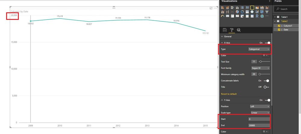
I can't reproduce your issue in the latest version of Power BI Desktop, you can review the example in my scenario. Do you use August version of Power BI Desktop(2.49.4831.521)?
Regards,
Lydia Zhang
- Mark as New
- Bookmark
- Subscribe
- Mute
- Subscribe to RSS Feed
- Permalink
- Report Inappropriate Content
Hi Lydia,
i am experience the same issue as Steve did. the reason why you couldn't replicate it, is because your max is big enough, so the line chart is not at the top of the edge, but it doesn't solve the issue though,
cheers,
Vida
- Mark as New
- Bookmark
- Subscribe
- Mute
- Subscribe to RSS Feed
- Permalink
- Report Inappropriate Content
Yes - it is the August version. Can you try it with markers? Not that mine works without markers.
- Mark as New
- Bookmark
- Subscribe
- Mute
- Subscribe to RSS Feed
- Permalink
- Report Inappropriate Content
- Mark as New
- Bookmark
- Subscribe
- Mute
- Subscribe to RSS Feed
- Permalink
- Report Inappropriate Content
- Mark as New
- Bookmark
- Subscribe
- Mute
- Subscribe to RSS Feed
- Permalink
- Report Inappropriate Content
Just found the problem. When I set your Y-axis maximum as Auto (leaving minimum as zero), this replicates the problem.
The context in which we are using these line charts is such that setting a maximum value is not practical - when using a dropdown list the maximum varies from a few hundred to over 100,000.
Helpful resources

New to Fabric Survey
If you have recently started exploring Fabric, we'd love to hear how it's going. Your feedback can help with product improvements.

Power BI DataViz World Championships - June 2026
A new Power BI DataViz World Championship is coming this June! Don't miss out on submitting your entry.

| User | Count |
|---|---|
| 45 | |
| 43 | |
| 39 | |
| 19 | |
| 15 |
| User | Count |
|---|---|
| 67 | |
| 66 | |
| 31 | |
| 28 | |
| 24 |


