Get Fabric certified for FREE!
Don't miss your chance to take the Fabric Data Engineer (DP-600) exam for FREE! Find out how by watching the DP-600 session on-demand now through April 28th.
Learn more- Power BI forums
- Get Help with Power BI
- Desktop
- Service
- Report Server
- Power Query
- Mobile Apps
- Developer
- DAX Commands and Tips
- Custom Visuals Development Discussion
- Health and Life Sciences
- Power BI Spanish forums
- Translated Spanish Desktop
- Training and Consulting
- Instructor Led Training
- Dashboard in a Day for Women, by Women
- Galleries
- Data Stories Gallery
- Themes Gallery
- Contests Gallery
- QuickViz Gallery
- Quick Measures Gallery
- Visual Calculations Gallery
- Notebook Gallery
- Translytical Task Flow Gallery
- TMDL Gallery
- R Script Showcase
- Webinars and Video Gallery
- Ideas
- Custom Visuals Ideas (read-only)
- Issues
- Issues
- Events
- Upcoming Events
Join the FabCon + SQLCon recap series. Up next: Power BI, Real-Time Intelligence, IQ and AI, and Data Factory take center stage. All sessions are available on-demand after the live show. Register now
- Power BI forums
- Forums
- Get Help with Power BI
- Desktop
- Re: Line Chart With Values As a %
- Subscribe to RSS Feed
- Mark Topic as New
- Mark Topic as Read
- Float this Topic for Current User
- Bookmark
- Subscribe
- Printer Friendly Page
- Mark as New
- Bookmark
- Subscribe
- Mute
- Subscribe to RSS Feed
- Permalink
- Report Inappropriate Content
Line Chart With Values As a %
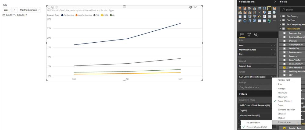
What I'm trying to do is a line chart that's basically the same as a 100% Stacked Column Chart, but displays in a line graph format
X Axis: Month Aggregates (Mar, April, May)
Y Axis: Percentages (0 - 100%)
Legend: Consists of 5 categories (Conforming, FHA, Non-Conforming, USDA, VA)
The line graph will initiallly plot the count of these values for each month in these different catgegories. There is an option to show the value as a percent of the grand total. However, i don't want the percent of the grand total. The grand total takes March values, and divides by the total of March, April, and May.
I would want the percent breakdown for each category just within a given month. So I want a % breakdown for Mar, one for April, and one for May and plot accordingly on the line graph. This is easily done with a 100% Stacked Column Chart as well as a Matrix. However, I can't get this to work for a Line Chart
Example:
Month: March
Conforming: 100
FHA: 50
NonConforming: 25
USDA: 10
VA: 5
Total: 190
So the % breakdown for the month of March is the following:
Conforming: 53%
FHA: 26%
NonConforming: 13%
USDA: 5%
VA: 3%
I don't want to take Conforming values for March (100) and divide them by the grand total of March, April and May.
Does this make sense any thoughts to work around this for a line chart?
- Mark as New
- Bookmark
- Subscribe
- Mute
- Subscribe to RSS Feed
- Permalink
- Report Inappropriate Content
Hi,
Please try this.
Measure =
DIVIDE (
    SUM ( Table1[Count] ),
    CALCULATE ( SUM ( Table1[Count] ), ALLSELECTED ( Table1[Category] ) )
)
- Mark as New
- Bookmark
- Subscribe
- Mute
- Subscribe to RSS Feed
- Permalink
- Report Inappropriate Content
- Mark as New
- Bookmark
- Subscribe
- Mute
- Subscribe to RSS Feed
- Permalink
- Report Inappropriate Content
Same issue with my report, please some one provide solution for this
- Mark as New
- Bookmark
- Subscribe
- Mute
- Subscribe to RSS Feed
- Permalink
- Report Inappropriate Content
same issue with me
- Mark as New
- Bookmark
- Subscribe
- Mute
- Subscribe to RSS Feed
- Permalink
- Report Inappropriate Content
- Mark as New
- Bookmark
- Subscribe
- Mute
- Subscribe to RSS Feed
- Permalink
- Report Inappropriate Content
Hi,
someone else who can help?
- Mark as New
- Bookmark
- Subscribe
- Mute
- Subscribe to RSS Feed
- Permalink
- Report Inappropriate Content
Could you create a column which calculates the percentage for the month, and then use a stacked line chart? If every month equals 100% it should look like a 100% stacked column chart.
Helpful resources

Power BI Monthly Update - April 2026
Check out the April 2026 Power BI update to learn about new features.

New to Fabric Survey
If you have recently started exploring Fabric, we'd love to hear how it's going. Your feedback can help with product improvements.

Power BI DataViz World Championships - June 2026
A new Power BI DataViz World Championship is coming this June! Don't miss out on submitting your entry.

| User | Count |
|---|---|
| 42 | |
| 38 | |
| 33 | |
| 21 | |
| 15 |
| User | Count |
|---|---|
| 64 | |
| 59 | |
| 31 | |
| 27 | |
| 25 |

