A new Data Days event is coming soon!
This time we’re going bigger than ever. Fabric, Power BI, SQL, AI and more. We're covering it all. You won't want to miss it.
Learn more- Power BI forums
- Get Help with Power BI
- Desktop
- Service
- Report Server
- Power Query
- Mobile Apps
- Developer
- DAX Commands and Tips
- Custom Visuals Development Discussion
- Health and Life Sciences
- Power BI Spanish forums
- Translated Spanish Desktop
- Training and Consulting
- Instructor Led Training
- Dashboard in a Day for Women, by Women
- Galleries
- Data Stories Gallery
- Themes Gallery
- Contests Gallery
- QuickViz Gallery
- Quick Measures Gallery
- Visual Calculations Gallery
- Notebook Gallery
- Translytical Task Flow Gallery
- TMDL Gallery
- R Script Showcase
- Webinars and Video Gallery
- Ideas
- Custom Visuals Ideas (read-only)
- Issues
- Issues
- Events
- Upcoming Events
Level up your Power BI skills this month - build one visual each week and tell better stories with data! Get started
- Power BI forums
- Forums
- Get Help with Power BI
- Desktop
- Re: Line Chart - Similar Problem but using numeric...
- Subscribe to RSS Feed
- Mark Topic as New
- Mark Topic as Read
- Float this Topic for Current User
- Bookmark
- Subscribe
- Printer Friendly Page
- Mark as New
- Bookmark
- Subscribe
- Mute
- Subscribe to RSS Feed
- Permalink
- Report Inappropriate Content
Line Chart - Similar Problem but using numerical data
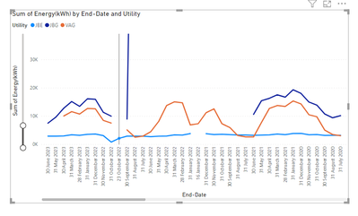
I wish to use a Line Chart visual to plot monthly utility usage for Gas & Electric meter readings. My meter data is sourced using dates and numbers in Excel. The readings are simple numbers not calculated values.
I wish to plot Energy Readings (y-axis) vs Time (x-axis).
Even though both the Excel and Power-BI Data type are both numerical and the data column is set to 'Don't summarize' when I drag the data into the y-axis well it is aggregated and labelled as 'COUNT OF...'. There is no 'Don't Sum' option offered.
I have found the document help page, 'Work with aggregates (Sum, average and so on) in Power BI', helpful but am still unable to solve the problem.
Thanks
Solved! Go to Solution.
- Mark as New
- Bookmark
- Subscribe
- Mute
- Subscribe to RSS Feed
- Permalink
- Report Inappropriate Content
Hi @Anonymous ,
Thanks for properly sharing the info.
I have checked it, it looks like this is standard feature of line chart and your data is that way. On one single date e.g. 30 Jun 2023, you show two data points and likewise many end dates have multiple energy readings, so if you plot a line chart with energy and end date, one single date on x axis has to show 2 data points or more, so it can show sum and count and so on but not the dont summarize option. Though if you use table visual for same data, you will see dont summarize option as well.
If you wish to see multiple data on one date, use some identifier as legend or with some other ways:
Hope it helps.
- Mark as New
- Bookmark
- Subscribe
- Mute
- Subscribe to RSS Feed
- Permalink
- Report Inappropriate Content
Hi @mahenkj2
Many thanks for this.
Pls find link to both files shared from Dropbox: Link to pbix in Dropbox Link to xlsx in Dropbox
Peter
- Mark as New
- Bookmark
- Subscribe
- Mute
- Subscribe to RSS Feed
- Permalink
- Report Inappropriate Content
Hi @Anonymous ,
Thanks for properly sharing the info.
I have checked it, it looks like this is standard feature of line chart and your data is that way. On one single date e.g. 30 Jun 2023, you show two data points and likewise many end dates have multiple energy readings, so if you plot a line chart with energy and end date, one single date on x axis has to show 2 data points or more, so it can show sum and count and so on but not the dont summarize option. Though if you use table visual for same data, you will see dont summarize option as well.
If you wish to see multiple data on one date, use some identifier as legend or with some other ways:
Hope it helps.
- Mark as New
- Bookmark
- Subscribe
- Mute
- Subscribe to RSS Feed
- Permalink
- Report Inappropriate Content
- Mark as New
- Bookmark
- Subscribe
- Mute
- Subscribe to RSS Feed
- Permalink
- Report Inappropriate Content
Hi @Anonymous
Pls post a sample data, better excel and power bi file both after removing any sensitive data.
Else paste data so as to simply copy, but better if u post in Excel and power bi file, easier to simulate.
Hope it helps.
Helpful resources

Power BI Monthly Update - April 2026
Check out the April 2026 Power BI update to learn about new features.

Data Days 2026 coming soon!
Sign up to receive a private message when registration opens and key events begin.

New to Fabric Survey
If you have recently started exploring Fabric, we'd love to hear how it's going. Your feedback can help with product improvements.

| User | Count |
|---|---|
| 38 | |
| 29 | |
| 28 | |
| 20 | |
| 18 |
| User | Count |
|---|---|
| 66 | |
| 36 | |
| 30 | |
| 25 | |
| 24 |

