FabCon is coming to Atlanta
Join us at FabCon Atlanta from March 16 - 20, 2026, for the ultimate Fabric, Power BI, AI and SQL community-led event. Save $200 with code FABCOMM.
Register now!- Power BI forums
- Get Help with Power BI
- Desktop
- Service
- Report Server
- Power Query
- Mobile Apps
- Developer
- DAX Commands and Tips
- Custom Visuals Development Discussion
- Health and Life Sciences
- Power BI Spanish forums
- Translated Spanish Desktop
- Training and Consulting
- Instructor Led Training
- Dashboard in a Day for Women, by Women
- Galleries
- Data Stories Gallery
- Themes Gallery
- Contests Gallery
- QuickViz Gallery
- Quick Measures Gallery
- Visual Calculations Gallery
- Notebook Gallery
- Translytical Task Flow Gallery
- TMDL Gallery
- R Script Showcase
- Webinars and Video Gallery
- Ideas
- Custom Visuals Ideas (read-only)
- Issues
- Issues
- Events
- Upcoming Events
Get Fabric Certified for FREE during Fabric Data Days. Don't miss your chance! Request now
- Power BI forums
- Forums
- Get Help with Power BI
- Desktop
- Line Chart Shadow area
- Subscribe to RSS Feed
- Mark Topic as New
- Mark Topic as Read
- Float this Topic for Current User
- Bookmark
- Subscribe
- Printer Friendly Page
- Mark as New
- Bookmark
- Subscribe
- Mute
- Subscribe to RSS Feed
- Permalink
- Report Inappropriate Content
Line Chart Shadow area
Hi,
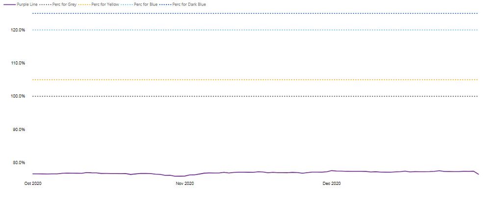
Are we able to somehow have the shadow area in the line chart ?
I have produced below chart:
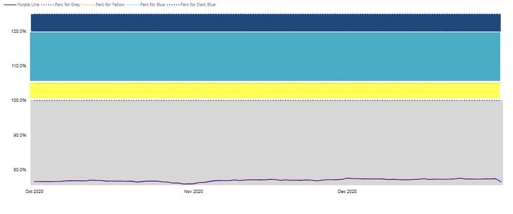
But ideally we would like to colour the dotted lines areas, something like below (purple line should be a line only!):
So it is something like having a area chart combined with the line chart.
Are you aware about any solutions to this ?
any tips or tricks are welcome! 🙂
Thanks in advance.
- Mark as New
- Bookmark
- Subscribe
- Mute
- Subscribe to RSS Feed
- Permalink
- Report Inappropriate Content
The Function as such, is not possible to develop with the visual objects developed; for these cases only on some occasions I have been able to duplicate the graph position it one on top of another and occupy the graph of lines in the graph and in the second the one of shadows with this gives the feeling that the behavior you mention is happening; although at the level of performance it is not optimal and I recommend you look for a supplementary way to generate the consumption of that information.
Best regards
Marcellus
- Mark as New
- Bookmark
- Subscribe
- Mute
- Subscribe to RSS Feed
- Permalink
- Report Inappropriate Content
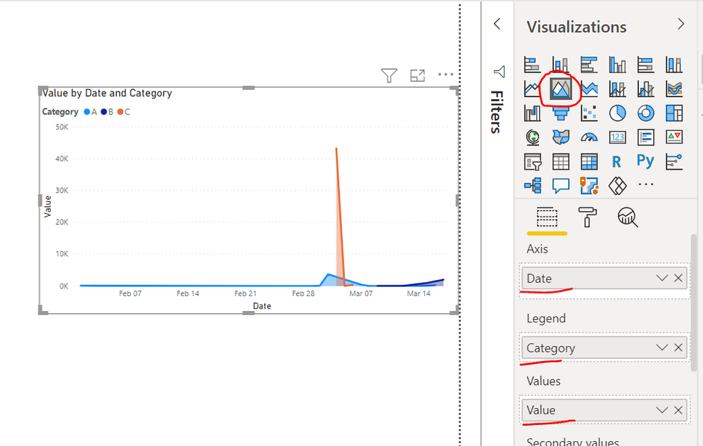
@Kopek Did you try Area Chart like below?
Please take a quick glance at newly created dashboards : Restaurant Management Dashboard , HR Analytics Report , Hotel Management Report, Sales Analysis Report , Fortune 500 Companies Analysis , Revenue Tracking Dashboard
- Mark as New
- Bookmark
- Subscribe
- Mute
- Subscribe to RSS Feed
- Permalink
- Report Inappropriate Content
@Tahreem24 yes, i did try this, but with area chart purple line will not be the line, but would have a shadow area as well...
i need purple line to be a line on grey area... just testing overlying the line chart on area chart.
- Mark as New
- Bookmark
- Subscribe
- Mute
- Subscribe to RSS Feed
- Permalink
- Report Inappropriate Content
Hi @Kopek ,
Based on my research, there is no such default visual to achieve your requirement in current Power BI visual. If you are good at coding, you could create your own custom visual to achieve this requirement.
https://powerbi.microsoft.com/en-us/documentation/powerbi-custom-visuals-getting-started-with-develo...
Best Regards,
Kelly
Did I answer your question? Mark my post as a solution!
Helpful resources

Power BI Monthly Update - November 2025
Check out the November 2025 Power BI update to learn about new features.

Fabric Data Days
Advance your Data & AI career with 50 days of live learning, contests, hands-on challenges, study groups & certifications and more!


