FabCon is coming to Atlanta
Join us at FabCon Atlanta from March 16 - 20, 2026, for the ultimate Fabric, Power BI, AI and SQL community-led event. Save $200 with code FABCOMM.
Register now!- Power BI forums
- Get Help with Power BI
- Desktop
- Service
- Report Server
- Power Query
- Mobile Apps
- Developer
- DAX Commands and Tips
- Custom Visuals Development Discussion
- Health and Life Sciences
- Power BI Spanish forums
- Translated Spanish Desktop
- Training and Consulting
- Instructor Led Training
- Dashboard in a Day for Women, by Women
- Galleries
- Data Stories Gallery
- Themes Gallery
- Contests Gallery
- QuickViz Gallery
- Quick Measures Gallery
- Visual Calculations Gallery
- Notebook Gallery
- Translytical Task Flow Gallery
- TMDL Gallery
- R Script Showcase
- Webinars and Video Gallery
- Ideas
- Custom Visuals Ideas (read-only)
- Issues
- Issues
- Events
- Upcoming Events
Get Fabric Certified for FREE during Fabric Data Days. Don't miss your chance! Request now
- Power BI forums
- Forums
- Get Help with Power BI
- Desktop
- Line Chart - Is it possible to have half of the ch...
- Subscribe to RSS Feed
- Mark Topic as New
- Mark Topic as Read
- Float this Topic for Current User
- Bookmark
- Subscribe
- Printer Friendly Page
- Mark as New
- Bookmark
- Subscribe
- Mute
- Subscribe to RSS Feed
- Permalink
- Report Inappropriate Content
Line Chart - Is it possible to have half of the chart as solid lines and the other half as dotted?
Hi all,
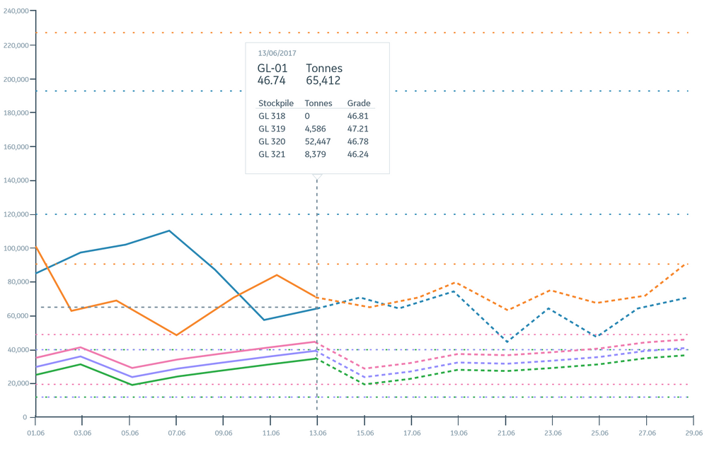
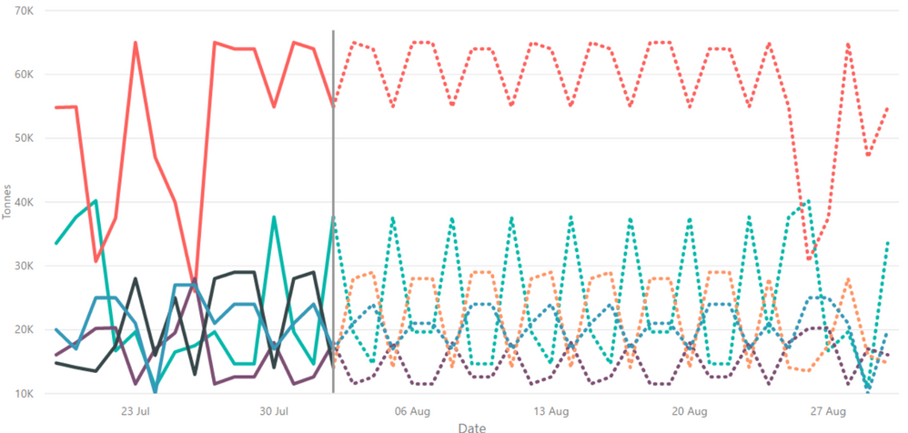
I have to series appended which I am displaying in the same line chart. I would like to have the data for one of the series to display as solid lines and the other series to display as dotted lines. Is this possible? When I change the shape to dotted lines it seems to change both series.
This is what I am trying to achieve:
Thanks,
Beatriz
Solved! Go to Solution.
- Mark as New
- Bookmark
- Subscribe
- Mute
- Subscribe to RSS Feed
- Permalink
- Report Inappropriate Content
Hi @tringuyenminh92,
I am able to follow the approach without using a measure, just selecting each series. I only have 10 series for now:
- Mark as New
- Bookmark
- Subscribe
- Mute
- Subscribe to RSS Feed
- Permalink
- Report Inappropriate Content
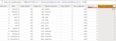
I have another solution for this problem! I create another column with the same values of the first one (the one you want to show) like that (Note the "2500" value on formula is random, just so we do not overwrite the original value):
after this I go to the line chart and put all two Values and rename one of these values to " " (just an space):
So now I have this:
After that, I go to "Format>Data Colors" and select for " " measure the same color of the background. After that you go to "Format>shapes>Customize series" select the " " measure and select Line style = Dashed. When you apply these filters you can see an override on the line plot after "TODAY()":
Best regards,
- Mark as New
- Bookmark
- Subscribe
- Mute
- Subscribe to RSS Feed
- Permalink
- Report Inappropriate Content
Hi @bmayz,
So far you could not customize x-axis like your expectation, but you could separate your measures to 2 parts (one measure for solid line and another for doted line). Adjust them to same color and ensure they have intersection point.
- Mark as New
- Bookmark
- Subscribe
- Mute
- Subscribe to RSS Feed
- Permalink
- Report Inappropriate Content
Hi @tringuyenminh92,
Thanks so much for your response. I'm new to Power BI, so, not sure how to set the measures for dotted and solid lines. I know how to create the measures but not how to customize the line style for them.
Could you please share the steps for this?
Thanks,
Beatriz
- Mark as New
- Bookmark
- Subscribe
- Mute
- Subscribe to RSS Feed
- Permalink
- Report Inappropriate Content
Hi @bmayz,
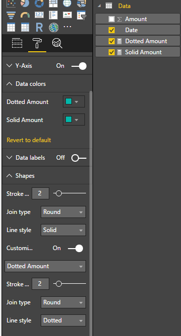
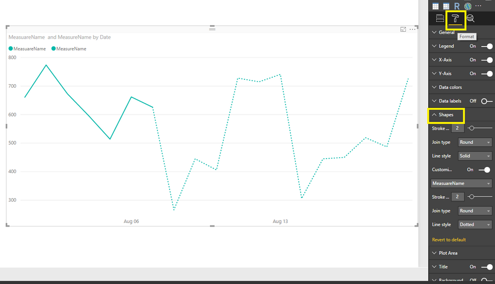
Please ensure you are using the newest version of PBI Desktop. In the Format option -> Shape -> choose measure you want to adjust
Create 2 calculated measure:

(To ensure there is no confusing for users, you could trick mesure name with one space)
- Mark as New
- Bookmark
- Subscribe
- Mute
- Subscribe to RSS Feed
- Permalink
- Report Inappropriate Content
This works great, thanks!
- Mark as New
- Bookmark
- Subscribe
- Mute
- Subscribe to RSS Feed
- Permalink
- Report Inappropriate Content
- Mark as New
- Bookmark
- Subscribe
- Mute
- Subscribe to RSS Feed
- Permalink
- Report Inappropriate Content
Hi @bmayz,
Firstly choose your chart -> in Format area -> choose Shapes -> Choose measure you want to customize
Hope you got it now.
- Mark as New
- Bookmark
- Subscribe
- Mute
- Subscribe to RSS Feed
- Permalink
- Report Inappropriate Content
Thanks @tringuyenminh92,
I was actually referring to this pane:
Thanks for posting your solution, whoever, I'm not sure it will work for me as I need to display the products in the legend rather than the measure names. I have multiple lines, each of them will have half of them solid and the other half should be dotted.
- Mark as New
- Bookmark
- Subscribe
- Mute
- Subscribe to RSS Feed
- Permalink
- Report Inappropriate Content
Hi @bmayz,
It's just workaround. How many items you have? if there are a few items, you could follow this approach.![]()
- Mark as New
- Bookmark
- Subscribe
- Mute
- Subscribe to RSS Feed
- Permalink
- Report Inappropriate Content
Hi @tringuyenminh92,
I am able to follow the approach without using a measure, just selecting each series. I only have 10 series for now:
- Mark as New
- Bookmark
- Subscribe
- Mute
- Subscribe to RSS Feed
- Permalink
- Report Inappropriate Content
- Mark as New
- Bookmark
- Subscribe
- Mute
- Subscribe to RSS Feed
- Permalink
- Report Inappropriate Content
Hi @bmayz,
I know this is old, but could you explain this solution to me? I am only able to get this to work by following tringuyenminh92's method and creating separate measures for each line rather than doing a legend. Were you somehow able to do it using one measure and a legend? If so, how? Thanks.
- Mark as New
- Bookmark
- Subscribe
- Mute
- Subscribe to RSS Feed
- Permalink
- Report Inappropriate Content
Hey there,
I know this has been a while but were you able to figure it out?
I wasn't able to replicate without creating separate measures for each line and it does not really work if I have a legend along with it with a slicer.
Thanks
- Mark as New
- Bookmark
- Subscribe
- Mute
- Subscribe to RSS Feed
- Permalink
- Report Inappropriate Content
Hi @bmayz,
Great to hear the problem got resolved! Could you accept your reply above as solution to close this thread(it will help others who has similar issue easily find the answer)? ![]()
Regards
Helpful resources

Power BI Monthly Update - November 2025
Check out the November 2025 Power BI update to learn about new features.

Fabric Data Days
Advance your Data & AI career with 50 days of live learning, contests, hands-on challenges, study groups & certifications and more!

