cancel
Showing results for 
Search instead for 
Did you mean: 

A new Data Days event is coming soon! This time we’re going bigger than ever. Fabric, Power BI, SQL, AI and more. Don't miss out.

Reply
rishtinz
Helper II
Helper II

Line Chart Coloring based on slicer selection

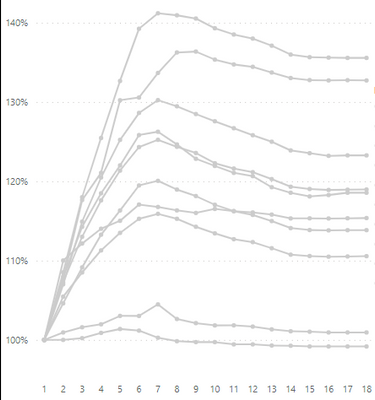
I have this line chart with values for different weeks. In the legend I've a department classification. I want to have slicer with Department values and I'd like the user to select a department and the chart only colors that department. 

Line chart doesn't allow me to do conditional coloring. Does anyone have a work around? could we use Calculation Items in Tabular Editor? 


rishtinz_0-1664893112944.png


1 ACCEPTED SOLUTION
PaulDBrown
Community Champion
Community Champion

Here is one way.

Create individual measures for each department. In my example they follow this pattern:


Classif A = 
CALCULATE(SUM(fTable[Classification]), 'Department Table'[Department] ="A")


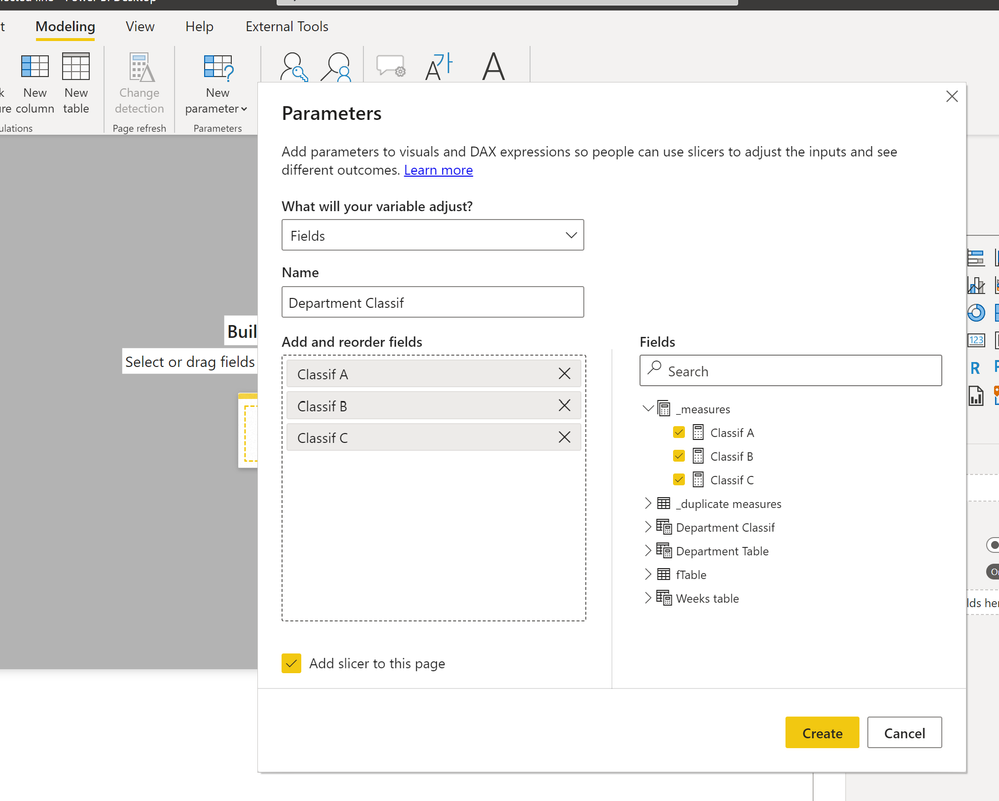
Next create a new Field parameter with all the individual measures:
Field parameter.png

Next duplicate the individual measures you created. In my example following this pattern (same measure; different name):


Points A = CALCULATE(SUM(fTable[Classification]), 'Department Table'[Department] ="A")


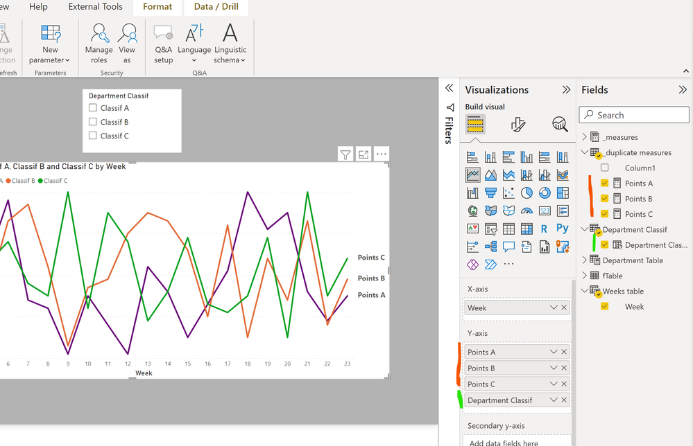
Next set up the line visual including the duplicate measures and the measure created by the field parameter (the order is important; the field parameter measure must be at the bottom of the bucket):
setup.png

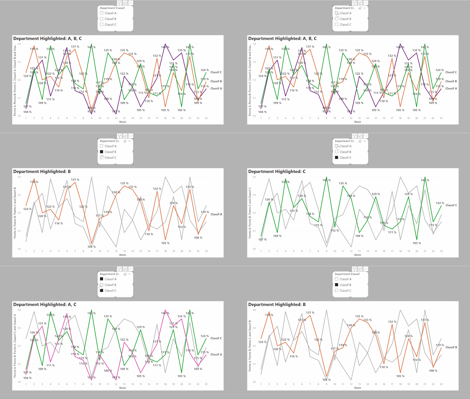
Now format the line colour so that only those included in the field parameter measure have a colour (I've made the colours different but you can use the same colour for these if you wish).

colours.png

 (I've also added selective labels for the FP parameter values)

And this is the result:
cf line1.gifI've attached a sample PBIX file


Did I answer your question? Mark my post as a solution!
In doing so, you are also helping me. Thank you!

Proud to be a Super User!
Paul on Linkedin.


View solution in original post

2 REPLIES 2
PaulDBrown
Community Champion
Community Champion

Here is one way.

Create individual measures for each department. In my example they follow this pattern:


Classif A = 
CALCULATE(SUM(fTable[Classification]), 'Department Table'[Department] ="A")


Next create a new Field parameter with all the individual measures:

Field parameter.png

Next duplicate the individual measures you created. In my example following this pattern (same measure; different name):


Points A = CALCULATE(SUM(fTable[Classification]), 'Department Table'[Department] ="A")


Next set up the line visual including the duplicate measures and the measure created by the field parameter (the order is important; the field parameter measure must be at the bottom of the bucket):

setup.png

Now format the line colour so that only those included in the field parameter measure have a colour (I've made the colours different but you can use the same colour for these if you wish).

colours.png

 (I've also added selective labels for the FP parameter values)

And this is the result:

cf line1.gifI've attached a sample PBIX file


Did I answer your question? Mark my post as a solution!
In doing so, you are also helping me. Thank you!

Proud to be a Super User!
Paul on Linkedin.


This worked perfectly for me. I just have to tweek it to control my filters but everything else worked as I wanted it. Thanks so much Paul for taking the time to respond to my question. appreciate it.

Helpful resources

Announcements
May Power BI Update Carousel

Power BI Monthly Update - May 2026

Check out the May 2026 Power BI update to learn about new features.

Fabric SQL PBI Data Days

Data Days 2026 coming soon!

Sign up to receive a private message when registration opens and key events begin.

New to Fabric survey Carousel

New to Fabric Survey

If you have recently started exploring Fabric, we'd love to hear how it's going. Your feedback can help with product improvements.

Power BI DataViz World Championships carousel

Power BI DataViz World Championships - June 2026

A new Power BI DataViz World Championship is coming this June! Don't miss out on submitting your entry.