Get Fabric certified for FREE!
Don't miss your chance to take the Fabric Data Engineer (DP-600) exam for FREE! Find out how by attending the DP-600 session on April 23rd (pacific time), live or on-demand.
Learn more- Power BI forums
- Get Help with Power BI
- Desktop
- Service
- Report Server
- Power Query
- Mobile Apps
- Developer
- DAX Commands and Tips
- Custom Visuals Development Discussion
- Health and Life Sciences
- Power BI Spanish forums
- Translated Spanish Desktop
- Training and Consulting
- Instructor Led Training
- Dashboard in a Day for Women, by Women
- Galleries
- Data Stories Gallery
- Themes Gallery
- Contests Gallery
- QuickViz Gallery
- Quick Measures Gallery
- Visual Calculations Gallery
- Notebook Gallery
- Translytical Task Flow Gallery
- TMDL Gallery
- R Script Showcase
- Webinars and Video Gallery
- Ideas
- Custom Visuals Ideas (read-only)
- Issues
- Issues
- Events
- Upcoming Events
Next up in the FabCon + SQLCon recap series: The roadmap for Microsoft SQL and Maximizing Developer experiences in Fabric. All sessions are available on-demand after the live show. Register now
- Power BI forums
- Forums
- Get Help with Power BI
- Desktop
- Language list visualization
- Subscribe to RSS Feed
- Mark Topic as New
- Mark Topic as Read
- Float this Topic for Current User
- Bookmark
- Subscribe
- Printer Friendly Page
- Mark as New
- Bookmark
- Subscribe
- Mute
- Subscribe to RSS Feed
- Permalink
- Report Inappropriate Content
Language list visualization
Hello Power BI Community,
Very new to Power BI so please feel free to ask any questions concerning clarity on the subject matter.
I am currently working on a project that compiles education courses from an EU institution across the EU. The project uses a sharepoint excel sheet to which combiles the course data into one sheet. One of the columns is labled Language and represents the languages that the course is taught in. The sheet is organized by course title (rows). Some of the courses are taught in English, while other are taught in several languages.
Currently, the cells with multiple languages are written as such:
Single langaue: English
Multiple languages: English ; Spanish ; Hungarian.
One of the visualizations that the client is interested in seeing is a pie chart with the ratio of all the languages that they teach in. What would be the best way to accomplish this?
Many thanks in advance,
-Joshua
Solved! Go to Solution.
- Mark as New
- Bookmark
- Subscribe
- Mute
- Subscribe to RSS Feed
- Permalink
- Report Inappropriate Content
Hi @JMHickman1987 ,
I think how to create visualization is based on your data model.
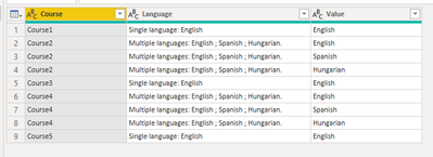
According to your statement, I think you data should look like as below.
You can transform your data in Power Query Editor and then create the pie chart.
let
    Source = Table.FromRows(Json.Document(Binary.Decompress(Binary.FromText("i45Wcs4vLSpONVTSUQrOzEvPSVXIScxLL01MT7VScAXyM4szlGJ1YMqMgMp8S3NKMguQFBbDVSpYKwQXJOZBWB6leemJRZmJeXoKSCYYE2eRCcUWmeK1KBYA", BinaryEncoding.Base64), Compression.Deflate)), let _t = ((type nullable text) meta [Serialized.Text = true]) in type table [Course = _t, Language = _t]),
    #"Changed Type" = Table.TransformColumnTypes(Source,{{"Course", type text}, {"Language", type text}}),
    #"Duplicated Column" = Table.DuplicateColumn(#"Changed Type", "Language", "Language - Copy"),
    #"Replaced Value" = Table.ReplaceValue(#"Duplicated Column","Single language: ","",Replacer.ReplaceText,{"Language - Copy"}),
    #"Replaced Value1" = Table.ReplaceValue(#"Replaced Value","Multiple languages: ","",Replacer.ReplaceText,{"Language - Copy"}),
    #"Split Column by Delimiter" = Table.SplitColumn(#"Replaced Value1", "Language - Copy", Splitter.SplitTextByDelimiter(";", QuoteStyle.Csv), {"Language - Copy.1", "Language - Copy.2", "Language - Copy.3"}),
    #"Unpivoted Columns" = Table.UnpivotOtherColumns(#"Split Column by Delimiter", {"Course", "Language"}, "Attribute", "Value"),
    #"Removed Columns" = Table.RemoveColumns(#"Unpivoted Columns",{"Attribute"}),
    #"Replaced Value2" = Table.ReplaceValue(#"Removed Columns"," ","",Replacer.ReplaceText,{"Value"}),
    #"Replaced Value3" = Table.ReplaceValue(#"Replaced Value2",".","",Replacer.ReplaceText,{"Value"})
in
    #"Replaced Value3"
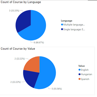
Here I create a sample with two pie charts, one is count courses by single or multiple and another is count courses by each language.
Best Regards,
Rico Zhou
If this post helps, then please consider Accept it as the solution to help the other members find it more quickly.
Helpful resources

New to Fabric Survey
If you have recently started exploring Fabric, we'd love to hear how it's going. Your feedback can help with product improvements.

Power BI DataViz World Championships - June 2026
A new Power BI DataViz World Championship is coming this June! Don't miss out on submitting your entry.

| User | Count |
|---|---|
| 46 | |
| 43 | |
| 39 | |
| 19 | |
| 15 |
| User | Count |
|---|---|
| 68 | |
| 67 | |
| 31 | |
| 27 | |
| 24 |


