A new Data Days event is coming soon!
This time we’re going bigger than ever. Fabric, Power BI, SQL, AI and more. We're covering it all. You won't want to miss it.
Learn more- Power BI forums
- Get Help with Power BI
- Desktop
- Service
- Report Server
- Power Query
- Mobile Apps
- Developer
- DAX Commands and Tips
- Custom Visuals Development Discussion
- Health and Life Sciences
- Power BI Spanish forums
- Translated Spanish Desktop
- Training and Consulting
- Instructor Led Training
- Dashboard in a Day for Women, by Women
- Galleries
- Data Stories Gallery
- Themes Gallery
- Contests Gallery
- QuickViz Gallery
- Quick Measures Gallery
- Visual Calculations Gallery
- Notebook Gallery
- Translytical Task Flow Gallery
- TMDL Gallery
- R Script Showcase
- Webinars and Video Gallery
- Ideas
- Custom Visuals Ideas (read-only)
- Issues
- Issues
- Events
- Upcoming Events
Level up your Power BI skills this month - build one visual each week and tell better stories with data! Get started
- Power BI forums
- Forums
- Get Help with Power BI
- Desktop
- Re: KPI Report
- Subscribe to RSS Feed
- Mark Topic as New
- Mark Topic as Read
- Float this Topic for Current User
- Bookmark
- Subscribe
- Printer Friendly Page
- Mark as New
- Bookmark
- Subscribe
- Mute
- Subscribe to RSS Feed
- Permalink
- Report Inappropriate Content
KPI Report
Hi,
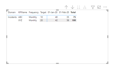
I want to create a KPI report in a table format (image attached). I have created measures for each month but how can I place this in the below format. Any idea? Thanks.
Solved! Go to Solution.
- Mark as New
- Bookmark
- Subscribe
- Mute
- Subscribe to RSS Feed
- Permalink
- Report Inappropriate Content
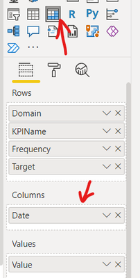
If you transform your data to this format in Power Query you can use the Date Field in a Matrix
Expand all down the hierarchy
Did I answer your question? Mark my post as a solution!
Proud to be a Super User!
- Mark as New
- Bookmark
- Subscribe
- Mute
- Subscribe to RSS Feed
- Permalink
- Report Inappropriate Content
There's a KPI Matrix visual in AppSource you could achieve a similar outcome only the historical data would be displayed in a sparkline which you can click on and expand to get the details.
You can download a sample workbook here:
Find the right app | Microsoft AppSource
Did I answer your question? Mark my post as a solution!
Proud to be a Super User!
- Mark as New
- Bookmark
- Subscribe
- Mute
- Subscribe to RSS Feed
- Permalink
- Report Inappropriate Content
@jk_adelaide , You hybrid table, not supported as of now, But refer to these workarounds
if you are looking for a Hybrid display with Matrix Column and measure
https://community.powerbi.com/t5/Community-Blog/Creating-a-custom-or-hybrid-matrix-in-PowerBI/ba-p/1...
https://community.powerbi.com/t5/Quick-Measures-Gallery/The-New-Hotness-Custom-Matrix-Hierarchy/m-p/...
vote for Hybrid Table
https://ideas.powerbi.com/ideas/idea/?ideaid=9bc32b23-1eb1-4e74-8b34-349887b37ebc
Helpful resources

Power BI Monthly Update - April 2026
Check out the April 2026 Power BI update to learn about new features.

Data Days 2026 coming soon!
Sign up to receive a private message when registration opens and key events begin.

New to Fabric Survey
If you have recently started exploring Fabric, we'd love to hear how it's going. Your feedback can help with product improvements.

| User | Count |
|---|---|
| 37 | |
| 32 | |
| 27 | |
| 24 | |
| 17 |
| User | Count |
|---|---|
| 70 | |
| 50 | |
| 31 | |
| 26 | |
| 22 |


