This is best Fabric, Power BI, SQL and AI community event. How do we know? The last event sold out! Save €200 with code FABCMTY200.
Register nowA new Data Days event is coming soon! This time we’re going bigger than ever. Fabric, Power BI, SQL, AI and more. Don't miss out.
Hi the community
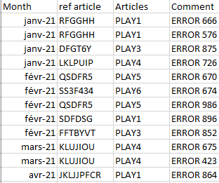
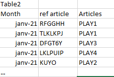
I have 2 tables that allow me to calculate anomalies on products
The first table below lists the anomalies found by month
The second table below lists all articles created by month
Using filters on dates and this measure "DISTINCTCOUNT(Table1[ref article]) / Count('Table2'[ref article)*100" I can display a percentage of anomaly on a period, which works very wel
What I would like now is to be able to make a graph with the % of anomaly each month to follow the evolution, my problem is that if I put in axis the month and in value my measurement it does not represent the % of anomaly per month
Do you know how I should proceed?
Hi @Cednok ,
You need to create a calendar table to make the relationship between both tables and then use it has you axis.
Seee below two links for creation of the table in DAX or on M
https://www.sqlbi.com/articles/creating-a-simple-date-table-in-dax/
https://www.mssqltips.com/sqlservertip/6756/power-bi-calendar-table/
Regards
Miguel Félix
Proud to be a Super User!
Check out my blog: Power BI em PortuguêsSorry but the result its the same i have the percentage on the period selectionned but not the fixed result on each months
Check out the May 2026 Power BI update to learn about new features.
Sign up to receive a private message when registration opens and key events begin.
If you have recently started exploring Fabric, we'd love to hear how it's going. Your feedback can help with product improvements.
| User | Count |
|---|---|
| 32 | |
| 26 | |
| 25 | |
| 24 | |
| 15 |
| User | Count |
|---|---|
| 63 | |
| 48 | |
| 27 | |
| 23 | |
| 20 |