A new Data Days event is coming soon!
This time we’re going bigger than ever. Fabric, Power BI, SQL, AI and more. We're covering it all. You won't want to miss it.
Learn more- Power BI forums
- Get Help with Power BI
- Desktop
- Service
- Report Server
- Power Query
- Mobile Apps
- Developer
- DAX Commands and Tips
- Custom Visuals Development Discussion
- Health and Life Sciences
- Power BI Spanish forums
- Translated Spanish Desktop
- Training and Consulting
- Instructor Led Training
- Dashboard in a Day for Women, by Women
- Galleries
- Data Stories Gallery
- Themes Gallery
- Contests Gallery
- QuickViz Gallery
- Quick Measures Gallery
- Visual Calculations Gallery
- Notebook Gallery
- Translytical Task Flow Gallery
- TMDL Gallery
- R Script Showcase
- Webinars and Video Gallery
- Ideas
- Custom Visuals Ideas (read-only)
- Issues
- Issues
- Events
- Upcoming Events
Level up your Power BI skills this month - build one visual each week and tell better stories with data! Get started
- Power BI forums
- Forums
- Get Help with Power BI
- Desktop
- Issue with Radar chart
- Subscribe to RSS Feed
- Mark Topic as New
- Mark Topic as Read
- Float this Topic for Current User
- Bookmark
- Subscribe
- Printer Friendly Page
- Mark as New
- Bookmark
- Subscribe
- Mute
- Subscribe to RSS Feed
- Permalink
- Report Inappropriate Content
Issue with Radar chart
Hello,
I have a question about using the radar chart visualization.
I am not able to overlay data on a radar chart by using the slicer visualization. It is not showing any overlay but only the "first", "last" or count result.
My data looks like this:
I would like to overlay sample 1 or 2 or 3 or ..., depending on which I would like to see with category A till M as the "category".
| Category | Sample 1 | Sample 2 | Sample 3 |
| A | 1 | 0.9 | 0.8 |
| B | 1.1 | 1 | 0.9 |
| C | 0.8 | 1.1 | 0.7 |
| D | 1.3 | 1.2 | 1.1 |
| E | 1.9 | 1.3 | 0.4 |
| F | 1.5 | 1.4 | 1.3 |
| G | 0.5 | 1.5 | 0.6 |
| H | 0.9 | 1.6 | 1.1 |
| I | 1 | 1.5 | 1.6 |
| J | 1.4 | 1.8 | 1 |
| K | 2 | 1.9 | 1.8 |
| L | 2.1 | 0.8 | 1.9 |
| M | 1.3 | 0.8 | 0.7 |
Can somenody help me solve this?
Thanks
Evert
Solved! Go to Solution.
- Mark as New
- Bookmark
- Subscribe
- Mute
- Subscribe to RSS Feed
- Permalink
- Report Inappropriate Content
Hi @evertfeyaerts,
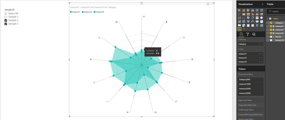
In your scenario, you may need to create different measures to calculate results for each Sample ID separately, then show all the measures as Y Axis on the Radar chart.
measure1 = CALCULATE(SUM(Table1[Results]),FILTER(Table1,Table1[Sample ID]="Sample 1"))
measure2 = CALCULATE(SUM(Table1[Results]),FILTER(Table1,Table1[Sample ID]="Sample 2"))
measure3 = CALCULATE(SUM(Table1[Results]),FILTER(Table1,Table1[Sample ID]="Sample 3"))
Here is the sample pbix file for your reference. ![]()
Regards
- Mark as New
- Bookmark
- Subscribe
- Mute
- Subscribe to RSS Feed
- Permalink
- Report Inappropriate Content
Hi @evertfeyaerts,
What column are you using as Slicer on your report?
Could you be more precisely with your issue by post some screenshots?
Regards
- Mark as New
- Bookmark
- Subscribe
- Mute
- Subscribe to RSS Feed
- Permalink
- Report Inappropriate Content
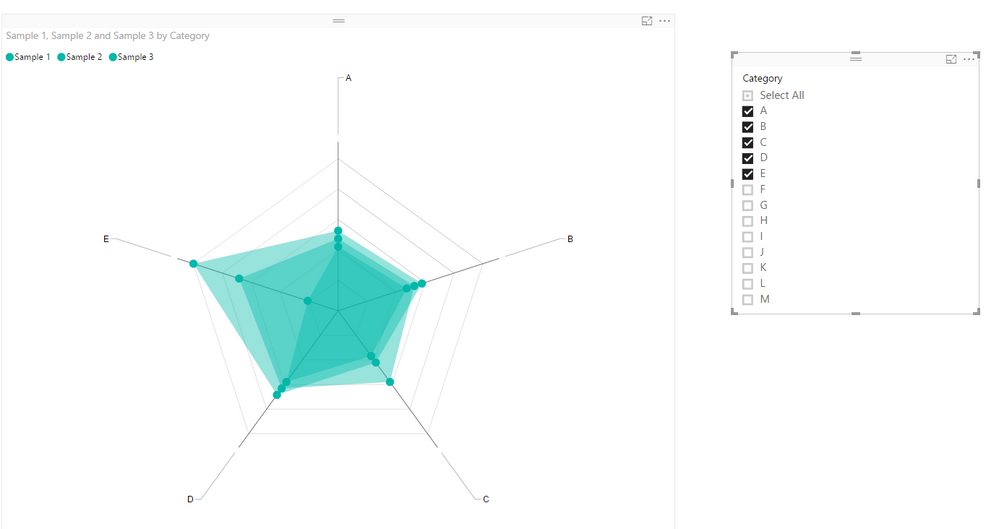
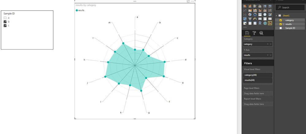
I am sorry, I added the wrong data. see below the correct data with some illustrations. The first picture of de radar chart gives me the data of 1 sample and the 2nd picture shows me a "count" of both data and not illustrated separately.
Thanks
- Mark as New
- Bookmark
- Subscribe
- Mute
- Subscribe to RSS Feed
- Permalink
- Report Inappropriate Content
Hi @evertfeyaerts,
In your scenario, you may need to create different measures to calculate results for each Sample ID separately, then show all the measures as Y Axis on the Radar chart.
measure1 = CALCULATE(SUM(Table1[Results]),FILTER(Table1,Table1[Sample ID]="Sample 1"))
measure2 = CALCULATE(SUM(Table1[Results]),FILTER(Table1,Table1[Sample ID]="Sample 2"))
measure3 = CALCULATE(SUM(Table1[Results]),FILTER(Table1,Table1[Sample ID]="Sample 3"))
Here is the sample pbix file for your reference. ![]()
Regards
- Mark as New
- Bookmark
- Subscribe
- Mute
- Subscribe to RSS Feed
- Permalink
- Report Inappropriate Content
Hello, I have a related question regarding the radar chart in PowerBI. I have a lot of different cases ( like in this example here sample 1, 2 and 3. I have like 100 different and want to avoid writing a measure for each individual one. Do you know a way to work around writing like a 100 measures and still have all "scenarios" visible on the radar chart? It is meant to be filtered, so there will only a few be visible at the same time.
Thank you in advance!
BR
- Mark as New
- Bookmark
- Subscribe
- Mute
- Subscribe to RSS Feed
- Permalink
- Report Inappropriate Content
Helpful resources

Power BI Monthly Update - April 2026
Check out the April 2026 Power BI update to learn about new features.

Data Days 2026 coming soon!
Sign up to receive a private message when registration opens and key events begin.

New to Fabric Survey
If you have recently started exploring Fabric, we'd love to hear how it's going. Your feedback can help with product improvements.

| User | Count |
|---|---|
| 35 | |
| 32 | |
| 25 | |
| 22 | |
| 18 |
| User | Count |
|---|---|
| 65 | |
| 35 | |
| 32 | |
| 25 | |
| 23 |


