FabCon is coming to Atlanta
Join us at FabCon Atlanta from March 16 - 20, 2026, for the ultimate Fabric, Power BI, AI and SQL community-led event. Save $200 with code FABCOMM.
Register now!- Power BI forums
- Get Help with Power BI
- Desktop
- Service
- Report Server
- Power Query
- Mobile Apps
- Developer
- DAX Commands and Tips
- Custom Visuals Development Discussion
- Health and Life Sciences
- Power BI Spanish forums
- Translated Spanish Desktop
- Training and Consulting
- Instructor Led Training
- Dashboard in a Day for Women, by Women
- Galleries
- Data Stories Gallery
- Themes Gallery
- Contests Gallery
- QuickViz Gallery
- Quick Measures Gallery
- Visual Calculations Gallery
- Notebook Gallery
- Translytical Task Flow Gallery
- TMDL Gallery
- R Script Showcase
- Webinars and Video Gallery
- Ideas
- Custom Visuals Ideas (read-only)
- Issues
- Issues
- Events
- Upcoming Events
The Power BI Data Visualization World Championships is back! Get ahead of the game and start preparing now! Learn more
- Power BI forums
- Forums
- Get Help with Power BI
- Desktop
- Re: Is logarithmic scale in power BI possible?
- Subscribe to RSS Feed
- Mark Topic as New
- Mark Topic as Read
- Float this Topic for Current User
- Bookmark
- Subscribe
- Printer Friendly Page
- Mark as New
- Bookmark
- Subscribe
- Mute
- Subscribe to RSS Feed
- Permalink
- Report Inappropriate Content
Is logarithmic scale in power BI possible?
HI ,
Is logarithmic scale in power BI possible
Thanks In Advance .
- Mark as New
- Bookmark
- Subscribe
- Mute
- Subscribe to RSS Feed
- Permalink
- Report Inappropriate Content
This still doesn't seem to be working correctly in May 2022. The LOG scale is disabled whenever a value is entered into the Min or Max fields. So it's impossible, for example, to have a log-scaled axis starting at 0.
- Mark as New
- Bookmark
- Subscribe
- Mute
- Subscribe to RSS Feed
- Permalink
- Report Inappropriate Content
Thank you @Phil_Seamark!! My line chart log trajectories of covid-19 deaths on the Data Stories Gallery was fine on log scale, until it later on new data quietly reset itself to linear (like @Anonymous)! It didn't give me the error when checking in Desktop (just the vague one about being not responsive) but this was the old problem of negatives. I appreciate mathematicians would have a heart attack but as it's only used for scaling, you'd have thought -10,000 could be rescaled in line with the positives (based on the start values!).
Anyway, the key is as you say, to set the Start Value - at 1 or 0.1 etc. Then problem solved, even with negatives in the data (but scaled accordingly as thought).
It's still a problem in x64 May update 2020, and is not mentioned in the docs! Fair enough to need a start value, but should be clearer or folk will miss out (or worse, it breaks to other users later) on this valuable functionality. Happy logging!
- Mark as New
- Bookmark
- Subscribe
- Mute
- Subscribe to RSS Feed
- Permalink
- Report Inappropriate Content
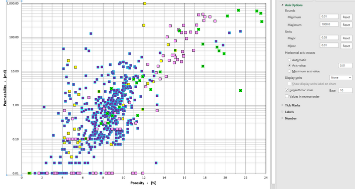
Is it possible to show major and minor lines in a logarithmic scale, similar to that shown on the Excel scatter chart shown below?
- Mark as New
- Bookmark
- Subscribe
- Mute
- Subscribe to RSS Feed
- Permalink
- Report Inappropriate Content
Hi @Vaishnavi_M,
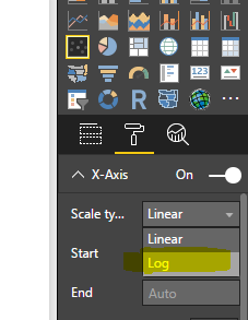
In scatter chart, the "Log" option is available in Scale Type property. You can use whole numbers in the resource data and seeing the option to change the scale from linear to log(please review the highlighted in yellow backgroud).
Log scale type is not available in bar charts and column charts currently based on my research.
The command R statement and create R visualization. The logarithmic scale can be used in R stament. For example, you can use ggplot2 function.
Thanks,
Angelia
- Mark as New
- Bookmark
- Subscribe
- Mute
- Subscribe to RSS Feed
- Permalink
- Report Inappropriate Content
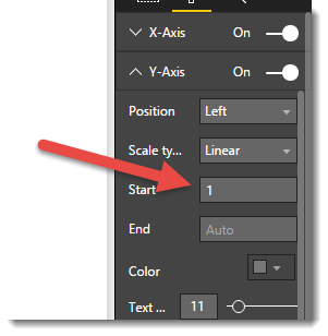
Log scale is now available on column and bar charts, but I also just hit that wierd little snag where the log option doesn't appear until you set the start value to 1.
Odd behaviour!
- Mark as New
- Bookmark
- Subscribe
- Mute
- Subscribe to RSS Feed
- Permalink
- Report Inappropriate Content
I found this thread by trying to overcome this very problem... For what it's worth, I now realise that it's not just values of 1 that you need to enter... Any non-zero value (other then 'Auto') will work... Just type in any suitable number.
- Mark as New
- Bookmark
- Subscribe
- Mute
- Subscribe to RSS Feed
- Permalink
- Report Inappropriate Content
- Mark as New
- Bookmark
- Subscribe
- Mute
- Subscribe to RSS Feed
- Permalink
- Report Inappropriate Content
Really??? I'm here because I just had the same issue... using Version 2.58.5103.501 (May 2018)...
Have I missed something?
- Mark as New
- Bookmark
- Subscribe
- Mute
- Subscribe to RSS Feed
- Permalink
- Report Inappropriate Content
Try using a Start value of 0.1
I had struggled with a similar issue - I had set up a combo chart (line + stacked column) with a log scale and it worked fine... but when I made some unrelated changes to some of my measures, the scale changed back to linear!
When I checked the Format panel, the Y-axis option for Scale type no longer showed "Log". Instead, it had a yellow triangle, with the tooltip message: "Can't apply log scale - The axis changed to a linear to accommodate both negative and positive values. To use a log scale, remove one set".
NOTE: I am confident my measure values did NOT have any negative values - I used a table visual to manually inspect the data. Then I even wrapped my measure in an IF statement to check if the measure value is < 0 and, if so, set the measure value to 0. But I still got the same error message.
Based on the advice in this forum, I tried entering a non-zero value in the start value, but unfortunately that did not work.
However, if I changed the Start field to a value *between* 0 and 1 (I started with 0.1) then it worked! The Log scale was magically back.
I then discovered that by changing the Start value (0.01, 0.001, etc.) I could change how "steep" the log axis values changed.
I did an extensive web search about this issue, but this forum was the closest I found to a solution.
Hopefully this modified workaround works for others.
EDITED: to add my current version: 2.59.5135.421 64-bit (June 2018). I don't know if this workaround will work in other versions.
- Mark as New
- Bookmark
- Subscribe
- Mute
- Subscribe to RSS Feed
- Permalink
- Report Inappropriate Content
Thanks for the detailed explanation of your hack for this annoying, obscure issue. I just bumped into this issue using the December 2021 update.
The one piece of good news I can add is that we can now specify the Axis Start value using a measure. So you can now set up a measure that returns 0 or 0.0001 (e.g. based on a disconnected slicer), and use that to drive the Axis Start property on your chart. Then with your measure returning 0.0001, you can choose Scale Type = Log. When the measure returns 0, the scale will crash back to Linear.
So now we have an elaborate hack-around, the product team need never resolve this issue... <sarcasm font>
- Mark as New
- Bookmark
- Subscribe
- Mute
- Subscribe to RSS Feed
- Permalink
- Report Inappropriate Content
I thought you used to have to enter a 0 for the start value, but I thought they changed it so you could have a value of 1.
Sorry if it doesn't work, I was just working off memory.
- Mark as New
- Bookmark
- Subscribe
- Mute
- Subscribe to RSS Feed
- Permalink
- Report Inappropriate Content
For what it's worth, I found this thread by searching... but it's not just a value of 1 you need to enter... It seems to be any value other then 'Auto'...
- Mark as New
- Bookmark
- Subscribe
- Mute
- Subscribe to RSS Feed
- Permalink
- Report Inappropriate Content
For some visuals, the Log option will not appear in the Scale Type drop down until after you override the Start value to be 1 instead of Auto
- Mark as New
- Bookmark
- Subscribe
- Mute
- Subscribe to RSS Feed
- Permalink
- Report Inappropriate Content
Thanks! Log didn't show up for me until I added a start value of 1. Weird 'bug'..
- Mark as New
- Bookmark
- Subscribe
- Mute
- Subscribe to RSS Feed
- Permalink
- Report Inappropriate Content
In what context? A visual? DAX? Query Editor?
Follow on LinkedIn
@ me in replies or I'll lose your thread!!!
Instead of a Kudo, please vote for this idea
Become an expert!: Enterprise DNA
External Tools: MSHGQM
YouTube Channel!: Microsoft Hates Greg
Latest book!: DAX For Humans
DAX is easy, CALCULATE makes DAX hard...
Helpful resources

Power BI Monthly Update - November 2025
Check out the November 2025 Power BI update to learn about new features.

Fabric Data Days
Advance your Data & AI career with 50 days of live learning, contests, hands-on challenges, study groups & certifications and more!

| User | Count |
|---|---|
| 58 | |
| 45 | |
| 42 | |
| 20 | |
| 18 |
| User | Count |
|---|---|
| 172 | |
| 110 | |
| 91 | |
| 55 | |
| 45 |


