Fabric Data Days starts November 4th!
Advance your Data & AI career with 50 days of live learning, dataviz contests, hands-on challenges, study groups & certifications and more!
Get registered- Power BI forums
- Get Help with Power BI
- Desktop
- Service
- Report Server
- Power Query
- Mobile Apps
- Developer
- DAX Commands and Tips
- Custom Visuals Development Discussion
- Health and Life Sciences
- Power BI Spanish forums
- Translated Spanish Desktop
- Training and Consulting
- Instructor Led Training
- Dashboard in a Day for Women, by Women
- Galleries
- Data Stories Gallery
- Themes Gallery
- Contests Gallery
- QuickViz Gallery
- Quick Measures Gallery
- Visual Calculations Gallery
- Notebook Gallery
- Translytical Task Flow Gallery
- TMDL Gallery
- R Script Showcase
- Webinars and Video Gallery
- Ideas
- Custom Visuals Ideas (read-only)
- Issues
- Issues
- Events
- Upcoming Events
Get Fabric Certified for FREE during Fabric Data Days. Don't miss your chance! Request now
- Power BI forums
- Forums
- Get Help with Power BI
- Desktop
- Re: Is it possible to have one persistent line to ...
- Subscribe to RSS Feed
- Mark Topic as New
- Mark Topic as Read
- Float this Topic for Current User
- Bookmark
- Subscribe
- Printer Friendly Page
- Mark as New
- Bookmark
- Subscribe
- Mute
- Subscribe to RSS Feed
- Permalink
- Report Inappropriate Content
Is it possible to have one persistent line to compare all other lines against?
We have data coming in at England level as well as more granular geographies. We would like to have the England line in our line chart visible regardless of the filters applied to the chart, so that whatever is selected can be compared to the England lines. Is this possible?
Solved! Go to Solution.
- Mark as New
- Bookmark
- Subscribe
- Mute
- Subscribe to RSS Feed
- Permalink
- Report Inappropriate Content
hi, @ABNHS84
Based on my research, you could use this way:
Step1:
Use this formula to add a dim group table.
Dim Group = UNION(VALUES('Table'[Group]),ROW("Group","persistent"))
Step2:
Create the relationship with basic data table.
Step3:
Create a measure by this formula:
Measure =
IF (
    SELECTEDVALUE ( 'Dim Group'[Group] ) = "persistent",
    CALCULATE (
        SUM ( 'Table'[Value] ),
        FILTER ( ALLEXCEPT ( 'Table', 'Table'[Month] ), 'Table'[Group] = "England" )
    ),
    CALCULATE ( SUM ( 'Table'[Value] ) )
)
Step4:
Now in the time series line chart, drag Group field from Dim Group table.
and use Group filed from basic data table as a slicer.
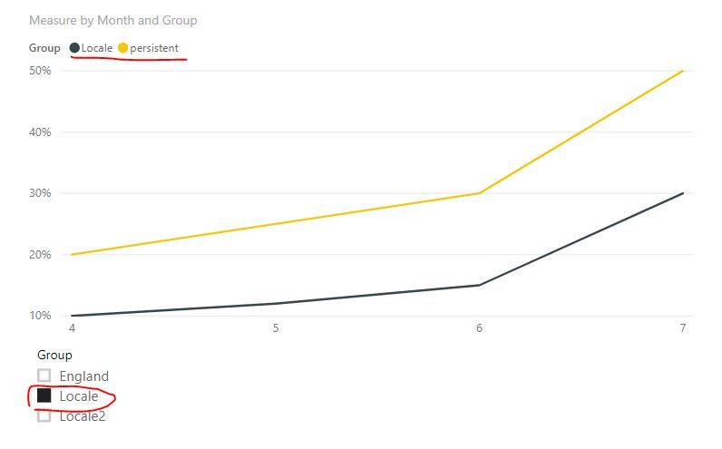
Result:
However, whatever the slicers are set to (although England is not selected), the line for England to remain visible (persistend line).
and here is pbix file, please try it.
Best Regards,
Lin
If this post helps, then please consider Accept it as the solution to help the other members find it more quickly.
- Mark as New
- Bookmark
- Subscribe
- Mute
- Subscribe to RSS Feed
- Permalink
- Report Inappropriate Content
Hi @ABNHS84
The below should do the trick.
england by measure =
CALCULATE(
    [measure],
    redion[country] = "England"
)
Hope this helps.
Mariusz
- Mark as New
- Bookmark
- Subscribe
- Mute
- Subscribe to RSS Feed
- Permalink
- Report Inappropriate Content
Thanks for the quick response Mariusz,
I don't think this solves by problem though.
I have data in the below format and want to produce a time series line chart. However, whatever the slicers are set to, I want to the line for England to remain visible.
+---------+-------+-----+------+------+
| Group   | April | May | June | July |
+---------+-------+-----+------+------+
| England | 20%   | 25% | 30%  | 50%  |
+---------+-------+-----+------+------+
| Locale   | 10%   | 12% | 15%  | 30%  |
+---------+-------+-----+------+------+
| locale2  | 20%   | 40% | 60%  | 70%  |
+---------+-------+-----+------+------+
- Mark as New
- Bookmark
- Subscribe
- Mute
- Subscribe to RSS Feed
- Permalink
- Report Inappropriate Content
Hi,
In the Query Editor, right click on the first column heading and Unpivot other columns. Create a slicer for Group and ensure that England is always selected in that slicer (along with any other Group). Now build your line chart visual.
Regards,
Ashish Mathur
http://www.ashishmathur.com
https://www.linkedin.com/in/excelenthusiasts/
- Mark as New
- Bookmark
- Subscribe
- Mute
- Subscribe to RSS Feed
- Permalink
- Report Inappropriate Content
hi, @ABNHS84
Based on my research, you could use this way:
Step1:
Use this formula to add a dim group table.
Dim Group = UNION(VALUES('Table'[Group]),ROW("Group","persistent"))
Step2:
Create the relationship with basic data table.
Step3:
Create a measure by this formula:
Measure =
IF (
    SELECTEDVALUE ( 'Dim Group'[Group] ) = "persistent",
    CALCULATE (
        SUM ( 'Table'[Value] ),
        FILTER ( ALLEXCEPT ( 'Table', 'Table'[Month] ), 'Table'[Group] = "England" )
    ),
    CALCULATE ( SUM ( 'Table'[Value] ) )
)
Step4:
Now in the time series line chart, drag Group field from Dim Group table.
and use Group filed from basic data table as a slicer.
Result:
However, whatever the slicers are set to (although England is not selected), the line for England to remain visible (persistend line).
and here is pbix file, please try it.
Best Regards,
Lin
If this post helps, then please consider Accept it as the solution to help the other members find it more quickly.
Helpful resources

Power BI Monthly Update - November 2025
Check out the November 2025 Power BI update to learn about new features.

Fabric Data Days
Advance your Data & AI career with 50 days of live learning, contests, hands-on challenges, study groups & certifications and more!

| User | Count |
|---|---|
| 97 | |
| 71 | |
| 50 | |
| 46 | |
| 44 |


