cancel
Showing results for 
Search instead for 
Did you mean: 

Level up your Power BI skills this month - build one visual each week and tell better stories with data! Get started

Reply
ABNHS84
Frequent Visitor

Is it possible to have one persistent line to compare all other lines against?

We have data coming in at England level as well as more granular geographies. We would like to have the England line in our line chart visible regardless of the filters applied to the chart, so that whatever is selected can be compared to the England lines. Is this possible?

1 ACCEPTED SOLUTION

hi, @ABNHS84 

Based on my research, you could use this way:

Step1:

Use this formula to add a dim group table.

Dim Group = UNION(VALUES('Table'[Group]),ROW("Group","persistent"))

Step2:

Create the relationship with basic data table.

Step3:

Create a measure by this formula:

Measure = 
IF (
    SELECTEDVALUE ( 'Dim Group'[Group] ) = "persistent",
    CALCULATE (
        SUM ( 'Table'[Value] ),
        FILTER ( ALLEXCEPT ( 'Table', 'Table'[Month] ), 'Table'[Group] = "England" )
    ),
    CALCULATE ( SUM ( 'Table'[Value] ) )
)

Step4:

Now in the time series line chart, drag Group field from Dim Group table.

and use Group filed from basic data table as a slicer.

Result:

1.JPG2.JPG

However, whatever the slicers are set to (although England is not selected), the line for England to remain visible (persistend line).


and here is pbix file, please try it.


Best Regards,

Lin

Community Support Team _ Lin
If this post helps, then please consider Accept it as the solution to help the other members find it more quickly.

View solution in original post

4 REPLIES 4
Mariusz
Community Champion
Community Champion

Hi @ABNHS84 

The below should do the trick.


england by measure = 
CALCULATE(
    [measure], 
    redion[country] = "England" 
)


Hope this helps.

Mariusz

Thanks for the quick response Mariusz,

I don't think this solves by problem though.


I have data in the below format and want to produce a time series line chart. However, whatever the slicers are set to, I want to the line for England to remain visible. 


+---------+-------+-----+------+------+
| Group   | April | May | June | July |
+---------+-------+-----+------+------+
| England | 20%   | 25% | 30%  | 50%  |
+---------+-------+-----+------+------+
| Locale   | 10%   | 12% | 15%  | 30%  |
+---------+-------+-----+------+------+
| locale2  | 20%   | 40% | 60%  | 70%  |
+---------+-------+-----+------+------+


Hi,

In the Query Editor, right click on the first column heading and Unpivot other columns.  Create a slicer for Group and ensure that England is always selected in that slicer (along with any other Group).  Now build your line chart visual.


Regards,
Ashish Mathur
http://www.ashishmathur.com
https://www.linkedin.com/in/excelenthusiasts/

hi, @ABNHS84 

Based on my research, you could use this way:

Step1:

Use this formula to add a dim group table.

Dim Group = UNION(VALUES('Table'[Group]),ROW("Group","persistent"))

Step2:

Create the relationship with basic data table.

Step3:

Create a measure by this formula:

Measure = 
IF (
    SELECTEDVALUE ( 'Dim Group'[Group] ) = "persistent",
    CALCULATE (
        SUM ( 'Table'[Value] ),
        FILTER ( ALLEXCEPT ( 'Table', 'Table'[Month] ), 'Table'[Group] = "England" )
    ),
    CALCULATE ( SUM ( 'Table'[Value] ) )
)

Step4:

Now in the time series line chart, drag Group field from Dim Group table.

and use Group filed from basic data table as a slicer.

Result:
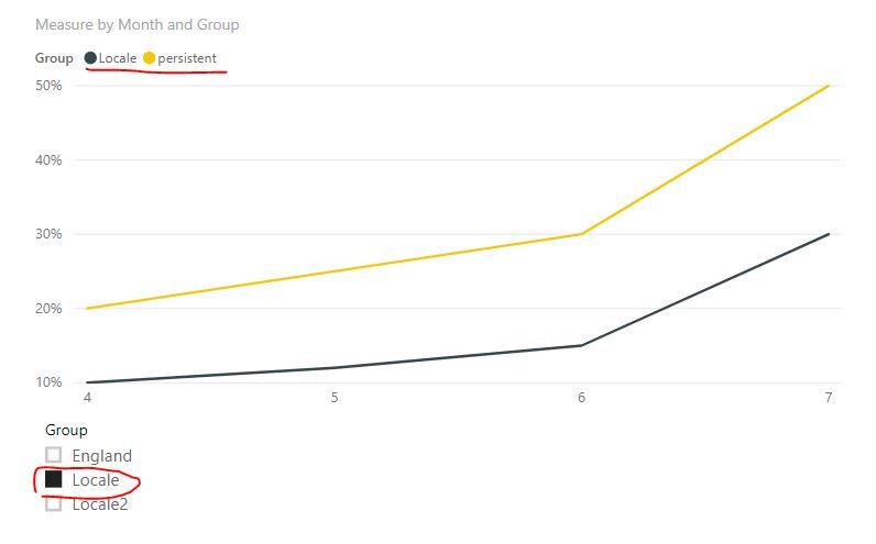
1.JPG2.JPG

However, whatever the slicers are set to (although England is not selected), the line for England to remain visible (persistend line).


and here is pbix file, please try it.


Best Regards,

Lin

Community Support Team _ Lin
If this post helps, then please consider Accept it as the solution to help the other members find it more quickly.

Helpful resources

Announcements
Fabric SQL PBI Data Days

Data Days 2026 coming soon!

Sign up to receive a private message when registration opens and key events begin.

New to Fabric survey Carousel

New to Fabric Survey

If you have recently started exploring Fabric, we'd love to hear how it's going. Your feedback can help with product improvements.

Power BI DataViz World Championships carousel

Power BI DataViz World Championships - June 2026

A new Power BI DataViz World Championship is coming this June! Don't miss out on submitting your entry.