FabCon is coming to Atlanta
Join us at FabCon Atlanta from March 16 - 20, 2026, for the ultimate Fabric, Power BI, AI and SQL community-led event. Save $200 with code FABCOMM.
Register now!- Power BI forums
- Get Help with Power BI
- Desktop
- Service
- Report Server
- Power Query
- Mobile Apps
- Developer
- DAX Commands and Tips
- Custom Visuals Development Discussion
- Health and Life Sciences
- Power BI Spanish forums
- Translated Spanish Desktop
- Training and Consulting
- Instructor Led Training
- Dashboard in a Day for Women, by Women
- Galleries
- Data Stories Gallery
- Themes Gallery
- Contests Gallery
- QuickViz Gallery
- Quick Measures Gallery
- Visual Calculations Gallery
- Notebook Gallery
- Translytical Task Flow Gallery
- TMDL Gallery
- R Script Showcase
- Webinars and Video Gallery
- Ideas
- Custom Visuals Ideas (read-only)
- Issues
- Issues
- Events
- Upcoming Events
The Power BI Data Visualization World Championships is back! Get ahead of the game and start preparing now! Learn more
- Power BI forums
- Forums
- Get Help with Power BI
- Desktop
- Re: Invert Y Axis
- Subscribe to RSS Feed
- Mark Topic as New
- Mark Topic as Read
- Float this Topic for Current User
- Bookmark
- Subscribe
- Printer Friendly Page
- Mark as New
- Bookmark
- Subscribe
- Mute
- Subscribe to RSS Feed
- Permalink
- Report Inappropriate Content
Invert Y Axis
Hi All,
I'm wanting to use Power BI for Google Analytics and website ranking reports.
One of the crucial parts that I'm struggling with is the Rankings line graph. Basically, in order to make the graph look positive, I need to invert the Y axis so that 0 is at the top and 100 is at the bottom. (A position of 1 is the best)
I can't seem to find any way of doing this.. In Excel you would simply reverse the axis but this option doesn't seem to be available in PowerBi.
Could anyone advise on how this could be achieved?
Thanks in advance.
Solved! Go to Solution.
- Mark as New
- Bookmark
- Subscribe
- Mute
- Subscribe to RSS Feed
- Permalink
- Report Inappropriate Content
Hi,
There is currently no option to invert the Y axis in your chart. Best workaround would be to multiply your values by -1.
Please leave a vote for this feature in our UserVoice forum:
https://support.powerbi.com/forums/265200-power-bi/category/91861-desktop
Thanks,
M.
- Mark as New
- Bookmark
- Subscribe
- Mute
- Subscribe to RSS Feed
- Permalink
- Report Inappropriate Content
This is still unresolved for such a simple capability? Excel does this at a beginning beginning level!
- Mark as New
- Bookmark
- Subscribe
- Mute
- Subscribe to RSS Feed
- Permalink
- Report Inappropriate Content
This was resolved months ago....
Did I answer your question? Mark my post as a solution!
In doing so, you are also helping me. Thank you!
Proud to be a Super User!
Paul on Linkedin.
- Mark as New
- Bookmark
- Subscribe
- Mute
- Subscribe to RSS Feed
- Permalink
- Report Inappropriate Content
That's for numerical data only. I'm using text that I want to sort.
- Mark as New
- Bookmark
- Subscribe
- Mute
- Subscribe to RSS Feed
- Permalink
- Report Inappropriate Content
Which visual are you using with text values for the y-axis?
Did I answer your question? Mark my post as a solution!
In doing so, you are also helping me. Thank you!
Proud to be a Super User!
Paul on Linkedin.
- Mark as New
- Bookmark
- Subscribe
- Mute
- Subscribe to RSS Feed
- Permalink
- Report Inappropriate Content
I am using a stacked bar chart.
This was working before (I believe), however got blown out due to some assistance from a coworker.
I figured out an oddity (at least to me) in that when I rearrange the X axis order in Visualizations, THAT rearranges the listing. So it doesen't seem that it's pulling from the data table. Like I said, I'm just starting to learn PBI, so bear with me if you would :), esp when/if I get terminology mixed up.
- Mark as New
- Bookmark
- Subscribe
- Mute
- Subscribe to RSS Feed
- Permalink
- Report Inappropriate Content
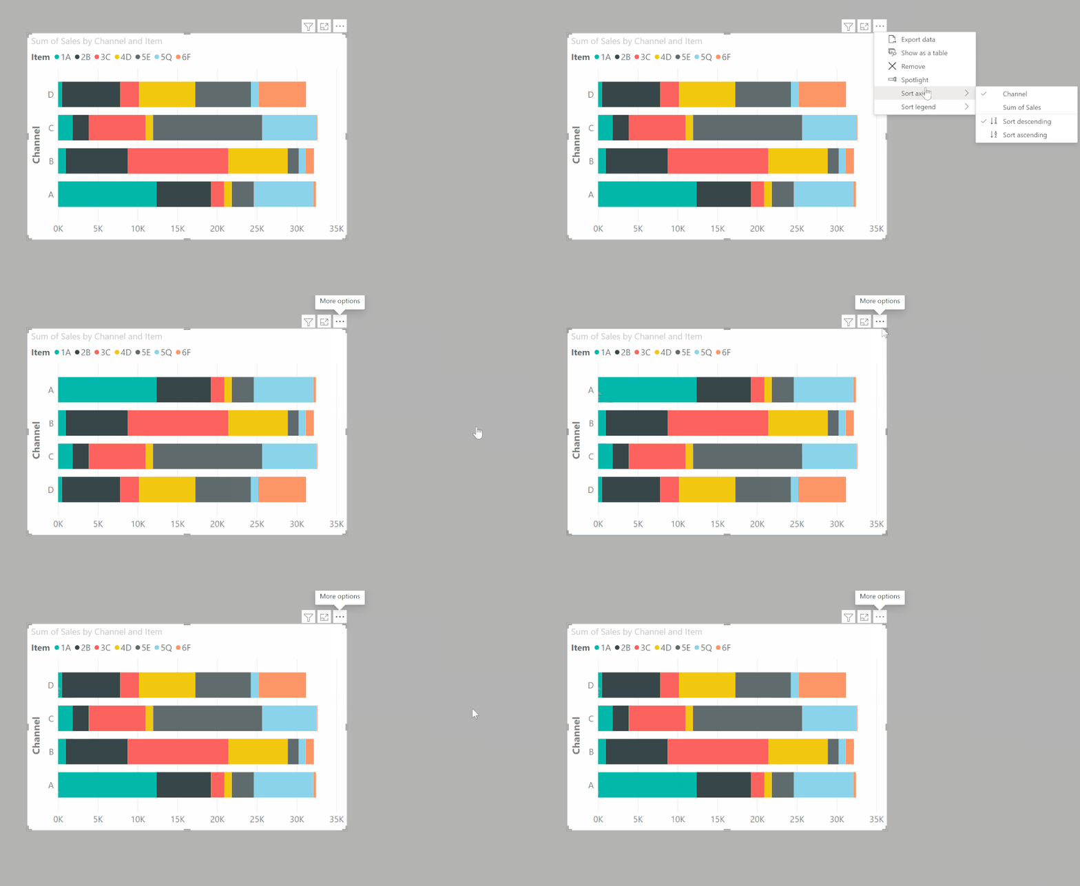
In that case use the sorting order in the actual visual, under the ellipsis:
Did I answer your question? Mark my post as a solution!
In doing so, you are also helping me. Thank you!
Proud to be a Super User!
Paul on Linkedin.
- Mark as New
- Bookmark
- Subscribe
- Mute
- Subscribe to RSS Feed
- Permalink
- Report Inappropriate Content
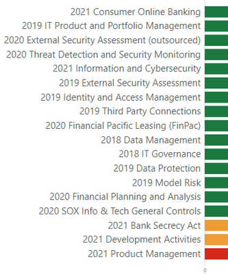
Thanks for following on with this, and yes, I see them. However... for Descending order:
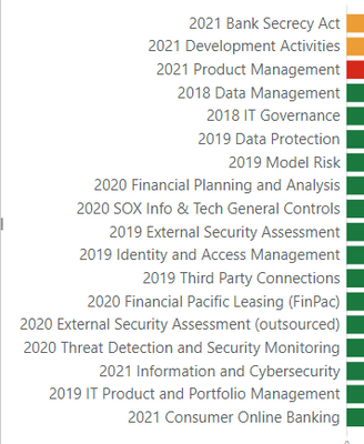
For Ascending order:
I'm just baffled...
Ideas?
Again, thanks for the assist on this. It just doesn't make any sense
- Mark as New
- Bookmark
- Subscribe
- Mute
- Subscribe to RSS Feed
- Permalink
- Report Inappropriate Content
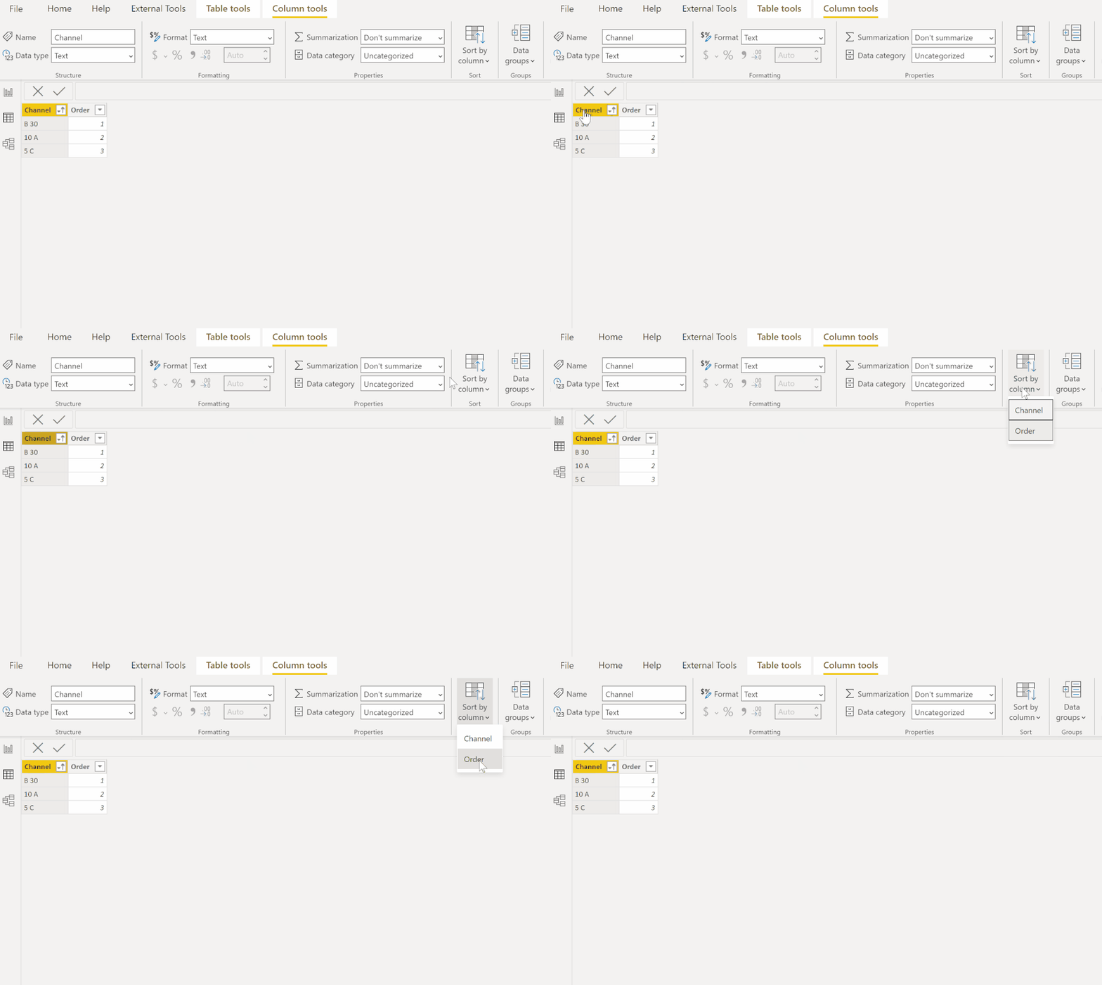
In that case, establish the order in the (dimension?) table using a sorting column ("order"), sorting the column by the order you have established,
and the order integrity will be maintained in the visual:
Did I answer your question? Mark my post as a solution!
In doing so, you are also helping me. Thank you!
Proud to be a Super User!
Paul on Linkedin.
- Mark as New
- Bookmark
- Subscribe
- Mute
- Subscribe to RSS Feed
- Permalink
- Report Inappropriate Content
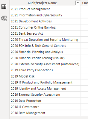
Are you talking in the table view? if so...
So that's already established there. I don't know what a dimension table is... and so now to add more to what I need to know more about 🙂 Is what I referenced is a 'Fact' table? I'm not sure how to add a dimension table... more youtube videos I guess...
- Mark as New
- Bookmark
- Subscribe
- Mute
- Subscribe to RSS Feed
- Permalink
- Report Inappropriate Content
Ideally you should be working with dimension tables (Best practices). The problem is that this field is a text field, so regardless of the apparent order you see, it may not actually be the order sorted as a text column.
Having said that, check that when you are sorting you have selected the actual field and not the value.
To get an order column, go into Power Query and add an index column (it take it the Audit/project field contains unique values?) under Add Column > Index. Use the index column to sort the field by in the table view (as per my first gif in my previous reply)
Did I answer your question? Mark my post as a solution!
In doing so, you are also helping me. Thank you!
Proud to be a Super User!
Paul on Linkedin.
- Mark as New
- Bookmark
- Subscribe
- Mute
- Subscribe to RSS Feed
- Permalink
- Report Inappropriate Content
Is there any update on this issue? It has been almost one year since the latest post in this thread...
- Mark as New
- Bookmark
- Subscribe
- Mute
- Subscribe to RSS Feed
- Permalink
- Report Inappropriate Content
@Anonymous
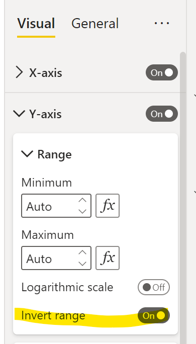
Here is one way of reversing the Y-Axis:
Did I answer your question? Mark my post as a solution!
In doing so, you are also helping me. Thank you!
Proud to be a Super User!
Paul on Linkedin.
- Mark as New
- Bookmark
- Subscribe
- Mute
- Subscribe to RSS Feed
- Permalink
- Report Inappropriate Content
Hi,
I found a solution to this problem.
To make the graph look positive , we can make a measure for the values and then multiply it with -1.
Then download a "multiple axis chart - XViz" and drag your measure into the values section. This will display an inverted chart but will show the data as negative values.
To change this go to number format and turn on semantic formatting.
Change the negative value format and positive value format to (X). You can change their colours as well. This will now show the values without the negative sign.
Regards Aman
- Mark as New
- Bookmark
- Subscribe
- Mute
- Subscribe to RSS Feed
- Permalink
- Report Inappropriate Content
Thanks for your solution @Anonymous,
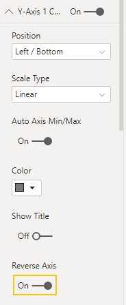
Now it's even easier using Multiple Axis Chart- xViz, as they added a new function to 'Reverse Axis', please see the screenshot below for navigation:
Edit: Darn, the visual is paid
- Mark as New
- Bookmark
- Subscribe
- Mute
- Subscribe to RSS Feed
- Permalink
- Report Inappropriate Content
Thank you. the -1 multiplication was normal but changing the representation was clever. Thanks. Its not a solution but its good enough while we wait ( somewhat impatiently ) for a product fix. Thanks
- Mark as New
- Bookmark
- Subscribe
- Mute
- Subscribe to RSS Feed
- Permalink
- Report Inappropriate Content
I had a similar requirement a few months ago and have recently pushlished the R-Script visual that I developed. Hopefully if can help you guys
Here's the link: https://community.powerbi.com/t5/R-Script-Showcase/Inverted-Y-Axis-with-Constants/m-p/671961
- Mark as New
- Bookmark
- Subscribe
- Mute
- Subscribe to RSS Feed
- Permalink
- Report Inappropriate Content
Any recent updates ? This is proving to be a major annoyance. The -1 solution "works" but wildly clumsy. Thanks
- Mark as New
- Bookmark
- Subscribe
- Mute
- Subscribe to RSS Feed
- Permalink
- Report Inappropriate Content
Hi DanWMG
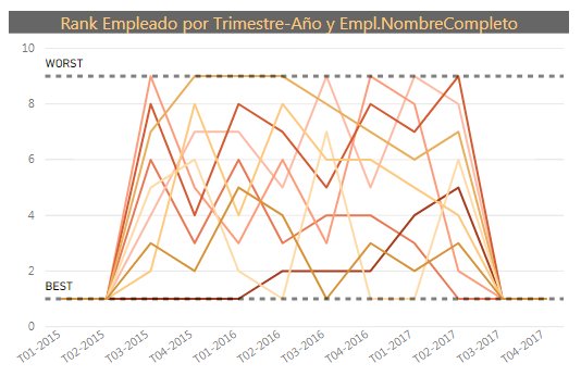
I have the same problem and, although it is not the ideal solution, I added to the chart two lines, one as a Maximum Value and the other with the minimum Value and I called them as "WORST" and BEST". The Visual looks like the image. Hope it will help you. Regards, Josep
- Mark as New
- Bookmark
- Subscribe
- Mute
- Subscribe to RSS Feed
- Permalink
- Report Inappropriate Content
Hi @mllopis,
Have they implemented this? if yes where can you do it?
Is there a custom visual that can do the same?
Best,
Jorge
- Mark as New
- Bookmark
- Subscribe
- Mute
- Subscribe to RSS Feed
- Permalink
- Report Inappropriate Content
There is no solution as of now but you can do it by multiplying your Y-axis dimension with -1 and call it [dimension name (inv)] or something like this.
Helpful resources

Power BI Dataviz World Championships
The Power BI Data Visualization World Championships is back! Get ahead of the game and start preparing now!

| User | Count |
|---|---|
| 39 | |
| 37 | |
| 33 | |
| 32 | |
| 29 |
| User | Count |
|---|---|
| 132 | |
| 88 | |
| 82 | |
| 68 | |
| 64 |
