Get certified for free when you join Fabric Data Days 2026 and dive into Fabric, Power BI, SQL, AI, and other essential data skills.
Join nowJuly 7 - July 17 | Round 2 of the Power BI Dataviz World Championships. Don't miss your chance! Learn more
Hi,
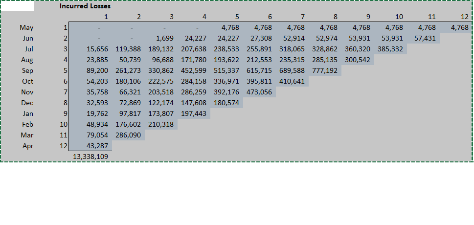
I was wondering if anyone has had any success in creating insurance Loss triangles in PowerBi? A typical claims loss triangle would show how losses develop over time for each period they were written in. eg...
Easy enough to create in Excel but I'm struggling in PowerBI and I can't find any custom visualisations.
Any advice greatly appreaciated, thanks
Solved! Go to Solution.
Hi @PowerPaddy,
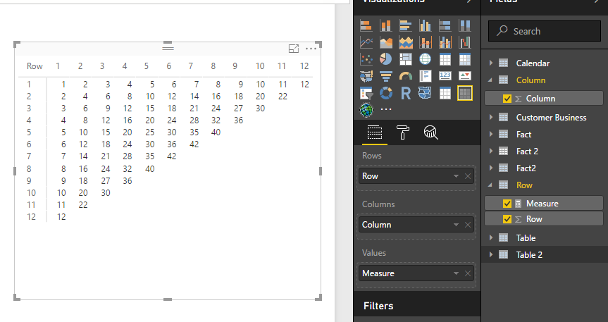
It is possible to create triangular matrix visual in power, you can refer to below sample to achieve your requirement.
Prerequisite: matrix preview visual, two table without relationship.
Measure:
Measure =
var current_Row=MAX('Row'[Row])
var current_Column=MAX('Column'[Column])
return
if(current_Row+current_Column<=13,current_Row*current_Column)
Regards,
Xiaoxin Sheng
Hi, might want to look at the follwoing blog -
https://insurancedatainsights.blog/2024/02/16/insurance-triangles-in-power-bi/
Hi @PowerPaddy,
It is possible to create triangular matrix visual in power, you can refer to below sample to achieve your requirement.
Prerequisite: matrix preview visual, two table without relationship.
Measure:
Measure =
var current_Row=MAX('Row'[Row])
var current_Column=MAX('Column'[Column])
return
if(current_Row+current_Column<=13,current_Row*current_Column)
Regards,
Xiaoxin Sheng
Join us in Barcelona for FabCon and SQLCon, the Fabric, Power BI, SQL, and AI community event. Save €200 with code FABCMTY200.
Join Data Days 2026: 60 days of free live/on-demand sessions, challenges, study groups, and certification opportunities.
| User | Count |
|---|---|
| 29 | |
| 23 | |
| 18 | |
| 18 | |
| 15 |
| User | Count |
|---|---|
| 51 | |
| 44 | |
| 43 | |
| 39 | |
| 32 |