FabCon is coming to Atlanta
Join us at FabCon Atlanta from March 16 - 20, 2026, for the ultimate Fabric, Power BI, AI and SQL community-led event. Save $200 with code FABCOMM.
Register now!- Power BI forums
- Get Help with Power BI
- Desktop
- Service
- Report Server
- Power Query
- Mobile Apps
- Developer
- DAX Commands and Tips
- Custom Visuals Development Discussion
- Health and Life Sciences
- Power BI Spanish forums
- Translated Spanish Desktop
- Training and Consulting
- Instructor Led Training
- Dashboard in a Day for Women, by Women
- Galleries
- Data Stories Gallery
- Themes Gallery
- Contests Gallery
- Quick Measures Gallery
- Notebook Gallery
- Translytical Task Flow Gallery
- TMDL Gallery
- R Script Showcase
- Webinars and Video Gallery
- Ideas
- Custom Visuals Ideas (read-only)
- Issues
- Issues
- Events
- Upcoming Events
To celebrate FabCon Vienna, we are offering 50% off select exams. Ends October 3rd. Request your discount now.
- Power BI forums
- Forums
- Get Help with Power BI
- Desktop
- Infographic designer problem after exporting
- Subscribe to RSS Feed
- Mark Topic as New
- Mark Topic as Read
- Float this Topic for Current User
- Bookmark
- Subscribe
- Printer Friendly Page
- Mark as New
- Bookmark
- Subscribe
- Mute
- Subscribe to RSS Feed
- Permalink
- Report Inappropriate Content
Infographic designer problem after exporting
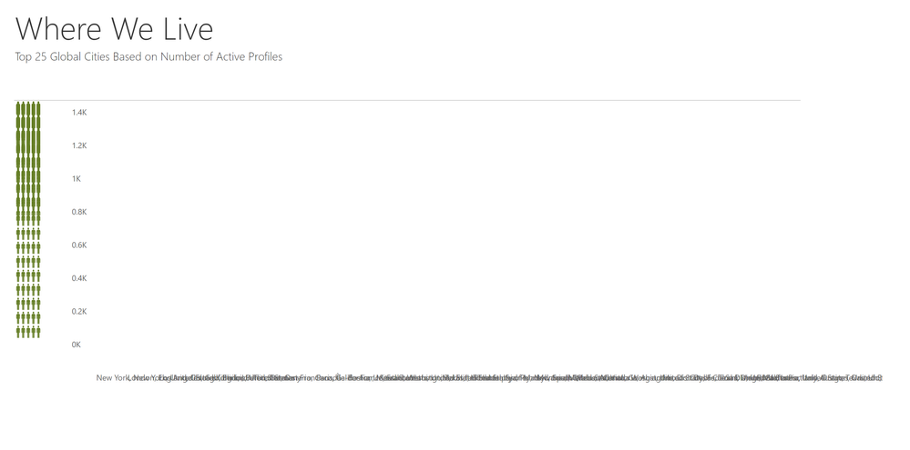
So I've been using the infographic designer for a few basic visualizations in a project without any problems over the last few weeks. Now it's suddenly acting up. Essentially, everything looks fine in the BI desktop application, but when viewing it after exporting/publishing, the visual is a complete mess. All the icons are crammed together on the left in a single column and the y axis turns into a giant word jumble.
I'm especially confused because this happened without me updating anything on my end. One day it looked perfect, the next, it was a mess. I tried re-exporting and the problem is still the same. Not sure if maybe they made an update that messed up the display? Anyone else have this issue? Any advice for fixing it?
Here's what I'm seeing in the BI desktop application:
And here's what it now looks like after publishing:
Anyone got any suggestion for fixes? I'd appreciate any help!!
- Mark as New
- Bookmark
- Subscribe
- Mute
- Subscribe to RSS Feed
- Permalink
- Report Inappropriate Content
I am having an issue with the icons 'flipping' in regards to the greatest number selected. Does anyone know how to keep the icons locked in place when slicing through different options?
- Mark as New
- Bookmark
- Subscribe
- Mute
- Subscribe to RSS Feed
- Permalink
- Report Inappropriate Content
I am having the same or similar problem. Started occuring today (4/9/2018). I wonder if it's related to the April update. I see the problem both in the desktop application and in the browser (Chrome and Edge).
- Mark as New
- Bookmark
- Subscribe
- Mute
- Subscribe to RSS Feed
- Permalink
- Report Inappropriate Content
All,
I am having the same issue too.
Any updates on this?
- Mark as New
- Bookmark
- Subscribe
- Mute
- Subscribe to RSS Feed
- Permalink
- Report Inappropriate Content
Try re-installing the visual. I believe the makers of the Infographic Designer reverted the visual to an earlier version to avoid this problem. I re-installed and this fixed the problem.
- Mark as New
- Bookmark
- Subscribe
- Mute
- Subscribe to RSS Feed
- Permalink
- Report Inappropriate Content
Hi @Grokio,
Do you use the latest version of Infographic Designer and latest version of Power BI Desktop? And do you encounter the above issue after publishing Power BI Desktop file to Power BI Service or using “Publish to Web” feature?
I am trying to test the scenario as yours, but I am not able to reproduce this issue. Could you please share me your PBIX file so that I can test it?
Thanks,
Lydia Zhang
- Mark as New
- Bookmark
- Subscribe
- Mute
- Subscribe to RSS Feed
- Permalink
- Report Inappropriate Content
Hey Lydia, yup! Just upgraded to the latest versions of both and still seeing the issue. It does appear to be a browser issue, possibly. I see it in Chrome, but in Edge and Safari it looks normal.
In the desktop application it looks normal. Then I click on "publish" and as soon as I open it in Chrome, it's all wrong. When I go to publish to web, it continues to not look right (except when viewing in Edge and Safari).
I tried contacting the folks who made the Infographic Designer to see if they might have a workaround.


