FabCon is coming to Atlanta
Join us at FabCon Atlanta from March 16 - 20, 2026, for the ultimate Fabric, Power BI, AI and SQL community-led event. Save $200 with code FABCOMM.
Register now!- Power BI forums
- Get Help with Power BI
- Desktop
- Service
- Report Server
- Power Query
- Mobile Apps
- Developer
- DAX Commands and Tips
- Custom Visuals Development Discussion
- Health and Life Sciences
- Power BI Spanish forums
- Translated Spanish Desktop
- Training and Consulting
- Instructor Led Training
- Dashboard in a Day for Women, by Women
- Galleries
- Data Stories Gallery
- Themes Gallery
- Contests Gallery
- QuickViz Gallery
- Quick Measures Gallery
- Visual Calculations Gallery
- Notebook Gallery
- Translytical Task Flow Gallery
- TMDL Gallery
- R Script Showcase
- Webinars and Video Gallery
- Ideas
- Custom Visuals Ideas (read-only)
- Issues
- Issues
- Events
- Upcoming Events
The Power BI Data Visualization World Championships is back! Get ahead of the game and start preparing now! Learn more
- Power BI forums
- Forums
- Get Help with Power BI
- Desktop
- Individual student's performance line chart with Y...
- Subscribe to RSS Feed
- Mark Topic as New
- Mark Topic as Read
- Float this Topic for Current User
- Bookmark
- Subscribe
- Printer Friendly Page
- Mark as New
- Bookmark
- Subscribe
- Mute
- Subscribe to RSS Feed
- Permalink
- Report Inappropriate Content
Individual student's performance line chart with Y axis as categories
Hello all,
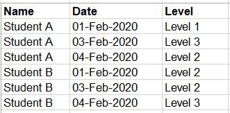
I need to visualize an improvement of a student's skills set by level and date. Here is the data I have:
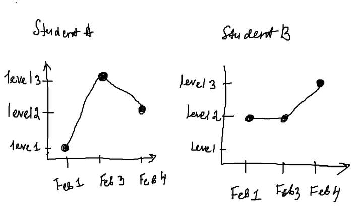
I need to draw a line chart per student with level names instead of Y axis and dates as X axis
I added a slicer to choose student's name, but it didn't work in Power BI
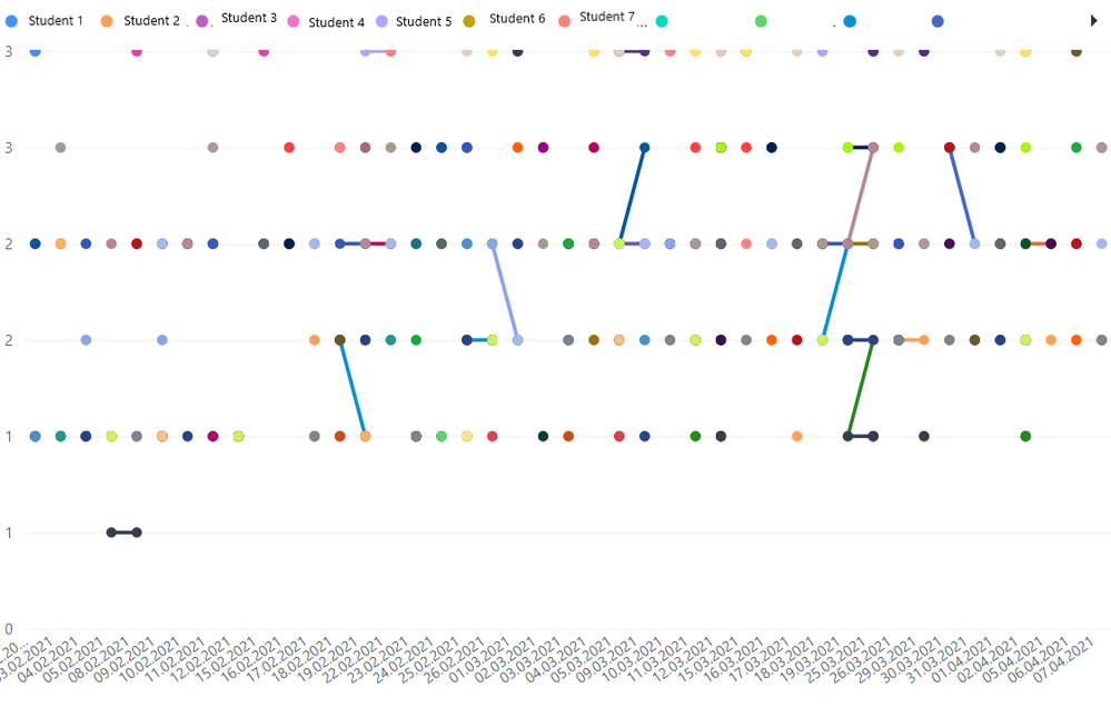
How can I draw a line chart like below?
I would appreciate your help!
Solved! Go to Solution.
- Mark as New
- Bookmark
- Subscribe
- Mute
- Subscribe to RSS Feed
- Permalink
- Report Inappropriate Content
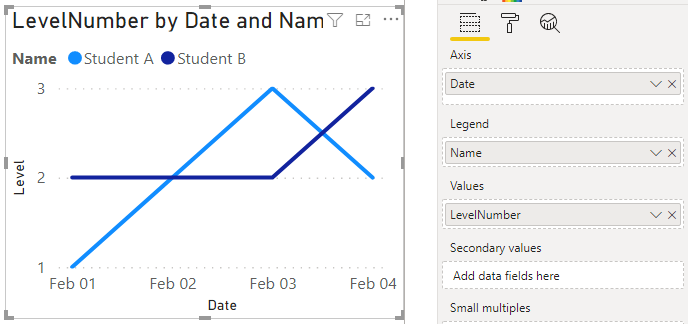
With the built-in line chart, you can get pretty close.
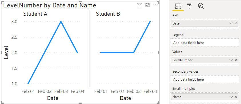
or
These both use a measure for the values.
I think you'd probably need a non-built-in visual to do the categorical Y axis with the lableing you specified.
- Mark as New
- Bookmark
- Subscribe
- Mute
- Subscribe to RSS Feed
- Permalink
- Report Inappropriate Content
Thank you it worked! now I have another problem with line chart. I have a filter with students' name and whenever I choose any of them I got mess on my line chart. Dots for each student do not connect with each other. How i can fix it? Appreciate your help!
- Mark as New
- Bookmark
- Subscribe
- Mute
- Subscribe to RSS Feed
- Permalink
- Report Inappropriate Content
Hi @LoonaMoon ,
I feel like you won't be able to use a "text" type field on the Y axis.
In return, I propose you to use a measure to extract only the numerical part of the "Level" column.
Measure = VALUE( RIGHT( MAX( 'Table' [Level] ) ) )
With this measure created, just add it on the "Values" section of the desired visual.
(I renamed it as "Level" on the visual to adapt the solution to the presented scenario).
Best Regards,
Eduardo
Helpful resources

Power BI Monthly Update - November 2025
Check out the November 2025 Power BI update to learn about new features.

Fabric Data Days
Advance your Data & AI career with 50 days of live learning, contests, hands-on challenges, study groups & certifications and more!

| User | Count |
|---|---|
| 58 | |
| 45 | |
| 42 | |
| 20 | |
| 18 |
| User | Count |
|---|---|
| 171 | |
| 110 | |
| 91 | |
| 55 | |
| 45 |
