FabCon is coming to Atlanta
Join us at FabCon Atlanta from March 16 - 20, 2026, for the ultimate Fabric, Power BI, AI and SQL community-led event. Save $200 with code FABCOMM.
Register now!- Power BI forums
- Get Help with Power BI
- Desktop
- Service
- Report Server
- Power Query
- Mobile Apps
- Developer
- DAX Commands and Tips
- Custom Visuals Development Discussion
- Health and Life Sciences
- Power BI Spanish forums
- Translated Spanish Desktop
- Training and Consulting
- Instructor Led Training
- Dashboard in a Day for Women, by Women
- Galleries
- Data Stories Gallery
- Themes Gallery
- Contests Gallery
- QuickViz Gallery
- Quick Measures Gallery
- Visual Calculations Gallery
- Notebook Gallery
- Translytical Task Flow Gallery
- TMDL Gallery
- R Script Showcase
- Webinars and Video Gallery
- Ideas
- Custom Visuals Ideas (read-only)
- Issues
- Issues
- Events
- Upcoming Events
The Power BI Data Visualization World Championships is back! Get ahead of the game and start preparing now! Learn more
- Power BI forums
- Forums
- Get Help with Power BI
- Desktop
- Re: Individual and Cumulative in a single visual
- Subscribe to RSS Feed
- Mark Topic as New
- Mark Topic as Read
- Float this Topic for Current User
- Bookmark
- Subscribe
- Printer Friendly Page
- Mark as New
- Bookmark
- Subscribe
- Mute
- Subscribe to RSS Feed
- Permalink
- Report Inappropriate Content
Individual and Cumulative in a single visual
Hi
For example on employee table, I need to show the number of employees in each department as well as total employees in a single visual.
I am able to do it in different visuals and keep side by side. Just checking if there is any possibility to keep them in a single visual.
Thanks
KVB
Solved! Go to Solution.
- Mark as New
- Bookmark
- Subscribe
- Mute
- Subscribe to RSS Feed
- Permalink
- Report Inappropriate Content
Hi @vkomarag,
You can create two measure using the formula.
Department = COUNTA(Table1[Employee])
Total = CALCULATE ( COUNTA ( Table1[Employee] ), ALL (Table1 ) )
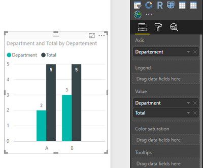
And select them as value field in bar chart. Please see the following screenshot, I use Cluster column chart, if you want to other bar chart, you can change it.
Thanks,
Angelia
- Mark as New
- Bookmark
- Subscribe
- Mute
- Subscribe to RSS Feed
- Permalink
- Report Inappropriate Content
Hi @vkomarag,
After test using the solution @dkay84_PowerBI posted using the following sample table.
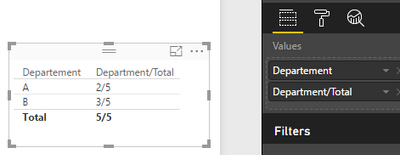
Then you get expected result.
If you still have problem, please share your sample data for further analysis.
Best Regards,
Angelia
- Mark as New
- Bookmark
- Subscribe
- Mute
- Subscribe to RSS Feed
- Permalink
- Report Inappropriate Content
Actually I need it in a bar chart in vertical representation.
- Mark as New
- Bookmark
- Subscribe
- Mute
- Subscribe to RSS Feed
- Permalink
- Report Inappropriate Content
Hi @vkomarag,
You can create two measure using the formula.
Department = COUNTA(Table1[Employee])
Total = CALCULATE ( COUNTA ( Table1[Employee] ), ALL (Table1 ) )
And select them as value field in bar chart. Please see the following screenshot, I use Cluster column chart, if you want to other bar chart, you can change it.
Thanks,
Angelia
- Mark as New
- Bookmark
- Subscribe
- Mute
- Subscribe to RSS Feed
- Permalink
- Report Inappropriate Content
Hi there,
You should be able to create a measure that concatenates two values. One for the total count of that column, and one for the count of rows of that department. It could look something like this:
Count of Employees
=COUNTA(Table[EmployeeID])
Count of ALL Employees
=
CALCULATE ( COUNTA ( Table[EmployeeID] ), ALL ( Table ) )
Concatenated Values
=
[Count of Employees] & " / " & [Count of ALL Employees]
You can this use this on a single card style or other visual. Hope this helps!
- Mark as New
- Bookmark
- Subscribe
- Mute
- Subscribe to RSS Feed
- Permalink
- Report Inappropriate Content
You can also use Tooltips to display the total on hover, where the actual components of the visual (i.e. columns or bars) show the value per department. Lastly, you can use a stacked column with department as legend to visually show the total (height of column) and breakdown by department (colors).
Helpful resources

Power BI Dataviz World Championships
The Power BI Data Visualization World Championships is back! Get ahead of the game and start preparing now!

| User | Count |
|---|---|
| 38 | |
| 38 | |
| 36 | |
| 28 | |
| 28 |
| User | Count |
|---|---|
| 124 | |
| 89 | |
| 73 | |
| 66 | |
| 65 |


