New Offer! Become a Certified Fabric Data Engineer
Check your eligibility for this 50% exam voucher offer and join us for free live learning sessions to get prepared for Exam DP-700.
Get Started- Power BI forums
- Get Help with Power BI
- Desktop
- Service
- Report Server
- Power Query
- Mobile Apps
- Developer
- DAX Commands and Tips
- Custom Visuals Development Discussion
- Health and Life Sciences
- Power BI Spanish forums
- Translated Spanish Desktop
- Training and Consulting
- Instructor Led Training
- Dashboard in a Day for Women, by Women
- Galleries
- Community Connections & How-To Videos
- COVID-19 Data Stories Gallery
- Themes Gallery
- Data Stories Gallery
- R Script Showcase
- Webinars and Video Gallery
- Quick Measures Gallery
- 2021 MSBizAppsSummit Gallery
- 2020 MSBizAppsSummit Gallery
- 2019 MSBizAppsSummit Gallery
- Events
- Ideas
- Custom Visuals Ideas
- Issues
- Issues
- Events
- Upcoming Events
Don't miss out! 2025 Microsoft Fabric Community Conference, March 31 - April 2, Las Vegas, Nevada. Use code MSCUST for a $150 discount. Prices go up February 11th. Register now.
- Power BI forums
- Forums
- Get Help with Power BI
- Desktop
- Ideas on how to achieve this visualization
- Subscribe to RSS Feed
- Mark Topic as New
- Mark Topic as Read
- Float this Topic for Current User
- Bookmark
- Subscribe
- Printer Friendly Page
- Mark as New
- Bookmark
- Subscribe
- Mute
- Subscribe to RSS Feed
- Permalink
- Report Inappropriate Content
Ideas on how to achieve this visualization
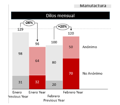
At work, I was asked to create a visualisation like the one below, showing the LastYear numbers in a different colour than CurrentYear and showing the changes between periods.
From a youtube video I learnt how to achieve something similar using a single column in the y-axis, but in this requirement I need to use 2 columns in the y-axis.
Is there any way to achieve this desired requirement?
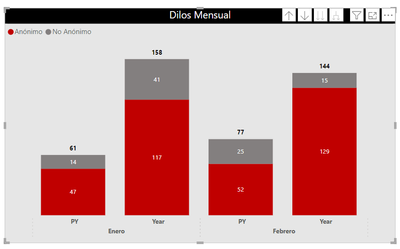
From my end I got this:
If there is no way to achieve the desired output, please feel free to suggest another type of visual to display the information.
Thank you very much!
Solved! Go to Solution.
- Mark as New
- Bookmark
- Subscribe
- Mute
- Subscribe to RSS Feed
- Permalink
- Report Inappropriate Content
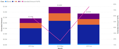
Hello! If you use the Line and Stacked Column Chart you can get a similar output - you can see the separation of categories in the columns and the YoY% difference in line. You just can't see the prior year total amount. Hope this helps!
Proud to be a Super User! |  |
- Mark as New
- Bookmark
- Subscribe
- Mute
- Subscribe to RSS Feed
- Permalink
- Report Inappropriate Content
Hello! If you use the Line and Stacked Column Chart you can get a similar output - you can see the separation of categories in the columns and the YoY% difference in line. You just can't see the prior year total amount. Hope this helps!
Proud to be a Super User! |  |
Helpful resources
| User | Count |
|---|---|
| 117 | |
| 73 | |
| 58 | |
| 49 | |
| 48 |
| User | Count |
|---|---|
| 171 | |
| 122 | |
| 60 | |
| 59 | |
| 56 |


