- Power BI forums
- Updates
- News & Announcements
- Get Help with Power BI
- Desktop
- Service
- Report Server
- Power Query
- Mobile Apps
- Developer
- DAX Commands and Tips
- Custom Visuals Development Discussion
- Health and Life Sciences
- Power BI Spanish forums
- Translated Spanish Desktop
- Power Platform Integration - Better Together!
- Power Platform Integrations (Read-only)
- Power Platform and Dynamics 365 Integrations (Read-only)
- Training and Consulting
- Instructor Led Training
- Dashboard in a Day for Women, by Women
- Galleries
- Community Connections & How-To Videos
- COVID-19 Data Stories Gallery
- Themes Gallery
- Data Stories Gallery
- R Script Showcase
- Webinars and Video Gallery
- Quick Measures Gallery
- 2021 MSBizAppsSummit Gallery
- 2020 MSBizAppsSummit Gallery
- 2019 MSBizAppsSummit Gallery
- Events
- Ideas
- Custom Visuals Ideas
- Issues
- Issues
- Events
- Upcoming Events
- Community Blog
- Power BI Community Blog
- Custom Visuals Community Blog
- Community Support
- Community Accounts & Registration
- Using the Community
- Community Feedback
Register now to learn Fabric in free live sessions led by the best Microsoft experts. From Apr 16 to May 9, in English and Spanish.
- Power BI forums
- Forums
- Get Help with Power BI
- Desktop
- Data shown in last 12 months - Visual
- Subscribe to RSS Feed
- Mark Topic as New
- Mark Topic as Read
- Float this Topic for Current User
- Bookmark
- Subscribe
- Printer Friendly Page
- Mark as New
- Bookmark
- Subscribe
- Mute
- Subscribe to RSS Feed
- Permalink
- Report Inappropriate Content
Data shown in last 12 months - Visual
Hello,
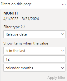
I need your support on adjusting visuals for one of the center : I have visual page for Instructor productivity and the filters on the page set is as follows:
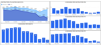
and it works for all the other centers as follows:
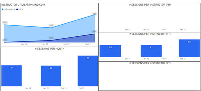
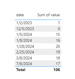
However for one of the center's which I recently added, visual shows in terms of dates instead of months:
Note : For all the other centers I have data for last 12 months and for the above one I have only have data from Jan 2024, is there any ways i can show data above in months for only Jan to March (3 months) instead of dates like Jan 14, Jan 28 etc
Thanks for your help.
Solved! Go to Solution.
- Mark as New
- Bookmark
- Subscribe
- Mute
- Subscribe to RSS Feed
- Permalink
- Report Inappropriate Content
Hi @pupadhya ,
It seems like the visual for the newly added center is showing data in terms of dates instead of aggregating it by months, which is different from how the other centers' data is displayed.
Please have a try.
Ensure that the visual level filter for the newly added center is set to aggregate data by month. This can be done by adjusting the filter settings in the visual's properties pane.
Or create relationships between the tables.
How to Get Your Question Answered Quickly - Microsoft Fabric Community
If it does not help, please provide more details with your desired output and pbix file without privacy information (or some sample data) .
Best Regards
Community Support Team _ Rongtie
If this post helps, then please consider Accept it as the solution to help the other members find it more quickly.
Helpful resources

Microsoft Fabric Learn Together
Covering the world! 9:00-10:30 AM Sydney, 4:00-5:30 PM CET (Paris/Berlin), 7:00-8:30 PM Mexico City

Power BI Monthly Update - April 2024
Check out the April 2024 Power BI update to learn about new features.

| User | Count |
|---|---|
| 108 | |
| 106 | |
| 87 | |
| 75 | |
| 66 |
| User | Count |
|---|---|
| 125 | |
| 114 | |
| 98 | |
| 81 | |
| 73 |
