FabCon is coming to Atlanta
Join us at FabCon Atlanta from March 16 - 20, 2026, for the ultimate Fabric, Power BI, AI and SQL community-led event. Save $200 with code FABCOMM.
Register now!- Power BI forums
- Get Help with Power BI
- Desktop
- Service
- Report Server
- Power Query
- Mobile Apps
- Developer
- DAX Commands and Tips
- Custom Visuals Development Discussion
- Health and Life Sciences
- Power BI Spanish forums
- Translated Spanish Desktop
- Training and Consulting
- Instructor Led Training
- Dashboard in a Day for Women, by Women
- Galleries
- Data Stories Gallery
- Themes Gallery
- Contests Gallery
- QuickViz Gallery
- Quick Measures Gallery
- Visual Calculations Gallery
- Notebook Gallery
- Translytical Task Flow Gallery
- TMDL Gallery
- R Script Showcase
- Webinars and Video Gallery
- Ideas
- Custom Visuals Ideas (read-only)
- Issues
- Issues
- Events
- Upcoming Events
Get Fabric Certified for FREE during Fabric Data Days. Don't miss your chance! Request now
- Power BI forums
- Forums
- Get Help with Power BI
- Desktop
- Re: How to show 2 years on x axis of bar chart whe...
- Subscribe to RSS Feed
- Mark Topic as New
- Mark Topic as Read
- Float this Topic for Current User
- Bookmark
- Subscribe
- Printer Friendly Page
- Mark as New
- Bookmark
- Subscribe
- Mute
- Subscribe to RSS Feed
- Permalink
- Report Inappropriate Content
How to show 2 years on x axis of bar chart when displaying months only?
Currently my data set has random dates between 01/01/2016 - 09/05/2017.
I'd like to show the count of dates per month spanning from the beginning of 2016 - present 2017, at the moment the count for months from 2017 are combining with those from 2016 and only forming 12 months along the x axis, rather than 17 months including the additional 5 from 2017.
Can anybody help?
Solved! Go to Solution.
- Mark as New
- Bookmark
- Subscribe
- Mute
- Subscribe to RSS Feed
- Permalink
- Report Inappropriate Content
Hi @HarryH
Try out the following
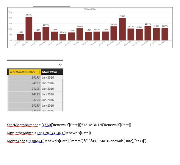
1. Create a column called YearMonthNumber as
YearMonthNumber = (Year('Sales'[Date])) * 12 + Month( 'Sales'[Date])
2. Create a column called MonthYear as
MonthYear = Format(Sales[Date],"mmm") & "-" & Format(Sales[Date],"yyyy")
3. Set the Sort by Coulmn for MonthYear to YearMonthNumber
4. Create a measure called DaysIntheMonth = DistinctCount(Sales[Date])
5. Now plot the barchart
with MonthYear as Axis and DaysIntheMonth as values.
6. You should get the Axis displayed for 17 months .
If this solves your issue please accept this as a solution and also give KUDOS.
Cheers
CheenuSing
- Mark as New
- Bookmark
- Subscribe
- Mute
- Subscribe to RSS Feed
- Permalink
- Report Inappropriate Content
Hello @Anonymous,
Sorry to be a pain.
I have one extra question.
I have created my new charts and they are excellent with data from my spreadsheet.
For example I might have list of 100 lines.
30 renewals & 70 settlements over 19 months.
Problem is when I am adding there measure from other spreadsheet.
I might have another excel with 200 lines.
I have measure 200-30 = 170
170 is conquest.
I can't visual conquest with renewals in my new chart.
I can visual them only in normal 12 month chart by date.
I have date table which links both spreadsheets.
Any idea how to sort this out?
Many thanks in advance.
Kind regards.
Andrej
- Mark as New
- Bookmark
- Subscribe
- Mute
- Subscribe to RSS Feed
- Permalink
- Report Inappropriate Content
Hello @Anonymous
Your tip was excelent.
I am facing now same issue.
I have still ony problem with sorting.
What I am doing wrongly?
I have MonthYear in Axis & me % rate in Values
Thx
- Mark as New
- Bookmark
- Subscribe
- Mute
- Subscribe to RSS Feed
- Permalink
- Report Inappropriate Content
Refer to point 3.
3. Set the Sort by Coulmn for MonthYear to YearMonthNumber.
This should resolve displaying the MonthYear in the correct order.
Cheers
CheenuSing
- Mark as New
- Bookmark
- Subscribe
- Mute
- Subscribe to RSS Feed
- Permalink
- Report Inappropriate Content
Hello @Anonymous,
I didn't know how to do taht but now it is fine.
Very Usefull.
Thanks.
Andrej
Helpful resources

Power BI Monthly Update - November 2025
Check out the November 2025 Power BI update to learn about new features.

Fabric Data Days
Advance your Data & AI career with 50 days of live learning, contests, hands-on challenges, study groups & certifications and more!


