FabCon is coming to Atlanta
Join us at FabCon Atlanta from March 16 - 20, 2026, for the ultimate Fabric, Power BI, AI and SQL community-led event. Save $200 with code FABCOMM.
Register now!- Power BI forums
- Get Help with Power BI
- Desktop
- Service
- Report Server
- Power Query
- Mobile Apps
- Developer
- DAX Commands and Tips
- Custom Visuals Development Discussion
- Health and Life Sciences
- Power BI Spanish forums
- Translated Spanish Desktop
- Training and Consulting
- Instructor Led Training
- Dashboard in a Day for Women, by Women
- Galleries
- Data Stories Gallery
- Themes Gallery
- Contests Gallery
- Quick Measures Gallery
- Notebook Gallery
- Translytical Task Flow Gallery
- TMDL Gallery
- R Script Showcase
- Webinars and Video Gallery
- Ideas
- Custom Visuals Ideas (read-only)
- Issues
- Issues
- Events
- Upcoming Events
Join the Fabric FabCon Global Hackathon—running virtually through Nov 3. Open to all skill levels. $10,000 in prizes! Register now.
- Power BI forums
- Forums
- Get Help with Power BI
- Desktop
- How to set vertical lines at the beginning of each...
- Subscribe to RSS Feed
- Mark Topic as New
- Mark Topic as Read
- Float this Topic for Current User
- Bookmark
- Subscribe
- Printer Friendly Page
- Mark as New
- Bookmark
- Subscribe
- Mute
- Subscribe to RSS Feed
- Permalink
- Report Inappropriate Content
How to set vertical lines at the beginning of each day in a time-series line graph
I would like to create a measure or use another method that sets vertical lines at the beginning of each day in the following time series plot:
The date column has hourly values. I would like to have a vertical line indicating the difference between days, similar to the plot below (which I made in paint) - at the start of every day.
Is there a way of doing so? My current issue with time series graphs is that they are hard to read and it is hard to distinguish between different days.
EDIT: Seems like there is no way to do this. Power BI is trash.
- Mark as New
- Bookmark
- Subscribe
- Mute
- Subscribe to RSS Feed
- Permalink
- Report Inappropriate Content
@arie_energy , You can follow the suggestion from @Luuky
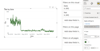
With a Date or number on X-axis , you get an option to have x-axis constant line too under the analytic pane with FX option, means you can add a measure or fixed date.
But 1 line will display as one point, so you have add A few
- Mark as New
- Bookmark
- Subscribe
- Mute
- Subscribe to RSS Feed
- Permalink
- Report Inappropriate Content
Yeah this really isn't going to work for me. I just want to have dynamically created vertical lines at the beginning of each day. My time series lasts a month so adding 30 vertical lines manually isn't going to help.
- Mark as New
- Bookmark
- Subscribe
- Mute
- Subscribe to RSS Feed
- Permalink
- Report Inappropriate Content
Hi @arie_energy ,
A quick tip to increase readability is to put on vertical gridlines.
Greeting,
Luuk
- Mark as New
- Bookmark
- Subscribe
- Mute
- Subscribe to RSS Feed
- Permalink
- Report Inappropriate Content
This does not help at all. This only helps when you display 5 days of data, but if its more it already skips a day. I am actually very disappointed by the fact that PowerBI doesn't have any capabilities of changing this.
Helpful resources

FabCon Global Hackathon
Join the Fabric FabCon Global Hackathon—running virtually through Nov 3. Open to all skill levels. $10,000 in prizes!

Power BI Monthly Update - September 2025
Check out the September 2025 Power BI update to learn about new features.


