FabCon is coming to Atlanta
Join us at FabCon Atlanta from March 16 - 20, 2026, for the ultimate Fabric, Power BI, AI and SQL community-led event. Save $200 with code FABCOMM.
Register now!- Power BI forums
- Get Help with Power BI
- Desktop
- Service
- Report Server
- Power Query
- Mobile Apps
- Developer
- DAX Commands and Tips
- Custom Visuals Development Discussion
- Health and Life Sciences
- Power BI Spanish forums
- Translated Spanish Desktop
- Training and Consulting
- Instructor Led Training
- Dashboard in a Day for Women, by Women
- Galleries
- Data Stories Gallery
- Themes Gallery
- Contests Gallery
- QuickViz Gallery
- Quick Measures Gallery
- Visual Calculations Gallery
- Notebook Gallery
- Translytical Task Flow Gallery
- TMDL Gallery
- R Script Showcase
- Webinars and Video Gallery
- Ideas
- Custom Visuals Ideas (read-only)
- Issues
- Issues
- Events
- Upcoming Events
Get Fabric Certified for FREE during Fabric Data Days. Don't miss your chance! Request now
- Power BI forums
- Forums
- Get Help with Power BI
- Desktop
- Re: How to set vertical lines at the beginning of ...
- Subscribe to RSS Feed
- Mark Topic as New
- Mark Topic as Read
- Float this Topic for Current User
- Bookmark
- Subscribe
- Printer Friendly Page
- Mark as New
- Bookmark
- Subscribe
- Mute
- Subscribe to RSS Feed
- Permalink
- Report Inappropriate Content
How to set vertical lines at the beginning of each day in a time-series line graph
I would like to create a measure or use another method that sets vertical lines at the beginning of each day in the following time series plot:
The date column has hourly values. I would like to have a vertical line indicating the difference between days, similar to the plot below (which I made in paint) - at the start of every day.
Is there a way of doing so? My current issue with time series graphs is that they are hard to read and it is hard to distinguish between different days.
EDIT: Seems like there is no way to do this. Power BI is trash.
- Mark as New
- Bookmark
- Subscribe
- Mute
- Subscribe to RSS Feed
- Permalink
- Report Inappropriate Content
@arie_energy , You can follow the suggestion from @Luuky
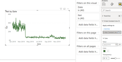
With a Date or number on X-axis , you get an option to have x-axis constant line too under the analytic pane with FX option, means you can add a measure or fixed date.
But 1 line will display as one point, so you have add A few
- Mark as New
- Bookmark
- Subscribe
- Mute
- Subscribe to RSS Feed
- Permalink
- Report Inappropriate Content
Yeah this really isn't going to work for me. I just want to have dynamically created vertical lines at the beginning of each day. My time series lasts a month so adding 30 vertical lines manually isn't going to help.
- Mark as New
- Bookmark
- Subscribe
- Mute
- Subscribe to RSS Feed
- Permalink
- Report Inappropriate Content
Hi @arie_energy ,
A quick tip to increase readability is to put on vertical gridlines.
Greeting,
Luuk
- Mark as New
- Bookmark
- Subscribe
- Mute
- Subscribe to RSS Feed
- Permalink
- Report Inappropriate Content
This does not help at all. This only helps when you display 5 days of data, but if its more it already skips a day. I am actually very disappointed by the fact that PowerBI doesn't have any capabilities of changing this.
Helpful resources

Power BI Monthly Update - November 2025
Check out the November 2025 Power BI update to learn about new features.

Fabric Data Days
Advance your Data & AI career with 50 days of live learning, contests, hands-on challenges, study groups & certifications and more!


