FabCon is coming to Atlanta
Join us at FabCon Atlanta from March 16 - 20, 2026, for the ultimate Fabric, Power BI, AI and SQL community-led event. Save $200 with code FABCOMM.
Register now!- Power BI forums
- Get Help with Power BI
- Desktop
- Service
- Report Server
- Power Query
- Mobile Apps
- Developer
- DAX Commands and Tips
- Custom Visuals Development Discussion
- Health and Life Sciences
- Power BI Spanish forums
- Translated Spanish Desktop
- Training and Consulting
- Instructor Led Training
- Dashboard in a Day for Women, by Women
- Galleries
- Data Stories Gallery
- Themes Gallery
- Contests Gallery
- Quick Measures Gallery
- Notebook Gallery
- Translytical Task Flow Gallery
- TMDL Gallery
- R Script Showcase
- Webinars and Video Gallery
- Ideas
- Custom Visuals Ideas (read-only)
- Issues
- Issues
- Events
- Upcoming Events
To celebrate FabCon Vienna, we are offering 50% off select exams. Ends October 3rd. Request your discount now.
- Power BI forums
- Forums
- Get Help with Power BI
- Desktop
- Re: How to plot box and whisker?
- Subscribe to RSS Feed
- Mark Topic as New
- Mark Topic as Read
- Float this Topic for Current User
- Bookmark
- Subscribe
- Printer Friendly Page
- Mark as New
- Bookmark
- Subscribe
- Mute
- Subscribe to RSS Feed
- Permalink
- Report Inappropriate Content
How to plot box and whisker?
Hi
I am trying to plot the min, max, median, 1st and 2nd quartile in Power BI. I thought a box plot would be the best, so I imported the box and whisker chart by Jan Pieter and the and the violin plot. I am confused about how to use these custom plots. Mainly at the Value setting, as usual for numerical fields I can choose to summarize it as max, min, median, mean etc, but I don't understand why this is the case. I thought the whole purpose of the chart is to generate those at once in the chart. I created a table with measures where I calculated the max, min, median and so on for reference. But the numbers don't match. Please see the snapshots where I used either Sum or Average to plot the charts. The numbers won' match my calculations. Why? How can I fix it?
Box and Whisker:
'Sum' applied.
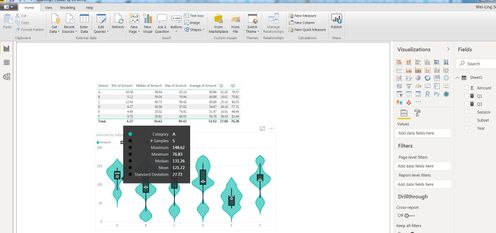
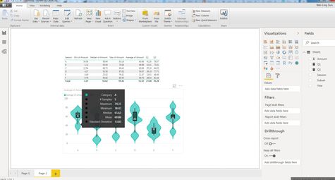
Average applied:
Violin Chart:
Sum applied:
Average applied:
Solved! Go to Solution.
- Mark as New
- Bookmark
- Subscribe
- Mute
- Subscribe to RSS Feed
- Permalink
- Report Inappropriate Content
Hi wsspglobal
According to your description, it seems that you want to understand the logic of above chart, right?
For whisker, you could find that it group on category, then calculate the max of sampling
For plot, you could find that it also group on “Category”, and calculate max, min based on “sampling”
So you could modify field in “Category ” and “sample” based on your requirement.
Best Regards,
Zoe Zhi
If this post helps, then please consider Accept it as the solution to help the other members find it more quickly.
- Mark as New
- Bookmark
- Subscribe
- Mute
- Subscribe to RSS Feed
- Permalink
- Report Inappropriate Content
Hi @wsspglobal - I just came across this post while browsing - I'm the author of the violin plot visual and may be able to help clarify its usage, if you're still experiencing some challenges.
This is documented here, but I'll walk through using your data.
You are correct that the visual should create all statistical measures, based on the data you feed into it. In its simplest terms, you need to be able to provide data at its lowest possible grain for this to be worked out correctly. If any of this data is pre-aggregated then it will not work.
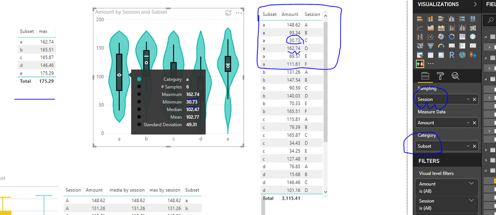
From your example, you are plotting Session as a Category and Amount as the Measure Data. If we only pass these in the the visual, then Power BI will aggregate Amount by Session - as you've already indicated in your screenshot - but to illustrate how this looks to the visual:
You will notice that the Amount is aggregated by the Session. In order for the visual to know more about the distribution of your data, we need to give it every row we can and this is where the Sampling field comes in.
You need to create a unique value for this field so that the visual does not aggregate the measure at a higher level. We'll look at your data and try and find a suitable candidate field.
An easy way to check this is by adding a measure that provides a count for the one you want to check. Let's have a look at Subset:
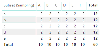
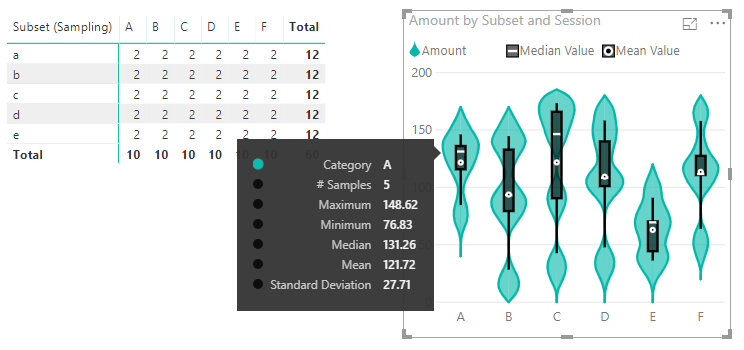
Note that there is a 2 in each column. This indicates that Subset is too high-level to provide all values of Amount to the visual, and we can see the resulting violin plot:
The tooltip says there's 5 samples, because there are 5 distinct values for Subset, and we actually need 10 because that;s what's in your raw data.
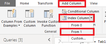
An ideal way to do this is to use something like a primary key in your table to do the sampling on. The puts the data at its lowest level of grain. You can do this in Power Query, e.g.:
- Add Column
- Index Column
- From 1
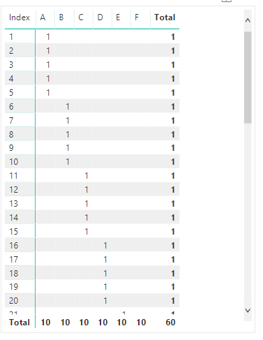
This creates a unique value for every row in your table, e.g.:
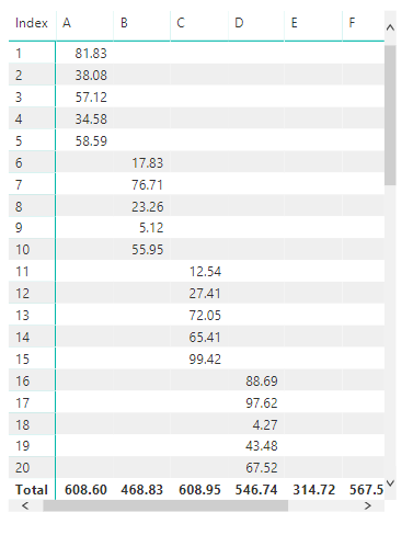
Close & Apply the query and this will get added to your table. Let's repeat the above 'Count Test' using Index:
We can now see that every row has a 1 in it, which means that for every row, the Amount is going to be as per the table and won't pre-aggregate, e.g.:
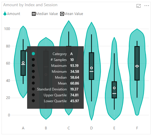
Now, we should add Index to the violin plot so replicate this behaviour, e.g.:
If we check the tooltip for A, we get the stats calculated, e.g.:
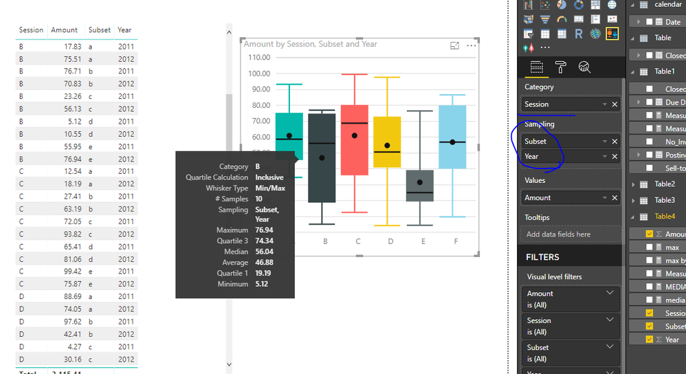
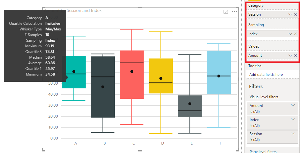
This technique will also work for the Box & Whisker Chart, e.g.:
Hopefully this helps clarify the usage and behaviour of both of these visuals, but feel free to ask anything else and I'll do my best to answer.
Good luck!
Daniel
Did I answer your question? Mark my post as a solution!
Proud to be a Super User!
On how to ask a technical question, if you really want an answer (courtesy of SQLBI)
- Mark as New
- Bookmark
- Subscribe
- Mute
- Subscribe to RSS Feed
- Permalink
- Report Inappropriate Content
Hi @dm-p,
I have stumbled accross this post and i found it extremely helpful for using the box and whisker plot shown above.
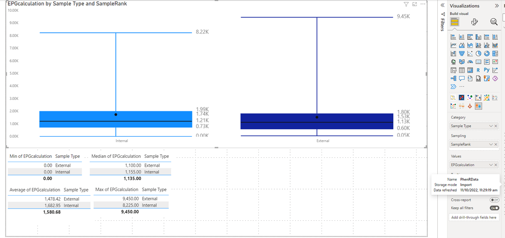
However, I am having a problem where the mean and median calculated with the built in agregation functions are not the same as the mean and median in the box and whisker chart.
Here we can see that the aggregations I have applied to "EPGcalculation" do not equal the same as those in the box and whisker chart.
Can you tell why this is happening?
Here is the link to mybpix file. all the data is from "bireportdata PhenRQCPlusData" and the visuals are on "Page 1".
https://techiongrouplimited-my.sharepoint.com/:u:/g/personal/ben_techiongroup_co_nz/EQw8qurSCo9Oo0SR...
Thanks in advance
- Mark as New
- Bookmark
- Subscribe
- Mute
- Subscribe to RSS Feed
- Permalink
- Report Inappropriate Content
Here's my data:
| Session | Subset | Year | Amount |
| A | a | 2011 | 81.82676 |
| A | b | 2011 | 38.07561 |
| A | c | 2011 | 57.11986 |
| A | d | 2011 | 34.58256 |
| A | e | 2011 | 58.59327 |
| B | a | 2011 | 17.83215 |
| B | b | 2011 | 76.71251 |
| B | c | 2011 | 23.25766 |
| B | d | 2011 | 5.124324 |
| B | e | 2011 | 55.95021 |
| C | a | 2011 | 12.54243 |
| C | b | 2011 | 27.4061 |
| C | c | 2011 | 72.05263 |
| C | d | 2011 | 65.40645 |
| C | e | 2011 | 99.42319 |
| D | a | 2011 | 88.69064 |
| D | b | 2011 | 97.62212 |
| D | c | 2011 | 4.266029 |
| D | d | 2011 | 43.47741 |
| D | e | 2011 | 67.51566 |
| E | a | 2011 | 26.86167 |
| E | b | 2011 | 4.488669 |
| E | c | 2011 | 25.73854 |
| E | d | 2011 | 76.41257 |
| E | e | 2011 | 20.14493 |
| F | a | 2011 | 40.40302 |
| F | b | 2011 | 85.39068 |
| F | c | 2011 | 40.93762 |
| F | d | 2011 | 42.4243 |
| F | e | 2011 | 32.9475 |
| A | a | 2012 | 66.79593 |
| A | b | 2012 | 93.1857 |
| A | c | 2012 | 58.68907 |
| A | d | 2012 | 42.2477 |
| A | e | 2012 | 77.47958 |
| B | a | 2012 | 75.50514 |
| B | b | 2012 | 70.82896 |
| B | c | 2012 | 56.12918 |
| B | d | 2012 | 10.55485 |
| B | e | 2012 | 76.93667 |
| C | a | 2012 | 18.18667 |
| C | b | 2012 | 63.1883 |
| C | c | 2012 | 93.8165 |
| C | d | 2012 | 81.05533 |
| C | e | 2012 | 75.86873 |
| D | a | 2012 | 74.05272 |
| D | b | 2012 | 42.40564 |
| D | c | 2012 | 30.16113 |
| D | d | 2012 | 57.68567 |
| D | e | 2012 | 40.86473 |
| E | a | 2012 | 42.71101 |
| E | b | 2012 | 65.83886 |
| E | c | 2012 | 8.514872 |
| E | d | 2012 | 19.7125 |
| E | e | 2012 | 24.29333 |
| F | a | 2012 | 71.20736 |
| F | b | 2012 | 80.1227 |
| F | c | 2012 | 86.54642 |
| F | d | 2012 | 9.776906 |
| F | e | 2012 | 77.82144 |
- Mark as New
- Bookmark
- Subscribe
- Mute
- Subscribe to RSS Feed
- Permalink
- Report Inappropriate Content
Hi wsspglobal
According to your description, it seems that you want to understand the logic of above chart, right?
For whisker, you could find that it group on category, then calculate the max of sampling
For plot, you could find that it also group on “Category”, and calculate max, min based on “sampling”
So you could modify field in “Category ” and “sample” based on your requirement.
Best Regards,
Zoe Zhi
If this post helps, then please consider Accept it as the solution to help the other members find it more quickly.
- Mark as New
- Bookmark
- Subscribe
- Mute
- Subscribe to RSS Feed
- Permalink
- Report Inappropriate Content
Hi @wsspglobal - I just came across this post while browsing - I'm the author of the violin plot visual and may be able to help clarify its usage, if you're still experiencing some challenges.
This is documented here, but I'll walk through using your data.
You are correct that the visual should create all statistical measures, based on the data you feed into it. In its simplest terms, you need to be able to provide data at its lowest possible grain for this to be worked out correctly. If any of this data is pre-aggregated then it will not work.
From your example, you are plotting Session as a Category and Amount as the Measure Data. If we only pass these in the the visual, then Power BI will aggregate Amount by Session - as you've already indicated in your screenshot - but to illustrate how this looks to the visual:
You will notice that the Amount is aggregated by the Session. In order for the visual to know more about the distribution of your data, we need to give it every row we can and this is where the Sampling field comes in.
You need to create a unique value for this field so that the visual does not aggregate the measure at a higher level. We'll look at your data and try and find a suitable candidate field.
An easy way to check this is by adding a measure that provides a count for the one you want to check. Let's have a look at Subset:
Note that there is a 2 in each column. This indicates that Subset is too high-level to provide all values of Amount to the visual, and we can see the resulting violin plot:
The tooltip says there's 5 samples, because there are 5 distinct values for Subset, and we actually need 10 because that;s what's in your raw data.
An ideal way to do this is to use something like a primary key in your table to do the sampling on. The puts the data at its lowest level of grain. You can do this in Power Query, e.g.:
- Add Column
- Index Column
- From 1
This creates a unique value for every row in your table, e.g.:
Close & Apply the query and this will get added to your table. Let's repeat the above 'Count Test' using Index:
We can now see that every row has a 1 in it, which means that for every row, the Amount is going to be as per the table and won't pre-aggregate, e.g.:
Now, we should add Index to the violin plot so replicate this behaviour, e.g.:
If we check the tooltip for A, we get the stats calculated, e.g.:
This technique will also work for the Box & Whisker Chart, e.g.:
Hopefully this helps clarify the usage and behaviour of both of these visuals, but feel free to ask anything else and I'll do my best to answer.
Good luck!
Daniel
Did I answer your question? Mark my post as a solution!
Proud to be a Super User!
On how to ask a technical question, if you really want an answer (courtesy of SQLBI)
- Mark as New
- Bookmark
- Subscribe
- Mute
- Subscribe to RSS Feed
- Permalink
- Report Inappropriate Content
This technique will also work for the Box & Whisker Chart, e.g.:
Adding an index in the sample field helped a bit.
I say a bit because out of my 5 years worth of data, for 3 years the box & whiskers match my manually calculated reference table but the other 2 are off.
One year completely vanishes while the other shows slight discrepancies.
Apparently this is due to there being too many index values and I'm hitting a sampling limit.
Filtering my category (years) to be only the two erroneous years fixes them (the box plot values match my reference table) however that's not really a good solution (as I'm trying to visualize a trend over time so having only 2 or 3 years to work with gives for a very limited historical overview)
Does anybody know how to bypass the index limit?


