Fabric Data Days starts November 4th!
Advance your Data & AI career with 50 days of live learning, dataviz contests, hands-on challenges, study groups & certifications and more!
Get registered- Power BI forums
- Get Help with Power BI
- Desktop
- Service
- Report Server
- Power Query
- Mobile Apps
- Developer
- DAX Commands and Tips
- Custom Visuals Development Discussion
- Health and Life Sciences
- Power BI Spanish forums
- Translated Spanish Desktop
- Training and Consulting
- Instructor Led Training
- Dashboard in a Day for Women, by Women
- Galleries
- Data Stories Gallery
- Themes Gallery
- Contests Gallery
- Quick Measures Gallery
- Visual Calculations Gallery
- Notebook Gallery
- Translytical Task Flow Gallery
- TMDL Gallery
- R Script Showcase
- Webinars and Video Gallery
- Ideas
- Custom Visuals Ideas (read-only)
- Issues
- Issues
- Events
- Upcoming Events
Get Fabric Certified for FREE during Fabric Data Days. Don't miss your chance! Learn more
- Power BI forums
- Forums
- Get Help with Power BI
- Desktop
- Re: How to only show the latest numbers on a line ...
- Subscribe to RSS Feed
- Mark Topic as New
- Mark Topic as Read
- Float this Topic for Current User
- Bookmark
- Subscribe
- Printer Friendly Page
- Mark as New
- Bookmark
- Subscribe
- Mute
- Subscribe to RSS Feed
- Permalink
- Report Inappropriate Content
How to only show the latest numbers on a line chart?
Hello everyone!
I created a line chart in power bi desktop but I only want to show the latest numbers. Can anyone show me how to do that please?
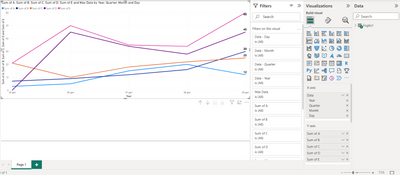
Original chart has all numbers showing for each month
The result I'm hoping to achieve (below is from excel that I was able to delete the numbers from previous month mannually):
Thank you in advance for your help!
Solved! Go to Solution.
- Mark as New
- Bookmark
- Subscribe
- Mute
- Subscribe to RSS Feed
- Permalink
- Report Inappropriate Content
Create the two measure above.
I hope I have been helpful.
Mark it as a solution if resolve your problem.
Ciao!
- Mark as New
- Bookmark
- Subscribe
- Mute
- Subscribe to RSS Feed
- Permalink
- Report Inappropriate Content
Foglio1 is the table [data] is the field of the calendar date.
in italian DATA is DATE.
- Mark as New
- Bookmark
- Subscribe
- Mute
- Subscribe to RSS Feed
- Permalink
- Report Inappropriate Content
Max Data =
--------
I hope I have been helpful.
Mark it as a solution if resolve your problem.
Ciao!
- Mark as New
- Bookmark
- Subscribe
- Mute
- Subscribe to RSS Feed
- Permalink
- Report Inappropriate Content
Yes in ALL and ALLSELECTED formula there is the solution if you have a date table with futures dates.
I'm happy I have been helpful.
Mark it as a solution if resolve your problem.
Ciao!
- Mark as New
- Bookmark
- Subscribe
- Mute
- Subscribe to RSS Feed
- Permalink
- Report Inappropriate Content
My fault, I missing double quotes and i use white instead of transparent.
Here is correct with two measure:
Max Data =
--------
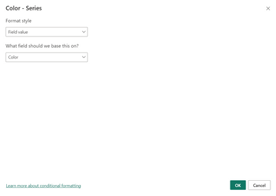
Then pass Color to conditional formatting.
Here the pbix link
https://we.tl/t-pJTAEJYuTv
I hope I have been helpful.
Mark it as a solution if resolve your problem.
Ciao!
- Mark as New
- Bookmark
- Subscribe
- Mute
- Subscribe to RSS Feed
- Permalink
- Report Inappropriate Content
Hi Lucadelicio,
Thanks for your fast reply. Do you mind sharing with me a screenshot of your pbix? my company blocked the site you sent me.
- Mark as New
- Bookmark
- Subscribe
- Mute
- Subscribe to RSS Feed
- Permalink
- Report Inappropriate Content
Create the two measure above.
I hope I have been helpful.
Mark it as a solution if resolve your problem.
Ciao!
- Mark as New
- Bookmark
- Subscribe
- Mute
- Subscribe to RSS Feed
- Permalink
- Report Inappropriate Content
Hi Lucadelico,
Sorry to bother you again.. do you mind expanding the data table so I can see what column you are referring to in your dax please? I got a bit confused by foglio1[data]
- Mark as New
- Bookmark
- Subscribe
- Mute
- Subscribe to RSS Feed
- Permalink
- Report Inappropriate Content
Foglio1 is the table [data] is the field of the calendar date.
in italian DATA is DATE.
- Mark as New
- Bookmark
- Subscribe
- Mute
- Subscribe to RSS Feed
- Permalink
- Report Inappropriate Content
- Mark as New
- Bookmark
- Subscribe
- Mute
- Subscribe to RSS Feed
- Permalink
- Report Inappropriate Content
Try to use the conditional formatting passing a measure that returns the color with the condition in wich date it will be.
MEASURE =
var _maxdate =
CALCULATE(
MAX(Sales[date])
,ALL(Sales)
)
RETURN
IF(_maxdate < MAX(Sales[date]), #FFFFFF, #000000)
I use white and black.
White i think is the color of your background.
I hope I have been helpful.
It's more easier to help you if you upload your pbix.
Mark it as a solution if resolve your problem.
Ciao!
- Mark as New
- Bookmark
- Subscribe
- Mute
- Subscribe to RSS Feed
- Permalink
- Report Inappropriate Content
Hi Lucadelicio,
I tried to reply to your PM but the system said I reached the maximum number of pm so I couldn't send it.
I have a follow up question.
I've got two tables, one transaction table and one calendar table. See below.
I created relationship by linking 'calendar date' with 'Date'. I want to use 'start of month' in X-axis in the line chart. In this case, how should I modify the dax you created?
Table 1 is the calendar table (I didn't write out all dates)
| Calendar date | start of month |
| 5/1/2022 | 5/1/2022 |
| 5/2/2022 | 5/1/2022 |
| 5/3/2022 | 5/1/2022 |
| 6/1/2022 | 6/1/2022 |
| 6/2/2022 | 6/1/2022 |
Table 2 shows transactions
| Date | A | B | C | D | E |
| 5/1/2022 | 3 | 7 | 21 | 21 | |
| 5/2/2022 | $5 | $9 | $10 | $45 | $50 |
| 5/3/2022 | $15 | $12 | $18 | $34 | $35 |
| 6/1/2022 | $20 | $16 | $22 | $28 | $34 |
| 6/2/2022 | $12 | $30 | $25 | $45 | $60 |
- Mark as New
- Bookmark
- Subscribe
- Mute
- Subscribe to RSS Feed
- Permalink
- Report Inappropriate Content
Max Data =
--------
I hope I have been helpful.
Mark it as a solution if resolve your problem.
Ciao!
- Mark as New
- Bookmark
- Subscribe
- Mute
- Subscribe to RSS Feed
- Permalink
- Report Inappropriate Content
- Mark as New
- Bookmark
- Subscribe
- Mute
- Subscribe to RSS Feed
- Permalink
- Report Inappropriate Content
Yes in ALL and ALLSELECTED formula there is the solution if you have a date table with futures dates.
I'm happy I have been helpful.
Mark it as a solution if resolve your problem.
Ciao!
- Mark as New
- Bookmark
- Subscribe
- Mute
- Subscribe to RSS Feed
- Permalink
- Report Inappropriate Content
If I use MAX(Table1[Startofmonth]), it will be december 1st because my calendar table goes up to december. However, my transaction table only has data from most current month.
- Mark as New
- Bookmark
- Subscribe
- Mute
- Subscribe to RSS Feed
- Permalink
- Report Inappropriate Content
Send me in email the fake pbix that rappresent your situation and I will fix tou
- Mark as New
- Bookmark
- Subscribe
- Mute
- Subscribe to RSS Feed
- Permalink
- Report Inappropriate Content
- Mark as New
- Bookmark
- Subscribe
- Mute
- Subscribe to RSS Feed
- Permalink
- Report Inappropriate Content
- Mark as New
- Bookmark
- Subscribe
- Mute
- Subscribe to RSS Feed
- Permalink
- Report Inappropriate Content
I'm sorry I can't share it due to company privacy policy
- Mark as New
- Bookmark
- Subscribe
- Mute
- Subscribe to RSS Feed
- Permalink
- Report Inappropriate Content
share me a excel seample fake data.
So i can try on your dataset.
- Mark as New
- Bookmark
- Subscribe
- Mute
- Subscribe to RSS Feed
- Permalink
- Report Inappropriate Content
The table shows the data used for creating the first chart in my original post
- Mark as New
- Bookmark
- Subscribe
- Mute
- Subscribe to RSS Feed
- Permalink
- Report Inappropriate Content
| A | B | C | D | E | Total | |
| 5/1/2022 | 3 | 7 | 21 | 21 | 52 | |
| 6/1/2022 | $5 | $9 | $10 | $45 | $50 | $119 |
| 7/1/2022 | $15 | $12 | $18 | $34 | $35 | $114 |
| 8/1/2022 | $20 | $16 | $22 | $28 | $34 | $120 |
| 9/1/2022 | $12 | $30 | $25 | $45 | $60 | $172 |
Helpful resources

Fabric Data Days
Advance your Data & AI career with 50 days of live learning, contests, hands-on challenges, study groups & certifications and more!

Power BI Monthly Update - October 2025
Check out the October 2025 Power BI update to learn about new features.


