FabCon is coming to Atlanta
Join us at FabCon Atlanta from March 16 - 20, 2026, for the ultimate Fabric, Power BI, AI and SQL community-led event. Save $200 with code FABCOMM.
Register now!- Power BI forums
- Get Help with Power BI
- Desktop
- Service
- Report Server
- Power Query
- Mobile Apps
- Developer
- DAX Commands and Tips
- Custom Visuals Development Discussion
- Health and Life Sciences
- Power BI Spanish forums
- Translated Spanish Desktop
- Training and Consulting
- Instructor Led Training
- Dashboard in a Day for Women, by Women
- Galleries
- Data Stories Gallery
- Themes Gallery
- Contests Gallery
- QuickViz Gallery
- Quick Measures Gallery
- Visual Calculations Gallery
- Notebook Gallery
- Translytical Task Flow Gallery
- TMDL Gallery
- R Script Showcase
- Webinars and Video Gallery
- Ideas
- Custom Visuals Ideas (read-only)
- Issues
- Issues
- Events
- Upcoming Events
Get Fabric Certified for FREE during Fabric Data Days. Don't miss your chance! Request now
- Power BI forums
- Forums
- Get Help with Power BI
- Desktop
- Re: How to make data labels really outside end?
- Subscribe to RSS Feed
- Mark Topic as New
- Mark Topic as Read
- Float this Topic for Current User
- Bookmark
- Subscribe
- Printer Friendly Page
- Mark as New
- Bookmark
- Subscribe
- Mute
- Subscribe to RSS Feed
- Permalink
- Report Inappropriate Content
How to make data labels really outside end?
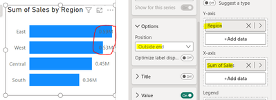
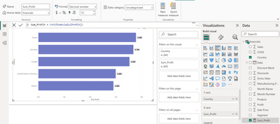
I create the following stacked bar chart (without adding Legend). I have made the position of Data Lables 'Outside end', but how to make the data labels really outside end (i.e. not interlace the end)?
- Mark as New
- Bookmark
- Subscribe
- Mute
- Subscribe to RSS Feed
- Permalink
- Report Inappropriate Content
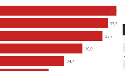
How is it that this has not been fixed!!! imho it is simply the "Auto" axis limit not giving a buffer when outside end data labels are on !!
I have been searching for a true resolution for this all day and i am only seeing silly workarounds like adding a measure with +10% and making that the limit or set a hard limit or adding a hidden value (from a measure) none of these are SOLUTIONS they are all workarounds to a stupid BUG.
yes i am frustrated.... i do no want to have to create countless measures and add them to my charts axis limits to make a simple visual BUG go away....
and no hard limits are not an option becuase slicers and parameters are a thing.... and the chart's required axis maximum can go from 10000+ down to basically 1 and a hard set max makes for a really garbage user experience.
and yes this seems to happen on bar and column charts....
- Mark as New
- Bookmark
- Subscribe
- Mute
- Subscribe to RSS Feed
- Permalink
- Report Inappropriate Content
I believe I've discovered a solution, specifically applicable to basic bar charts. Hope it helps.
1. Create a "Stacked bar chart" ; Note that the "Outside end" feature does not function flawlessly.
2. Create a measure with a value of zero.
3. Place the new measure on the X-axis -> Turn On "Total labels" ->Turn Off "Data labels". Refer to the highlighted sections below.
- Mark as New
- Bookmark
- Subscribe
- Mute
- Subscribe to RSS Feed
- Permalink
- Report Inappropriate Content
I have the same problem, it is very simple for PBI to implement something like adding some margin to the bar and label. Did you fix it?
- Mark as New
- Bookmark
- Subscribe
- Mute
- Subscribe to RSS Feed
- Permalink
- Report Inappropriate Content
You can increase space on the right by increase number of decimal places of your measure.
- Mark as New
- Bookmark
- Subscribe
- Mute
- Subscribe to RSS Feed
- Permalink
- Report Inappropriate Content
@VisheshRockStar this technique will only work if a number column is used on the x-axis. A good solution though but will not work in all cases.
Subscribe to the @PowerBIHowTo YT channel for an upcoming video on List and Record functions in Power Query!!
Learn Power BI and Fabric - subscribe to our YT channel - Click here: @PowerBIHowTo
If my solution proved useful, I'd be delighted to receive Kudos. When you put effort into asking a question, it's equally thoughtful to acknowledge and give Kudos to the individual who helped you solve the problem. It's a small gesture that shows appreciation and encouragement! ❤
Did I answer your question? Mark my post as a solution. Proud to be a Super User! Appreciate your Kudos 🙂
Feel free to email me with any of your BI needs.
- Mark as New
- Bookmark
- Subscribe
- Mute
- Subscribe to RSS Feed
- Permalink
- Report Inappropriate Content
Hi All,
You can fix this issue by creating the X axis maximum measure .This issue generally happens bz chart have lower magrin w.r.t the bars .
So create a measure which returns the max axis value and add some margin to it.
Ex- If max age is 60 in the chart and it is overlapping it. you can do in similar way
Measure= Max(Age)+5
Note-I have take 5 as a margin
And pull this measure in the X axis Maximum range.
Best Regard,
Vishesh
- Mark as New
- Bookmark
- Subscribe
- Mute
- Subscribe to RSS Feed
- Permalink
- Report Inappropriate Content
I am facing the same issue and definitely this is something to do with the code inbuilt with powerBI, im quite shocked no one else has sounded this out given how old PowerBI is
- Mark as New
- Bookmark
- Subscribe
- Mute
- Subscribe to RSS Feed
- Permalink
- Report Inappropriate Content
- Mark as New
- Bookmark
- Subscribe
- Mute
- Subscribe to RSS Feed
- Permalink
- Report Inappropriate Content
@amitchandak I can't use the X-axis values (Start and End) because the chart is dynamic according to the filters...
- Mark as New
- Bookmark
- Subscribe
- Mute
- Subscribe to RSS Feed
- Permalink
- Report Inappropriate Content
Hi @Anonymous,
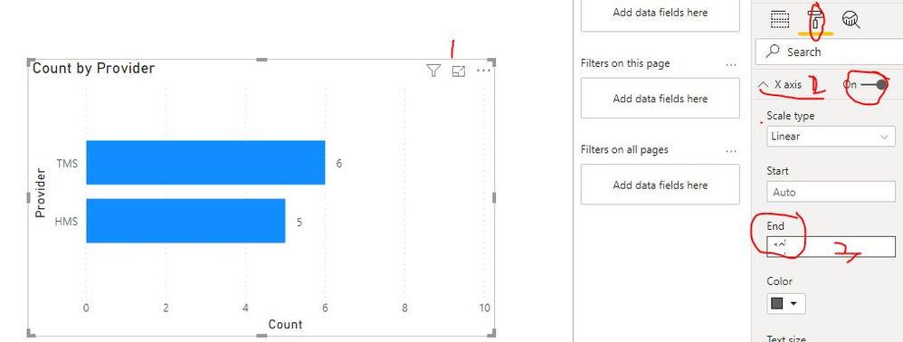
Could you please try to complete the following steps(check below screenshot) to check if all data labels can display at the outside end?
- Select the related stacked bar chart
- Navigate to “Format” pane, find X axis tab
- Set the proper value for “Start” and “End” textbox
Best Regards
Rena
- Mark as New
- Bookmark
- Subscribe
- Mute
- Subscribe to RSS Feed
- Permalink
- Report Inappropriate Content
@Anonymous thanks. but as mentioned, I can't use the X-axis values (Start and End) because the chart is dynamic according to the filters...
the values range could be from 1000 to 100M...
- Mark as New
- Bookmark
- Subscribe
- Mute
- Subscribe to RSS Feed
- Permalink
- Report Inappropriate Content
Hi @Anonymous ,
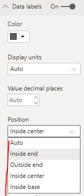
I'm sorry I still not find other way to achieve your needs. If can change the display position of the data label to another position(like inside center)?
Best Regards
Rena
- Mark as New
- Bookmark
- Subscribe
- Mute
- Subscribe to RSS Feed
- Permalink
- Report Inappropriate Content
@Anonymous I don;t think there is much available in this case. You can surely create matrix with databars and values in a seperate column. It can achieve what you are looking for.
May be add this as a suggestion on ideas forum.
Subscribe to the @PowerBIHowTo YT channel for an upcoming video on List and Record functions in Power Query!!
Learn Power BI and Fabric - subscribe to our YT channel - Click here: @PowerBIHowTo
If my solution proved useful, I'd be delighted to receive Kudos. When you put effort into asking a question, it's equally thoughtful to acknowledge and give Kudos to the individual who helped you solve the problem. It's a small gesture that shows appreciation and encouragement! ❤
Did I answer your question? Mark my post as a solution. Proud to be a Super User! Appreciate your Kudos 🙂
Feel free to email me with any of your BI needs.
Helpful resources

Power BI Monthly Update - November 2025
Check out the November 2025 Power BI update to learn about new features.

Fabric Data Days
Advance your Data & AI career with 50 days of live learning, contests, hands-on challenges, study groups & certifications and more!


