FabCon is coming to Atlanta
Join us at FabCon Atlanta from March 16 - 20, 2026, for the ultimate Fabric, Power BI, AI and SQL community-led event. Save $200 with code FABCOMM.
Register now!- Power BI forums
- Get Help with Power BI
- Desktop
- Service
- Report Server
- Power Query
- Mobile Apps
- Developer
- DAX Commands and Tips
- Custom Visuals Development Discussion
- Health and Life Sciences
- Power BI Spanish forums
- Translated Spanish Desktop
- Training and Consulting
- Instructor Led Training
- Dashboard in a Day for Women, by Women
- Galleries
- Data Stories Gallery
- Themes Gallery
- Contests Gallery
- QuickViz Gallery
- Quick Measures Gallery
- Visual Calculations Gallery
- Notebook Gallery
- Translytical Task Flow Gallery
- TMDL Gallery
- R Script Showcase
- Webinars and Video Gallery
- Ideas
- Custom Visuals Ideas (read-only)
- Issues
- Issues
- Events
- Upcoming Events
The Power BI Data Visualization World Championships is back! Get ahead of the game and start preparing now! Learn more
- Power BI forums
- Forums
- Get Help with Power BI
- Desktop
- How to get dynamic index of a column in table
- Subscribe to RSS Feed
- Mark Topic as New
- Mark Topic as Read
- Float this Topic for Current User
- Bookmark
- Subscribe
- Printer Friendly Page
- Mark as New
- Bookmark
- Subscribe
- Mute
- Subscribe to RSS Feed
- Permalink
- Report Inappropriate Content
How to get dynamic index of a column in table
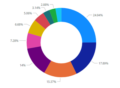
I have a table that changes per country with changes according to slicer for country. At a given moment a particular country is select I have used filter pane to show only top 10 city sales both in table and in pie chart. For reference both look similar to what I have shown below.
| City | Sales_leather | Sales_tin |
| A | 100 | 87 |
| B | 80 | 87 |
| C | 77 | 54 |
| D | 7 | 122 |
| E | 34 | 67 |
| F | 65 | 26 |
| G | 23 | 57 |
| H | 65 | 14 |
| I | 32 | 45 |
| J | 56 | 19 |
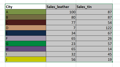
Now instead of showing legend of pie charts (as I have one more pie chart in the sheet) I would rather like to have the city columns background colored of the same color code that I want in pie chart. To have it I had created a table with rank and color codes that I need. Now I want the index numbers of each city for the particular selected country and match it with my rank table where I can not merge the relation of a measure with rank table. The rank table is shown below.
rankcolor
| 1 | #074E64 |
| 2 | #007FA3 |
| 3 | #30ABCE |
| 4 | #8DC0DD |
| 5 | #007770 |
| 6 | #5F7419 |
| 7 | #7E9B21 |
| 8 | #9CBD23 |
| 9 | #808080 |
| 10 | #969696 |
I want then for my table to look something similar to this:
Of course ,both the background color and pie chart should show same colors. But another problem is I have a slicer which when selected for another country should still follow the same color code ranking as my table. Please help me how could I achieve this.
Thanks in advance 🙂
- Mark as New
- Bookmark
- Subscribe
- Mute
- Subscribe to RSS Feed
- Permalink
- Report Inappropriate Content
Adding to the post, the ranking of cities is based on Sales_Leather + Sales_tin. Though that column is not in the table. I just created a measure and used it in filter.
Helpful resources

Power BI Dataviz World Championships
The Power BI Data Visualization World Championships is back! Get ahead of the game and start preparing now!

Power BI Monthly Update - November 2025
Check out the November 2025 Power BI update to learn about new features.

| User | Count |
|---|---|
| 66 | |
| 47 | |
| 43 | |
| 26 | |
| 19 |
| User | Count |
|---|---|
| 198 | |
| 126 | |
| 102 | |
| 67 | |
| 50 |


