FabCon is coming to Atlanta
Join us at FabCon Atlanta from March 16 - 20, 2026, for the ultimate Fabric, Power BI, AI and SQL community-led event. Save $200 with code FABCOMM.
Register now!- Power BI forums
- Get Help with Power BI
- Desktop
- Service
- Report Server
- Power Query
- Mobile Apps
- Developer
- DAX Commands and Tips
- Custom Visuals Development Discussion
- Health and Life Sciences
- Power BI Spanish forums
- Translated Spanish Desktop
- Training and Consulting
- Instructor Led Training
- Dashboard in a Day for Women, by Women
- Galleries
- Data Stories Gallery
- Themes Gallery
- Contests Gallery
- QuickViz Gallery
- Quick Measures Gallery
- Visual Calculations Gallery
- Notebook Gallery
- Translytical Task Flow Gallery
- TMDL Gallery
- R Script Showcase
- Webinars and Video Gallery
- Ideas
- Custom Visuals Ideas (read-only)
- Issues
- Issues
- Events
- Upcoming Events
Get Fabric Certified for FREE during Fabric Data Days. Don't miss your chance! Request now
- Power BI forums
- Forums
- Get Help with Power BI
- Desktop
- How to get a way to make a Progress bar
- Subscribe to RSS Feed
- Mark Topic as New
- Mark Topic as Read
- Float this Topic for Current User
- Bookmark
- Subscribe
- Printer Friendly Page
- Mark as New
- Bookmark
- Subscribe
- Mute
- Subscribe to RSS Feed
- Permalink
- Report Inappropriate Content
How to get a way to make a Progress bar
Hi everyone,
I am working on a proof of concept and the client would like to have a progress bar that shows the completion of a task.
Do you guys have a way to make it ?
Kind regards,
Mohammad PATEL
- Mark as New
- Bookmark
- Subscribe
- Mute
- Subscribe to RSS Feed
- Permalink
- Report Inappropriate Content
Used Clustered bar chart.
Created one additional measure for Target value = 1 (100%)
In the layout selected overlap
and removed values from target, only showing values from actual measure on the inside end
end result
- Mark as New
- Bookmark
- Subscribe
- Mute
- Subscribe to RSS Feed
- Permalink
- Report Inappropriate Content
If you are looking for a specific progress bar style, you could also create it in Excel and then copy paste to Power BI and make it dynamic. This video explains how it's done:
- Mark as New
- Bookmark
- Subscribe
- Mute
- Subscribe to RSS Feed
- Permalink
- Report Inappropriate Content
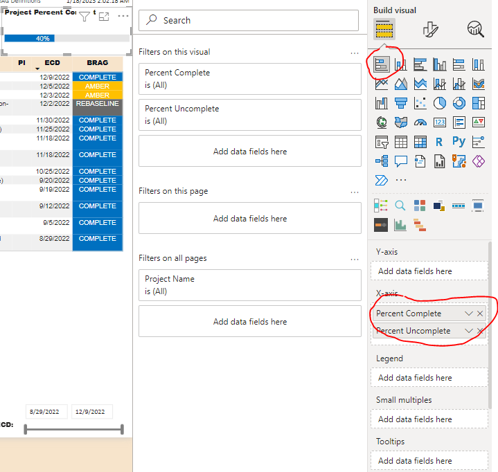
I just used regular old stacked bar chart with 2 values, one the percent complete (blue portion) and the other a measure which is 1 minus the percent complete (the grey portion). I chose the grey color as the font for the data labels as well so only the portion completed is visible. It works and is free. Here's screen snip of it next to a table.
- Mark as New
- Bookmark
- Subscribe
- Mute
- Subscribe to RSS Feed
- Permalink
- Report Inappropriate Content
How did you show the percentage inside the bar? Could you please share the pbix file
- Mark as New
- Bookmark
- Subscribe
- Mute
- Subscribe to RSS Feed
- Permalink
- Report Inappropriate Content
pbix file has a lot of data that would take too long to sanitize and/or make shareable. I am creating some screen shots here.
Used stacked bar chart with 2 fields on X-axis, Percent Complete (a calculated column called DecPercentComplete and Percent Uncomplete ( a measure called PercentUncomplete). Screen shots are shown for each. The calulcated column was required as the data comes in with the percent complete as a whole number. I also am showing the formatting, the percent complete blue and uncomplete grey. The values are all grey so that the percent complete shows up with a value and you don't see the value for uncomplete since it is same color as the bar itself.
- Mark as New
- Bookmark
- Subscribe
- Mute
- Subscribe to RSS Feed
- Permalink
- Report Inappropriate Content
Hi @Anonymous,
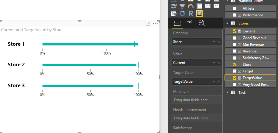
You can try to ue bullet visual to show the progress bar, below is the sample:
Regards,
Xiaoxin Sheng
- Mark as New
- Bookmark
- Subscribe
- Mute
- Subscribe to RSS Feed
- Permalink
- Report Inappropriate Content
Hi @Anonymous
You should check this VIDEO for understanding how PowerBI can be used in proof of concept scenario.
Bhavesh
Love the Self Service BI.
Please use the 'Mark as answer' link to mark a post that answers your question. If you find a reply helpful, please remember to give Kudos.
- Mark as New
- Bookmark
- Subscribe
- Mute
- Subscribe to RSS Feed
- Permalink
- Report Inappropriate Content
@Anonymous the Linear Gauge custom visual will probably give you what you want.
Did I answer your question? Mark my post as a solution!
Proud to be a Super User!
Helpful resources

Power BI Monthly Update - November 2025
Check out the November 2025 Power BI update to learn about new features.

Fabric Data Days
Advance your Data & AI career with 50 days of live learning, contests, hands-on challenges, study groups & certifications and more!

| User | Count |
|---|---|
| 102 | |
| 79 | |
| 57 | |
| 51 | |
| 46 |


