Fabric Data Days starts November 4th!
Advance your Data & AI career with 50 days of live learning, dataviz contests, hands-on challenges, study groups & certifications and more!
Get registered- Power BI forums
- Get Help with Power BI
- Desktop
- Service
- Report Server
- Power Query
- Mobile Apps
- Developer
- DAX Commands and Tips
- Custom Visuals Development Discussion
- Health and Life Sciences
- Power BI Spanish forums
- Translated Spanish Desktop
- Training and Consulting
- Instructor Led Training
- Dashboard in a Day for Women, by Women
- Galleries
- Data Stories Gallery
- Themes Gallery
- Contests Gallery
- Quick Measures Gallery
- Visual Calculations Gallery
- Notebook Gallery
- Translytical Task Flow Gallery
- TMDL Gallery
- R Script Showcase
- Webinars and Video Gallery
- Ideas
- Custom Visuals Ideas (read-only)
- Issues
- Issues
- Events
- Upcoming Events
Join us at FabCon Atlanta from March 16 - 20, 2026, for the ultimate Fabric, Power BI, AI and SQL community-led event. Save $200 with code FABCOMM. Register now.
- Power BI forums
- Forums
- Get Help with Power BI
- Desktop
- Re: How to exclude Sparkline Column in Matrix View...
- Subscribe to RSS Feed
- Mark Topic as New
- Mark Topic as Read
- Float this Topic for Current User
- Bookmark
- Subscribe
- Printer Friendly Page
- Mark as New
- Bookmark
- Subscribe
- Mute
- Subscribe to RSS Feed
- Permalink
- Report Inappropriate Content
How to exclude Sparkline Column in Matrix View from the applied filter ?
Hi All,
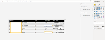
I am have a requirement to show multiple column as tooltip for which I have created a page as tooltip and used Matrix view to create the table like view and used 5 fields (metric) from data as Customer Name, Value, Score, Target Value, Score Trend. In order to create Score Trend, I used the Score field and then convert it to "Add to Sparkline" where I took Average of Score along with Date field from table and it shows Score Trend Line in the matrix and at the end I renamed "Score" to "Score Trend".
As business want to see only latest date data, therefore created New Column using DAX function: Max_Date = IF (MAX(‘Table’[Date]) = ‘Table’[Date], 1,0)
and drop on Filter under "Filters on this page" and selected '1' in order to show the latest date details for fields Customer Name, Value, Score, Target Value. As filter is getting applied in all the 5 columns but I want to exclude "Score Trend" column so that I can see the score trend line as when MAX_DATE is applied as filter (Filters on this Visual or Filters on this page ) is changes the Score Trend column into Dot(.) instead of trend line.
Before applying MAX_DATE on Filter
After applying MAX_DATE on Filter , it shows Dot(.) but client want to see the Trend line insted on dot(.)
- Mark as New
- Bookmark
- Subscribe
- Mute
- Subscribe to RSS Feed
- Permalink
- Report Inappropriate Content
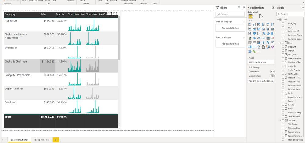
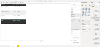
@lbendlin Thank you for your reply. I Created Sparkline using SVG with dummy data but not able exclude the Sparkline Column from the filter been applied as for reference I have attached the pbix file with "Linewithout Filter" & "Tooltip with Filter" page where I have applied the filter MAX_DATE on Tooltip sheet and filter get applied on Sparkline Line column. As my requirement is to exclude the Sparkline from the applied filter. You can check the SVG code as well for Sparkline Line measure created.
Sparkline Line =
// Static line color
VAR LineColor = "#01B8AA"
// "Date" field used in this example along the X axis
VAR XMinDate = MIN('Table'[Date])
VAR XMaxDate = MAX('Table'[Date])
// Obtain overall min and overall max measure values when evaluated for each date
VAR YMinValue = MINX(VALUES('Table'[Date]),CALCULATE([Measure Value]))
VAR YMaxValue = MAXX(VALUES('Table'[Date]),CALCULATE([Measure Value]))
// Build table of X & Y coordinates and fit to 100 x 100 viewbox
VAR SparklineTable = ADDCOLUMNS(
    SUMMARIZE('Table','Table'[Date]),
        "X",INT(100 * DIVIDE('Table'[Date] - XMinDate, XMaxDate - XMinDate)),
        "Y",INT(100 * DIVIDE([Measure Value] - YMinValue,YMaxValue - YMinValue)))
// Concatenate X & Y coordinates to build the sparkline
VAR Lines = CONCATENATEX(SparklineTable,[X] & "," & 100-[Y]," ", [Date])
// Add to SVG, and verify Data Category is set to Image URL for this measure
VAR SVGImageURL = IF(HASONEVALUE('Table'[Category]),
    "data:image/svg+xml;utf8," &
    "<svg xmlns='http://www.w3.org/2000/svg' x='0px' y='0px' viewBox='0 0 100 100'>" &
     "<polyline fill='none' stroke='" & LineColor &
     "' stroke-width='3' points='" & Lines &
     "'/></svg>",
     BLANK())
RETURN SVGImageURL

When MAX_DATE Filter applied:

Thank you !!
- Mark as New
- Bookmark
- Subscribe
- Mute
- Subscribe to RSS Feed
- Permalink
- Report Inappropriate Content
which filters are you trying to ignore? your intermediate variables
// "Date" field used in this example along the X axis
VAR XMinDate = MIN('Table'[Date])
VAR XMaxDate = MAX('Table'[Date])
// Obtain overall min and overall max measure values when evaluated for each date
VAR YMinValue = MINX(VALUES('Table'[Date]),CALCULATE([Measure Value]))
VAR YMaxValue = MAXX(VALUES('Table'[Date]),CALCULATE([Measure Value]))
// Build table of X & Y coordinates and fit to 100 x 100 viewbox
VAR SparklineTable = ADDCOLUMNS(
need to be modified with REMOVEFILTERS accordingly.
- Mark as New
- Bookmark
- Subscribe
- Mute
- Subscribe to RSS Feed
- Permalink
- Report Inappropriate Content
Use SVG to handcraft your own sparklines.
Helpful resources

FabCon Global Hackathon
Join the Fabric FabCon Global Hackathon—running virtually through Nov 3. Open to all skill levels. $10,000 in prizes!

Power BI Monthly Update - October 2025
Check out the October 2025 Power BI update to learn about new features.

| User | Count |
|---|---|
| 82 | |
| 42 | |
| 31 | |
| 27 | |
| 27 |


