Fabric Data Days starts November 4th!
Advance your Data & AI career with 50 days of live learning, dataviz contests, hands-on challenges, study groups & certifications and more!
Get registered- Power BI forums
- Get Help with Power BI
- Desktop
- Service
- Report Server
- Power Query
- Mobile Apps
- Developer
- DAX Commands and Tips
- Custom Visuals Development Discussion
- Health and Life Sciences
- Power BI Spanish forums
- Translated Spanish Desktop
- Training and Consulting
- Instructor Led Training
- Dashboard in a Day for Women, by Women
- Galleries
- Data Stories Gallery
- Themes Gallery
- Contests Gallery
- Quick Measures Gallery
- Visual Calculations Gallery
- Notebook Gallery
- Translytical Task Flow Gallery
- TMDL Gallery
- R Script Showcase
- Webinars and Video Gallery
- Ideas
- Custom Visuals Ideas (read-only)
- Issues
- Issues
- Events
- Upcoming Events
Join us at FabCon Atlanta from March 16 - 20, 2026, for the ultimate Fabric, Power BI, AI and SQL community-led event. Save $200 with code FABCOMM. Register now.
- Power BI forums
- Forums
- Get Help with Power BI
- Desktop
- How to display values of a whole within the same c...
- Subscribe to RSS Feed
- Mark Topic as New
- Mark Topic as Read
- Float this Topic for Current User
- Bookmark
- Subscribe
- Printer Friendly Page
- Mark as New
- Bookmark
- Subscribe
- Mute
- Subscribe to RSS Feed
- Permalink
- Report Inappropriate Content
How to display values of a whole within the same column
Hi,
How would you solve this challenge. I have let's say 100 dollars as salary per day. Now everyday I have to pay rent which is 40 dollars, groceries for 20 dollars and gas for 10 dollars. All of these expenses total 70 dollars.
Now I would like to display these graphically based on salary (100 dollars) and have rent, groceries and gas within the 100 dollar value column, like having a visual budget to see, how much "free" money I have.
How would one display these within the larger value? Having a clustered column or stacked column chart would not do, as this would display them respectively beside one another or on top and would not give the "correct" feel.
Any help, ideas or comments are appreciated.
- Mark as New
- Bookmark
- Subscribe
- Mute
- Subscribe to RSS Feed
- Permalink
- Report Inappropriate Content
Hi @Datafruit ,
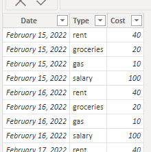
If you do not want bar chart ,you can try pie chart. I assume you have a record sheet, like this.
Then create a Type table via enter data.
I create a measure to calcualte the total of all.
Measure =
VAR _sum =
    SUMX( Records, [Cost] )
VAR _free =
    SUMX( FILTER( ALL( Records ), [Type] = "salary" ), [Cost] )
        - SUMX( FILTER( ALL( Records ), [Type] <> "salary" ), [Cost] )
RETURN
    IF( SELECTEDVALUE( 'Type'[Type] ) = "free", _free, _sum )
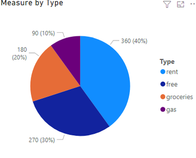
You need to be careful to leave the Type in the filter pane unchecked for salary. Result:
Pbix in the end you can refer.
Best Regards
Community Support Team _ chenwu zhu
If this post helps, then please consider Accept it as the solution to help the other members find it more quickly.
- Mark as New
- Bookmark
- Subscribe
- Mute
- Subscribe to RSS Feed
- Permalink
- Report Inappropriate Content
Hi @v-chenwuz-msft
Thanks for the reply. But unfortunately I would like a bar chart as the aim is to track how much of the overhead/free amount is per day...
I know that this is rather tricky and I have not been able to figure out a way to do it now.
Hoping that you have some ideas 🙂
Best
Jaanis
- Mark as New
- Bookmark
- Subscribe
- Mute
- Subscribe to RSS Feed
- Permalink
- Report Inappropriate Content
@Datafruit can you provide an example of what would give the right visual output? Even if you can hand draw what you're after. I apologise as I am not entirely understanding the output you would want if the two charts you mentioned wouldn't give the right output.
Thanks in advance.
Theo
If I have posted a response that resolves your question, please accept it as a solution to formally close the post.
Also, if you are as passionate about Power BI, DAX and data as I am, please feel free to reach out if you have any questions, queries, or if you simply want to connect and talk to another data geek!
Want to connect?www.linkedin.com/in/theoconias
- Mark as New
- Bookmark
- Subscribe
- Mute
- Subscribe to RSS Feed
- Permalink
- Report Inappropriate Content
Hi, So I was thinking something like this. That the "separate" items or costs per day are marked within the available cash per day, if that makes sense.
Helpful resources

FabCon Global Hackathon
Join the Fabric FabCon Global Hackathon—running virtually through Nov 3. Open to all skill levels. $10,000 in prizes!

Power BI Monthly Update - October 2025
Check out the October 2025 Power BI update to learn about new features.


